How to Choose the Right Car Color?

When it comes to selecting a new car, the color often plays a significant role in the decision-making process.

Beyond mere aesthetics, the psychology of car colors taps into our emotions, identities, and even perceptions of safety and style. Each hue carries its own connotations—bold red exudes energy and passion, while a sleek black might evoke sophistication and power. As you embark on the journey of choosing the perfect color for your ride, understanding the psychological impact of these shades can elevate your choice from merely practical to profoundly personal. In this blog post, we’ll delve into the fascinating world of car color psychology, explore how different colors can influence your mood and image, and provide you with insights to help you select a hue that not only reflects your personality but also enhances your driving experience. Whether you’re a fan of timeless neutrals or vibrant pops of color, this guide will empower you to make a choice that resonates with you on multiple levels.

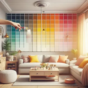
1. Introduction to Car Color Psychology

How to Choose the Right Car Color?
Credit : whatcanu.com

Choosing the color of your car goes beyond mere aesthetics; it delves into the fascinating realm of psychology and personal expression. The hue you select can convey your personality, influence how others perceive you, and even impact the resale value of your vehicle. Car color psychology is a nuanced field that explores the emotional and cultural associations tied to various shades, helping buyers make informed choices that resonate with their identity and lifestyle.

For many, a car is more than just a mode of transportation; it’s a reflection of who they are. Whether it’s the sleek sophistication of a black sedan, the boldness of a fiery red sports car, or the calming presence of a serene blue hatchback, each color evokes specific feelings and attitudes. Research has shown that colors can trigger emotional responses, with warmer shades often associated with energy and passion, while cooler tones promote tranquility and trust.

Moreover, cultural perceptions play a significant role in color preference. For instance, in some cultures, white symbolizes purity and new beginnings, making it a popular choice for new car buyers. In contrast, in other regions, it may be viewed as a color associated with mourning. Understanding these cultural nuances can help you choose a color that not only suits your taste but also resonates positively within your community.

As we dive deeper into the world of car color psychology, we’ll explore the meanings behind different colors, their popularity trends, and practical tips on how to select the perfect hue that aligns with your personality and lifestyle. By the end of this journey, you’ll be equipped with the knowledge to make a car color choice that truly reflects who you are—inside and out.

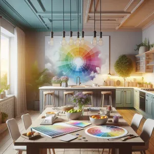
2. The Impact of Color on Perception and Emotion

When it comes to car colors, the impact goes far beyond mere aesthetics; it delves deep into the realms of perception and emotion. The color of a vehicle plays a pivotal role in how it is perceived by others and how it makes its owner feel while driving. This psychological connection can influence everything from purchase decisions to the way drivers interact with the world around them.

For instance, red is often associated with passion, energy, and excitement. A red car can evoke a sense of speed and adventure, making it an appealing choice for those who crave a thrilling driving experience. On the other hand, blue is frequently linked to calmness and reliability. A blue vehicle can create an impression of trustworthiness, making it an ideal choice for professionals looking to project stability and confidence.

Moreover, the psychological effects of color can influence a car owner’s mood and self-perception. Bright colors like yellow and orange can induce feelings of happiness and positivity, while darker shades like black or navy may convey sophistication and authority. This emotional resonance can make a significant difference in how drivers feel about their car, and by extension, themselves.

Understanding how color impacts perception and emotion can help potential car buyers make more informed choices. Whether you’re seeking to stand out on the road or hoping to exude a sense of professionalism, the color of your car is an essential factor that deserves careful consideration. By selecting a hue that aligns with your personality and desired image, you can ensure that your ride not only looks great but also resonates on a deeper emotional level.

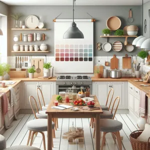
3. Popular Car Colors and Their Meanings

How to Choose the Right Car Color?
Credit : whatcanu.com

When it comes to selecting the perfect hue for your vehicle, understanding the psychological implications of color can significantly influence your choice. Popular car colors not only reflect personal style but also convey messages about the driver’s personality and preferences. Here’s a closer look at some of the most common car colors and their inherent meanings:

**1. Black:** Often associated with sophistication and elegance, black is a classic choice that exudes power and authority. It can also signify a sense of mystery and is often chosen by those who wish to convey a strong, professional image. However, it can also imply a desire for anonymity, making it a popular choice for business vehicles.

**2. White:** Representing purity, simplicity, and cleanliness, white cars are often seen as timeless and practical. This color is commonly associated with safety and reliability, making it a popular choice for families and individuals who prioritize functionality over flashiness. Additionally, white vehicles tend to stay cooler in sunny climates, adding a practical benefit to their aesthetic appeal.

**3. Silver and Gray:** These neutral tones evoke a sense of modernity and technological advancement. Silver and gray cars are often associated with sophistication and a futuristic outlook. They are versatile colors that can suit various vehicle types, from sporty sedans to practical SUVs, appealing to those who appreciate minimalism and understated elegance.

**4. Red:** Vibrant and attention-grabbing, red is the color of passion, excitement, and energy. It tends to attract attention and can indicate a more adventurous or bold personality. Red cars are often linked to a sense of speed and performance, making them a favorite among sports car enthusiasts. However, they might also be perceived as aggressive, so consider your audience when opting for this daring hue.

**5. Blue:** Often linked to calmness and tranquility, blue is a popular choice that can convey a sense of reliability and trustworthiness. Light blues are associated with peace and serenity, while darker shades may evoke professionalism and stability. Choosing blue can reflect a balanced personality and a preference for harmony.

**6. Green:** Green is often associated with nature, growth, and sustainability. It can convey a sense of uniqueness and individuality, as it’s less commonly chosen than other colors. Opting for a green car can reflect a connection to eco-friendliness, making it appealing for environmentally conscious consumers.

**7. Yellow and Orange:** These energetic colors are typically seen as fun and playful. They can signify a sunny disposition and an outgoing personality. However, they are also less common, which can make a car in these hues stand out even more, showcasing a driver who is confident and non-conformist.

Choosing the right color for your vehicle goes beyond aesthetics; it taps into the psychology of perception and emotion. Whether you want to project professionalism, excitement, or a commitment to sustainability, consider how your choice of color will influence not just your driving experience, but also how others perceive you on the road.

4. The Influence of Cultural Factors on Color Preferences

When it comes to choosing the perfect hue for your car, cultural factors play a significant role in shaping our color preferences. Colors often hold different meanings and associations across various cultures, influencing how individuals perceive and respond to specific shades. For instance, while white is often associated with purity and simplicity in Western cultures, it can signify mourning and loss in some Eastern societies. This stark contrast can impact an individual’s choice when selecting a vehicle, as the color may evoke different emotions or convey unintended messages.

In countries like China, red is a favored color, symbolizing good fortune and happiness, which can lead to a booming market for red vehicles during festive seasons. On the flip side, in certain regions of Europe, muted colors like grey and navy blue may be preferred, reflecting a more conservative and sophisticated approach to car ownership.

Furthermore, trends can shift with cultural movements; for example, the rise of eco-consciousness has popularized earthy tones and greens as consumers seek to align their personal values with their purchasing decisions. Understanding these cultural nuances can provide valuable insight into not only what colors are trending in various markets but also how specific hues may resonate with potential buyers.

Ultimately, when selecting a car color, it’s essential to consider not just personal taste but also the broader cultural context in which you live. By doing so, you can choose a hue that not only reflects your personality but also aligns with the sentiments and values of your community, ensuring your vehicle makes the right impression on the road.

5. The Connection Between Color and Safety

How to Choose the Right Car Color?
Credit : whatcanu.com

When it comes to choosing a car color, safety should be at the forefront of your decision-making process. Studies have shown that certain colors can significantly impact visibility on the road, which in turn affects accident rates. Bright and vibrant colors, such as white, yellow, and orange, tend to stand out more against the backdrop of asphalt and can be easier for other drivers to spot, especially in low-light conditions such as dawn, dusk, or during inclement weather.

For instance, a study conducted by the Monash University Accident Research Centre found that vehicles in darker shades—such as black, gray, or navy blue—are more likely to be involved in accidents compared to their brighter counterparts. The reasoning is simple: lighter colors reflect more light and are more noticeable, making them less likely to blend into the surroundings. This is especially important in urban areas where traffic is dense, and visual clutter can obscure a vehicle’s presence.

Furthermore, the psychological aspect of color also plays a role in how drivers perceive safety. Brightly colored cars are often associated with positivity and alertness, which can enhance a driver’s confidence on the road. Conversely, darker colors can evoke a sense of anonymity, which might lead to more aggressive driving behavior, as drivers feel less visible to others.

Ultimately, while personal preference and style are crucial in selecting the perfect hue for your ride, considering the connection between color and safety can provide an added layer of assurance in your choice. By opting for a color that maximizes visibility, you not only enhance your vehicle’s aesthetic appeal but also contribute to a safer driving experience for yourself and others on the road.

6. How Color Affects Resale Value

When it comes to purchasing a vehicle, the color you choose can have a surprising impact on its resale value. While you may love that vibrant shade of electric blue or the sleek allure of matte black, it’s essential to consider how these choices resonate in the broader automotive market. Certain colors tend to hold their value better than others, largely because of buyer preferences and market trends.

Neutral colors like white, black, gray, and silver often dominate the resale market. They are timeless, versatile, and appeal to a larger demographic, making them easier to sell down the line. Buyers often view these colors as safe and practical, which can lead to higher demand and, consequently, better resale prices. For instance, a classic black sedan may attract a wider audience than a bright orange sports car, which could be seen as a niche choice appealing only to specific buyers.

Conversely, bold colors—while they can make a strong personal statement—may not always translate well in terms of resale. A striking color like hot pink or lime green may turn heads on the road, but when it comes time to sell, you might find yourself waiting longer for a buyer who shares your enthusiasm for such a unique hue. These less conventional colors can sometimes be perceived as less desirable, potentially leading to a lower resale value.

Furthermore, trends in car colors can shift over time based on societal influences and preferences. Just as fashion ebbs and flows, so too does the automotive landscape. For example, the rise of eco-conscious buyers has led to an increased popularity of earthy tones and muted shades, which may fetch a better price in the second-hand market.

Ultimately, while color is a personal choice that reflects your style and personality, it’s wise to consider the resale implications. Striking a balance between your preferences and market trends can help ensure that your car not only looks good on the road but also retains its value when it’s time to sell.

7. Choosing a Color Based on Personality Traits

How to Choose the Right Car Color?
Credit : whatcanu.com

When it comes to selecting the perfect hue for your vehicle, understanding the psychology of color can be a game-changer. Your choice of car color can reflect personal traits, values, and even aspirations. It’s not just about aesthetics; it’s about choosing a shade that resonates with who you are and how you wish to be perceived by the world.

For instance, individuals who gravitate towards bold colors like red or orange often exude confidence and enthusiasm. These vibrant shades are associated with energy and passion, making them ideal for those who view driving as an exhilarating experience. If you’re someone who thrives on excitement and enjoys being the center of attention, a fiery red or a striking neon orange may be the perfect choice for your ride.

In contrast, those who prefer more subdued colors, such as black or gray, might be seen as more serious or sophisticated. These shades convey a sense of elegance and authority, appealing to individuals who value professionalism and a timeless aesthetic. A sleek black car can suggest a powerful presence, making it an excellent option for business professionals aiming to create a strong impression.

If you’re a free spirit who embraces creativity, colors like teal or purple may resonate with you. These hues are often linked to innovation and individuality, attracting those who wish to stand out in a crowd while still maintaining a sense of uniqueness. A car in a vibrant teal or deep plum can reflect an adventurous personality, one that seeks to break free from conventions.

Lastly, for those who cherish calmness and tranquility, softer shades like blue or green can evoke a sense of peace and harmony. These colors are often associated with nature and serenity, appealing to individuals who prioritize comfort and relaxation in their lives. A gentle sky blue or a refreshing mint green can make a statement about your love for simplicity and a balanced lifestyle.

Ultimately, when choosing a color for your car, consider not only your personal preferences but also how you want to express your identity through your vehicle. After all, your car is an extension of who you are, and the right color can enhance your driving experience while making a bold statement on the road.

8. Seasonal Trends in Car Colors

When it comes to choosing the perfect hue for your vehicle, it’s essential to consider seasonal trends in car colors. Just as fashion evolves with the seasons, so too does the automotive color palette. Car manufacturers and consumers alike often gravitate toward hues that resonate with the mood of the time, reflecting broader cultural and environmental shifts.

In the spring and summer months, vibrant colors tend to dominate the roads. Bright reds, sunny yellows, and refreshing greens evoke feelings of energy and optimism, perfectly aligning with the blossoming of nature and the longer, sunnier days. These eye-catching shades not only stand out in the sunlight but also signal a sense of adventure and fun, making them popular choices for new car buyers looking to embrace the season’s spirit.

As autumn approaches, the color trends shift, embracing the rich, warm tones found in nature. Earthy shades like deep oranges, rustic browns, and sophisticated burgundies become prevalent, mirroring the changing leaves and the cozy ambiance of the season. These colors not only blend harmoniously with the fall landscape but also convey a sense of comfort and stability, appealing to those who prefer a more grounded aesthetic.

Winter, on the other hand, ushers in a different set of preferences. cool colors like icy blues, sleek silvers, and classic blacks often dominate the market during this time. These shades reflect the tranquility and elegance of the winter months, while also offering practicality, as they tend to hide dirt and grime during inclement weather. Additionally, the timeless appeal of neutral and metallic colors can give vehicles a sophisticated edge that many buyers seek.

By paying attention to these seasonal shifts, you can not only align your car color choice with current trends but also tap into the psychological impact of color. Whether you want to make a bold statement or exude a sense of calm and reliability, understanding seasonal trends can help you choose a hue that feels just right for your ride—one that you’ll love for years to come.

9. The Role of Color in Branding and Marketing

When it comes to branding and marketing, color plays a pivotal role in shaping perceptions and influencing consumer behavior. Each hue carries its own set of psychological implications that can evoke specific emotions and responses, making color selection an essential aspect of any automotive brand’s identity. For instance, bold and vibrant colors like red and yellow tend to attract attention and convey a sense of excitement, making them ideal for sports cars and performance vehicles. Conversely, cooler tones like blue and green may evoke feelings of tranquility and reliability, appealing to consumers seeking comfort and dependability in family-oriented vehicles.

Automakers strategically leverage color in their marketing campaigns to align with their brand values and target audience. A luxury car brand might opt for sleek, understated shades like black or silver to communicate sophistication and elegance, while a more adventurous brand might embrace brighter, unconventional colors to reflect a sense of freedom and exploration. This careful consideration of color not only contributes to a vehicle’s aesthetic appeal but also reinforces the brand’s message and identity in the minds of potential buyers.

Moreover, color trends in the automotive industry can shift based on cultural influences and societal moods. For example, during times of uncertainty, consumers may gravitate towards neutral and classic colors that symbolize stability. In contrast, periods of optimism may see a rise in demand for bold and expressive hues. By staying attuned to these trends, brands can better position themselves in the market and connect with consumers on a deeper emotional level.

Ultimately, the role of color in branding and marketing transcends mere aesthetics; it is a strategic tool that can significantly impact consumer choices and brand loyalty. When selecting a color for your vehicle, consider not only your personal preferences but also the broader psychological implications that can enhance your car’s appeal and reflect your identity on the road.

10. Customizing Your Car: Beyond Basic Colors

When it comes to personalizing your vehicle, the options extend far beyond the standard palette of basic colors. Customizing your car allows you to express your personality, preferences, and lifestyle in ways that go beyond the conventional. Imagine transforming your ride into a unique reflection of who you are—whether it’s with a vivid matte finish, an iridescent sheen that changes color with the angle of light, or a striking graphic wrap that tells a story.

Customization can also involve nuanced shades that evoke specific emotions or associations. A deep burgundy can convey sophistication and elegance, while a bright electric blue might exude energy and playfulness. For those looking to make a statement, consider bold two-tone combinations or intricate patterns that stand out on the road.

Moreover, customization isn’t solely about color; it encompasses finishes, textures, and designs. Think about adding a sleek carbon fiber accent or a glossy chrome trim to elevate your car’s aesthetic. You could even explore eco-friendly options, such as plant-based paints or custom wraps made from sustainable materials, which not only look good but also reflect a commitment to environmental responsibility.

Beyond aesthetics, remember that certain colors and finishes can influence the perceived value of your vehicle. A well-thought-out custom design can enhance the car’s appeal and possibly increase its resale value.

As you embark on the journey of customizing your car, take the time to explore various options and visualize how each choice resonates with your identity. Your car is not just a mode of transportation; it’s an extension of yourself. So, embrace the opportunity to make it truly yours, transforming it into a masterpiece that turns heads and sparks conversations wherever you go.

11. Maintenance and Longevity of Different Car Colors

When it comes to the maintenance and longevity of car colors, not all hues are created equal. The color you choose for your vehicle can significantly impact not just its appearance, but also the effort and resources needed to keep it looking pristine over time.

For instance, lighter shades like white and silver tend to hide dirt and scratches better than darker colors, making them an appealing choice for those who prefer a low-maintenance option. These hues reflect sunlight effectively, which can help reduce the wear and tear from UV exposure. As a result, they often require less frequent washing and detailing, allowing you to enjoy your vehicle without the constant upkeep.

On the other hand, deep colors such as black or navy blue can be strikingly beautiful but may require more diligence to maintain their luster. These shades are more prone to showing dirt, swirl marks, and scratches, which can be particularly frustrating for owners who want their cars to remain flawless. While a meticulously maintained dark vehicle can be a head-turner, it may also demand more frequent washes and a solid polishing regimen to keep it looking its best.

Additionally, the choice of color can affect how the vehicle withstands the test of time. For example, vibrant colors like bright reds or yellows may fade more quickly under intense sunlight compared to more muted tones. This fading can diminish the car’s resale value and overall aesthetic appeal. Therefore, if longevity is a priority, opting for classic and neutral shades can often yield the best results in terms of maintaining the car’s appearance over the years.

Ultimately, understanding the maintenance demands associated with different car colors allows you to make a more informed decision. By selecting a hue that aligns with your lifestyle and care preferences, you can ensure that your vehicle remains a source of pride for years to come. Whether you opt for a bold statement or a timeless classic, knowing how to care for your choice will enhance both its longevity and your enjoyment of the ride.

12. Tips for Choosing the Right Color for Your Lifestyle

When it comes to selecting the perfect color for your car, it’s essential to consider not just aesthetics, but also how your choice aligns with your lifestyle. The color of your vehicle can reflect your personality, influence your driving experience, and even affect your mood behind the wheel. Here are some tips to help you choose a hue that complements your life.

**1. Assess Your Daily Routine:** If you have a busy lifestyle filled with family outings, work commutes, or outdoor adventures, you might want to choose a color that is practical. Neutral shades like silver, gray, or white are excellent at hiding dirt and scratches, making them ideal for daily use. On the other hand, if you prefer a vibrant lifestyle, consider bold colors like red or blue that can energize your daily drives.

**2. Consider Your Environment:** Think about the climate and surroundings where you live. Dark colors, such as black or deep blue, can absorb heat, making your car warmer in sunny climates. In contrast, lighter colors reflect sunlight and can keep your vehicle cooler. If you live in a rainy area, darker hues may show water spots more prominently, while lighter colors could brighten up gloomy days.

**3. Reflect Your Personality:** Your car color can be an extension of who you are. If you’re adventurous and love to stand out, a striking yellow or electric green may suit you perfectly. For those who prefer a classic and sophisticated look, colors like navy blue, burgundy, or even a sleek charcoal can convey a sense of elegance.

**4. Think Long-Term:** While trendy colors can be enticing, consider how your choice will hold up over time. Classic colors often have better resale value and appeal to a broader audience. Trends can fade, but timeless colors like white, black, and metallic shades tend to remain in demand.

**5. Test It Out:** If you’re torn between a few shades, don’t hesitate to take advantage of digital tools or paint swatches to visualize how they would look on your car. Many manufacturers offer customization options that allow you to see how different colors pair with various finishes, helping you make a more informed decision.

Choosing the right color for your car is not just about aesthetics; it’s about making a statement that resonates with your lifestyle. By considering these factors, you can find a hue that not only looks great but also enhances your driving experience for years to come.

13. The Future of Car Colors: Trends to Watch

As we look ahead to the future of car colors, several intriguing trends are emerging that reflect both technological advancements and shifting consumer preferences. One of the most prominent trends is the rise of **matte finishes** and **textured surfaces**. Once considered a niche option, matte paint has gained significant popularity, offering a sleek, modern aesthetic that stands out on the road. This finish not only enhances the vehicle’s appearance but also allows for unique customization opportunities, enabling owners to express their individuality.

Another trend to keep an eye on is the integration of **smart technology** into car color choices. Imagine vehicles that can change color at the touch of a button or based on environmental conditions. Emerging innovations in **electronic ink** and **thermochromic materials** are paving the way for cars that adapt their hues depending on the driver’s mood, the temperature, or even the time of day. This transformative approach not only allows for personalization but also serves practical purposes, such as improving visibility in low-light conditions or reflecting sunlight to keep the interior cooler.

Sustainability is also shaping the future of car colors. With an increasing emphasis on eco-friendliness, many manufacturers are exploring **natural pigments** and **bio-based paints**. These environmentally conscious options not only reduce the carbon footprint associated with traditional paint processes but also appeal to a growing demographic of consumers who prioritize sustainability in their purchasing decisions.

Lastly, **bold and vibrant colors** are making a comeback, moving away from the conservative palettes of recent years. Shades like electric blue, fiery red, and vibrant green are capturing the attention of younger buyers who seek to make a statement with their vehicles. This trend reflects a broader societal shift towards self-expression and individuality, encouraging car manufacturers to embrace bolder palettes in their offerings.

As we navigate the evolving landscape of automotive design, keeping an eye on these trends will not only help you choose a car that reflects your personal style but also ensure that your vehicle stands out in an increasingly competitive market. The psychology of car colors is not just about aesthetics; it’s about embracing the future of mobility and how it intertwines with our identities on the road.

14. Conclusion: Finding Your Perfect Hue

Choosing the right color for your car is more than just a matter of aesthetics; it’s a reflection of your personality, preferences, and even your lifestyle. As we’ve explored throughout this post, the psychology of color plays a significant role in how we perceive and are perceived by others. From the bold confidence of a fiery red to the serene elegance of a deep blue, each hue carries its own unique connotations and emotional resonance.

When selecting your perfect hue, consider not only how the color makes you feel but also how it fits into your everyday life. Do you often drive in bustling city traffic? A bright, attention-grabbing color might enhance your visibility and safety. Conversely, if you’re drawn to the understated allure of neutral tones, you might appreciate the classic sophistication they bring, along with the potential for easier maintenance.

Moreover, think about how your choice aligns with your long-term goals. Are you looking to make a statement or blend in? Will this vehicle serve as a reflection of your professional image or a personal escape? As you weigh these factors, remember that your car’s color will not only influence your driving experience but also how others perceive you on the road.

Ultimately, there’s no right or wrong choice when it comes to car colors—only what feels right for you. Take your time, explore different shades, and trust your instincts. Your car is an extension of yourself, and finding that perfect hue will not only enhance your driving experience but also bring you joy every time you get behind the wheel. Happy color hunting!

In conclusion, selecting the perfect color for your car is about more than just aesthetics; it’s a reflection of your personality and an opportunity to make a statement on the road. By understanding the psychology behind car colors—how they evoke emotions, influence perceptions, and even impact resale value—you can make a more informed choice that aligns with your style and practical considerations. Whether you prefer the boldness of red, the sophistication of black, or the tranquility of blue, consider how each hue resonates with you and your lifestyle. Ultimately, your car is an extension of yourself, and choosing the right color will enhance your driving experience and make every journey a little more enjoyable. So, as you embark on the exciting journey of selecting your next vehicle, remember to embrace the power of color and let it reflect who you are!

How to choose the right paint color for your kitchen?

The kitchen is often regarded as the heart of the home, a bustling hub where culinary creations come to life and memories are made over shared meals.

As the backdrop to countless family gatherings and intimate dinners, choosing the perfect paint color for this vital space can significantly influence its ambiance and functionality. With an overwhelming array of hues and shades to consider, from serene pastels to bold, vibrant tones, the decision can feel daunting. But fear not! In this ultimate guide, we’ll navigate the intricate world of color selection, exploring how light, space, and your personal style can harmonize to create a kitchen that is not only visually stunning but also a true reflection of your taste. Whether you’re aiming for a cozy farmhouse feel or a sleek modern aesthetic, join us as we uncover tips, tricks, and inspiration to help you make the right choice and transform your kitchen into a space you’ll love for years to come.

1. Understanding Color Psychology in the Kitchen

How to choose the right paint color for your kitchen?
Credit : whatcanu.com

When it comes to selecting the perfect paint color for your kitchen, understanding color psychology is essential. Colors can evoke emotions, influence moods, and even affect our appetite, making them a crucial element in a space where we gather to cook, eat, and socialize.

In the kitchen, warm colors such as reds, oranges, and yellows stimulate energy and enthusiasm. These vibrant hues are often associated with warmth and comfort, making them ideal for fostering an inviting atmosphere. A splash of red can enhance appetite and conversation, while sunny yellows can inspire a cheerful ambiance, perfect for morning breakfasts or family dinners.

On the other hand, cooler colors like blues and greens promote calmness and relaxation. Soft blues can create a serene environment, making your kitchen a peaceful place to unwind after a long day. Greens, reminiscent of nature, can add a refreshing touch and bring a sense of balance to the space. These colors can be particularly appealing in open-plan homes where the kitchen flows into other areas of the house.

Neutral colors, such as whites, grays, and beiges, provide a timeless backdrop that allows for versatility. They can make your kitchen feel spacious and airy, while also serving as a blank canvas for colorful accents and decor. Choosing a neutral palette can be an excellent option if you prefer to change up your decor frequently or want to highlight special features in your kitchen.

Ultimately, the key to harnessing color psychology in your kitchen is to consider the atmosphere you want to create. Do you envision a vibrant, lively space or a calm, serene retreat? By thoughtfully selecting colors that align with your desired mood, you can transform your kitchen into not just a functional area, but a welcoming and emotionally resonant part of your home.

2. Assessing Your Kitchen’s Lighting

When it comes to choosing the perfect paint color for your kitchen, one of the most critical factors to consider is the lighting. The way light interacts with paint can dramatically alter the hue and ambiance of your space, so taking the time to evaluate your kitchen’s lighting is essential.

Begin by observing the natural light that floods into your kitchen throughout the day. Is your kitchen bathed in warm, golden sunlight in the morning, or does it receive cooler, bluish tones in the late afternoon? The direction your windows face plays a significant role; south-facing kitchens tend to be brighter and warmer, while north-facing ones can feel cooler and more subdued. By analyzing these variations, you can better predict how different colors will appear at different times of the day.

Next, consider your artificial lighting options. The type of bulbs you use—whether incandescent, fluorescent, or LED—can influence the paint color’s perception. Incandescent bulbs emit a warm, inviting glow that can enhance warmer paint shades, making them feel cozy and inviting. In contrast, fluorescent lighting tends to cast a cooler, more clinical light that can wash out warmer tones and accentuate cooler hues.

To truly understand how a color will look in your space, it’s advisable to test paint samples under various lighting conditions. Apply swatches of your chosen colors on the walls and observe them at different times of the day and under different lighting scenarios. This simple yet effective step will help you see how the paint interacts with your kitchen’s unique lighting, ensuring that you select a shade that not only complements your style but also enhances the overall atmosphere of the room.

By carefully assessing your kitchen’s lighting, you’re one step closer to achieving a harmonious and inviting space that reflects your personal taste and lifestyle.

3. Considering Your Kitchen Size and Layout

How to choose the right paint color for your kitchen?
Credit : whatcanu.com

When it comes to selecting the perfect paint color for your kitchen, understanding the size and layout of your space is crucial. The dimensions and configuration of your kitchen can dramatically influence how colors are perceived and how they interact with the overall design.

In smaller kitchens, light and airy colors can create an illusion of space, making the area feel larger and more welcoming. Soft whites, pale blues, or gentle pastels reflect light and open up the room, providing a fresh, clean aesthetic. Consider using a satin or eggshell finish to enhance the light reflection, which can further brighten up cramped quarters.

On the other hand, larger kitchens offer more freedom in color choices. This is an opportunity to explore bolder hues that can add depth and character to the space. Rich shades like deep navy, forest green, or even vibrant reds can create a dramatic focal point, especially if the kitchen features an island or a unique architectural detail. However, it’s essential to balance these bold colors with lighter accents—perhaps in the form of cabinetry or backsplash—to maintain an inviting atmosphere.

Additionally, the layout of your kitchen can dictate how color transitions throughout the space. If you have an open-concept design that flows into adjacent rooms, consider how your chosen color will harmonize with neighboring areas. A seamless transition can enhance the overall flow of your home, while contrasting colors can define spaces but may require careful coordination to avoid clashing.

Finally, don’t forget about the natural light that enters your kitchen. A color that looks stunning in the afternoon sun may appear entirely different in the evening’s artificial lighting. Taking the time to test paint samples in various lighting conditions can provide a clearer picture of how your choices will ultimately look in your kitchen’s unique environment. By thoughtfully considering the size and layout of your kitchen, you can select a paint color that not only beautifies the space but also enhances its functionality and ambiance.

4. Exploring Current Kitchen Trends

When it comes to selecting the ideal paint color for your kitchen, keeping an eye on current trends can provide refreshing inspiration and help you create a space that feels modern and inviting. As you explore the latest kitchen design trends, you’ll find a dynamic range of color palettes and styles that cater to various tastes and aesthetics.

One of the hottest trends in kitchen design is the use of bold, deep hues. Rich colors like navy blue, forest green, and charcoal gray are making waves, adding an element of sophistication and warmth to the heart of the home. These darker shades can create a stunning contrast against white cabinetry or light countertops, offering a dramatic yet inviting ambiance.

On the flip side, soft pastels are also gaining popularity, providing a gentle touch that evokes a sense of calmness. Colors like mint green, blush pink, and pale yellow can brighten up your kitchen, making it feel airy and cheerful. These lighter shades work beautifully in smaller spaces, helping them feel larger and more open.

Another noteworthy trend is the return of earthy tones. Shades inspired by nature, such as terracotta, sage green, and sandy beige, are perfect for creating a rustic, organic feel in your kitchen. These colors not only connect your space to the outdoors but also work harmoniously with natural materials like wood and stone.

Additionally, don’t forget about the impact of two-tone kitchens, where contrasting colors are used to define different areas of the space. For instance, pairing a dark color on the lower cabinets with a lighter hue on the upper cabinets can add depth and interest, while allowing you to experiment with multiple shades without overwhelming the room.

As you consider your options, take time to browse design magazines, visit home decor websites, or even explore social media platforms like Pinterest and Instagram for the latest kitchen color inspirations. By staying attuned to current trends, you can choose a paint color that not only reflects your personal style but also positions your kitchen as a chic, contemporary gathering place for family and friends.

5. Choosing a Color Palette: Warm, Cool, or Neutral

How to choose the right paint color for your kitchen?
Credit : whatcanu.com

When it comes to selecting the right color palette for your kitchen, one of the most crucial decisions is whether to opt for warm, cool, or neutral tones. Each category offers distinct vibes and can significantly influence the overall atmosphere of your cooking space.

**Warm Colors**: Warm hues like reds, oranges, and yellows evoke feelings of comfort and energy. They can create a cozy environment that invites family and friends to gather. Imagine a rich terracotta for your walls paired with creamy white cabinetry, which not only encourages conversation but also stimulates appetite—the perfect recipe for a bustling kitchen. These colors are ideal for homes with a rustic or traditional decor style, as they harmonize beautifully with wooden accents and natural materials.

**Cool Colors**: On the other hand, cool tones such as blues, greens, and purples can introduce a sense of calm and tranquility to your kitchen. A soft sage green or a refreshing sky blue can make your space feel airy and spacious, perfect for smaller kitchens that may benefit from an illusion of openness. These colors work wonderfully in modern or minimalist designs, providing a serene backdrop against sleek appliances and contemporary fixtures. Additionally, cool colors can balance out warmer elements in your kitchen, creating a harmonious blend that feels both inviting and refreshing.

**Neutral Colors**: If you prefer a more understated approach, neutral colors like whites, grays, and beiges offer versatility and timelessness. A classic white kitchen exudes cleanliness and sophistication, while a warm beige can add a touch of coziness without overwhelming the senses. Neutrals provide a blank canvas that allows for easy experimentation with decorative elements, such as colorful dishware or vibrant artwork. This flexibility makes them an excellent choice for those who enjoy changing their decor frequently or want to ensure their kitchen remains stylish for years to come.

In choosing a color palette, consider not only your personal preferences but also the size and layout of your kitchen, the amount of natural light it receives, and how the chosen colors will complement your overall home decor. Each palette has its advantages, and the right choice can transform your kitchen from a simple cooking space into a welcoming hub of creativity and connection.

6. The Role of Cabinet and Countertop Colors

When it comes to choosing the perfect paint color for your kitchen, the hues of your cabinets and countertops play a crucial role in the overall aesthetic. These elements serve as the foundation of your kitchen’s design, influencing not only the mood but also the perceived size and lighting of the space.

Begin by considering the existing colors of your cabinetry and countertops. If you have dark wood cabinets or rich, textured countertops, lighter paint colors can create a beautiful contrast, making the room feel more open and inviting. Think soft creams, pale grays, or even a fresh mint green to brighten up the space and draw attention to your cabinetry’s natural beauty.

On the other hand, if your cabinets are painted a bright white or a light pastel, you might want to opt for bolder paint colors on the walls to add depth and character. A deep navy blue, a vibrant coral, or even a sophisticated charcoal can bring a modern flair to your kitchen while framing your cabinetry beautifully.

Additionally, consider the undertones of your countertops. A countertop with warm undertones works harmoniously with warm wall colors, such as buttery yellows or earthy terracotta shades. Conversely, cooler-toned countertops pair well with colors like soft blues or crisp whites, maintaining a cohesive and stylish look.

Don’t forget about texture, either. Glossy finishes on cabinets will reflect light and can enhance lighter wall colors, while matte finishes can soften the overall vibe.

Ultimately, the synergy between cabinet and countertop colors and your chosen paint can transform your kitchen into a cohesive space that feels both functional and inviting. Take the time to explore color swatches alongside your cabinet and countertop samples to visualize how they work together. This thoughtful approach will ensure your kitchen is not only beautiful but uniquely yours.

7. Testing Paint Samples: How to Do It Right

How to choose the right paint color for your kitchen?
Credit : whatcanu.com

When it comes to selecting the perfect paint color for your kitchen, testing paint samples is an essential step that can make all the difference in achieving the look you desire. However, it’s not just about slapping a few swatches on the wall and calling it a day; there’s a method to the madness that can help you make the most informed decision.

First, choose a selection of colors that resonate with you, keeping in mind the overall theme and feel you want for your kitchen. Whether it’s a modern, sleek aesthetic or a cozy, farmhouse vibe, narrowing down your options will make the testing process more manageable.

Once you have your colors, purchase sample pots of your top choices. It’s best to opt for small quantities to avoid waste and unnecessary expense. Now, here comes the important part: application. Instead of painting a small swatch in one area, consider painting a larger rectangle—about two feet by two feet—on different walls or sections of your kitchen. This allows you to see how the color interacts with various lighting conditions throughout the day.

Observe how the paint looks in both natural light and artificial lighting. Colors can change dramatically depending on the time of day and the type of bulbs in your kitchen. Take note of how the color feels at different times—does it appear warm and inviting in the morning sunlight, or does it take on a cooler tone in the late afternoon?

Additionally, don’t forget to consider the other elements in your kitchen. Take a step back and assess how your chosen colors play off your cabinetry, countertops, and flooring. It can be helpful to have these materials on hand when testing so you can visualize the entire space cohesively.

Finally, be patient and give yourself the time to really see the colors in action. Live with the samples for a few days, or even a week, to truly understand how they fit into your lifestyle and routine. By taking the time to test paint samples thoughtfully, you’ll be better equipped to choose a color that you’ll love for years to come—one that reflects your style and enhances the heart of your home.

8. Coordinating with Adjacent Spaces

When selecting the perfect paint color for your kitchen, it’s crucial to consider how it will coordinate with adjacent spaces. The kitchen is often the heart of the home, acting as a bridge between living areas, dining rooms, and hallways. A well-thought-out color scheme can create a seamless flow throughout your home, enhancing the overall aesthetic and making every space feel connected.

Begin by assessing the colors and styles of the rooms that adjoin your kitchen. If your dining room is painted a deep, rich navy, you might want to choose a lighter shade of blue or a complementary color that harmonizes with it, such as soft gray or crisp white. This will not only create visual continuity but also ensure that each room feels inviting and cohesive.

Additionally, consider the materials and finishes in adjacent spaces. For instance, if your living room features warm wooden tones, you may want to opt for a warm, earthy paint color for your kitchen—think terracotta or creamy beige—to echo that warmth and create a welcoming atmosphere. If you have an open-concept layout, remember that the kitchen color will be more visible and can impact the perception of space, so keep transitions in mind.

You can also experiment with colors that create contrast—like a bold kitchen color that pops against neutral tones in the living area—while maintaining a balance that feels intentional rather than jarring. Using color swatches to see how different shades interact with the light and surrounding colors at various times of day will help you make an informed choice.

Lastly, don’t forget about the decorative elements, such as artwork and furniture, that will be seen in both areas. These pieces can help tie your color choices together, allowing you to strike the perfect balance between individuality and coherence across your home. By thoughtfully coordinating your kitchen paint color with adjacent spaces, you’ll create an atmosphere that feels curated and harmonious, inviting family and friends to gather and enjoy the warmth of your home.

9. The Importance of Finish: Matte vs. Gloss

When it comes to selecting the perfect paint color for your kitchen, the finish you choose can be just as crucial as the color itself. The finish not only affects the overall aesthetic but also influences durability, maintenance, and the way light interacts with your space. Understanding the differences between matte and gloss finishes can help you make an informed decision that aligns with both your style and practical needs.

**Matte Finish:** Matte paints offer a soft, velvety appearance that can create a warm, inviting atmosphere in your kitchen. They excel at hiding imperfections in walls, making them a popular choice for older homes or those with textured surfaces. However, while matte finishes can contribute to a cozy vibe, they may not be the best option for high-traffic areas like kitchens. They tend to be less washable and can show stains more easily, requiring more frequent touch-ups. If you lean toward a matte finish, consider using it in areas that are less prone to splatters, such as on upper cabinets or accent walls.

**Gloss Finish:** On the other hand, gloss paints are known for their reflective qualities, which can brighten up a space by bouncing light around the room. This finish is highly durable and easy to clean, making it an excellent choice for kitchens where spills and splatters are a part of daily life. Glossy surfaces can withstand scrubbing and are less likely to retain stains, making them ideal for lower cabinets, trim, or even the walls around your cooking area. However, they can highlight imperfections, so proper wall preparation is essential before application.

Ultimately, the choice between matte and gloss finishes will depend on your kitchen’s design, your lifestyle, and the overall vibe you want to create. Many homeowners choose to combine finishes, using matte for a serene backdrop while incorporating gloss on cabinetry or trim for a touch of sophistication. Whatever you decide, understanding the characteristics of each finish will empower you to create a kitchen that not only looks beautiful but also stands the test of time.

10. Tips for Small Kitchens: Making Colors Work

When it comes to small kitchens, the right color choice can make all the difference between a cramped, claustrophobic space and a bright, airy haven. The key is to opt for hues that create an illusion of space while still reflecting your personal style. Here are some essential tips for making colors work in your small kitchen.

**1. Embrace Light Colors:** Lighter shades, such as soft whites, pale grays, and gentle pastels, can significantly enhance the sense of space. These hues reflect more natural light, making your kitchen feel larger and more open. Consider a creamy off-white for the walls paired with crisp white cabinetry to create a seamless, expansive look.

**2. Use a Monochromatic Palette:** A monochromatic color scheme—where you choose varying shades of a single color—can also work wonders in small spaces. This approach creates a cohesive and harmonious environment. For instance, a palette of soft blues can range from a delicate sky blue on the walls to deeper navy accents in your kitchen accessories.

**3. Add Depth with Dark Accents:** While light colors are essential, incorporating darker accents can add depth and character to your small kitchen. Think about using a navy or charcoal gray for an accent wall, or opt for darker cabinetry to create a focal point that draws the eye. Just remember to balance darker hues with lighter elements to maintain a sense of openness.

**4. Create Contrast with Hardware and Accessories:** Incorporating contrasting colors through your kitchen hardware and accessories can bring both interest and personality to your small kitchen. For example, sleek black handles on white cabinets or colorful dishware on neutral shelves can provide visual intrigue without overwhelming the space.

**5. Consider Reflective Surfaces:** Glossy finishes, such as high-gloss paint or mirrored backsplashes, can amplify light and create a more spacious feel. These reflective surfaces not only brighten the area but also add a touch of elegance and sophistication, making your small kitchen feel more upscale.

**6. Use Accent Colors Wisely:** If you’re eager to incorporate bold colors, do so strategically. Choose one or two accent colors to highlight specific areas, like a cheerful yellow for your kitchen island or vibrant green for your bar stools. This way, you can inject personality into your space without overwhelming it.

By thoughtfully selecting your color scheme and utilizing these tips, you can transform your small kitchen into a stylish and inviting space that feels larger than life. Embrace the challenge of working with limited square footage, and let your creativity shine through with a color palette that perfectly suits your taste and lifestyle.

11. Incorporating Bold Colors vs. Subtle Shades

When it comes to choosing the perfect paint color for your kitchen, the decision often boils down to a captivating tug-of-war between bold colors and subtle shades. Each approach brings its own unique advantages and can fundamentally alter the atmosphere of the space.

**Incorporating Bold Colors:**

Daring to embrace bold colors can transform your kitchen into a vibrant focal point of your home. Shades like fiery reds, deep blues, or radiant yellows can inject personality and energy into the room, making it a lively place to gather and create. Bold colors can evoke feelings of warmth and excitement, sparking creativity in your culinary endeavors. Imagine a bright citrusy orange accent wall paired with sleek white cabinetry; the result is a kitchen that feels both modern and invigorating. However, it’s important to balance these vivid hues with neutral tones in your furnishings or decor to avoid overwhelming the space.

**Opting for Subtle Shades:**

On the other hand, subtle shades offer a calming and timeless elegance that can make your kitchen feel spacious and serene. Soft pastels, muted grays, and gentle earth tones can create a soothing backdrop, allowing for versatility in accessorizing and styling. These colors serve as a blank canvas, enabling you to experiment with bolder kitchen accessories, such as colorful dishware or striking artwork, without clashing. For instance, a pale sage green paired with natural wood accents can bring a touch of the outdoors inside, creating a fresh and inviting atmosphere. Subtle shades also tend to be more forgiving and can easily adapt to changing trends, ensuring your kitchen remains stylish for years to come.

Ultimately, the choice between bold and subtle colors should reflect your personality, lifestyle, and the overall aesthetic you wish to achieve. Whether you decide to make a statement with vibrant tones or cultivate an oasis with soft hues, the right paint color will breathe new life into your kitchen, making it a place where memories are made and shared.

12. DIY vs. Hiring a Professional: What to Consider

When it comes to choosing the perfect paint color for your kitchen, one of the most significant decisions you’ll face is whether to tackle the project yourself or bring in a professional. Each option has its merits and pitfalls, so let’s break down what to consider before making your choice.

**DIY: The Creative Freedom and Cost Savings**
If you’re a hands-on kind of person or simply looking to save some money, a DIY approach can be incredibly rewarding. Choosing to paint your kitchen yourself allows you to experiment with colors and techniques, providing the opportunity to express your personal style without the constraints of someone else’s vision. You can take your time, test various shades on the wall, and make adjustments as inspiration strikes. Plus, you’ll have the satisfaction of knowing you completed the project with your own two hands.

However, DIY painting isn’t without its challenges. It can be physically demanding, requiring you to move furniture, tape edges, and spend hours applying paint. For those without experience, achieving a polished finish can be tricky, and what starts as a fun project may turn into a stressful ordeal. Also, consider the time commitment; painting a kitchen can take longer than expected, especially if you’re new to the process.

**Hiring a Professional: The Expertise and Efficiency**
On the other hand, hiring a professional painter can take the weight off your shoulders. Professionals bring a wealth of experience, ensuring that the job is done efficiently and to a high standard. They’re familiar with different types of paint finishes, know how to handle tricky areas like cabinets and trim, and often have access to better quality tools and materials that can result in a more durable and attractive finish.

While hiring a pro may come with a higher upfront cost, think of it as an investment in your home. A beautifully painted kitchen can significantly boost your property value, making it a worthwhile expense. Moreover, professionals can often work around your schedule, ensuring minimal disruption to your daily life.

**Final Thoughts**
Ultimately, the decision between DIY and hiring a professional depends on your budget, time constraints, and confidence in your painting skills. If you choose to go the DIY route, be sure to arm yourself with the right tools and take your time to achieve the desired outcome. Conversely, if you opt for a professional, do your research, read reviews, and select someone whose style aligns with your vision. Whichever path you take, the right paint color will transform your kitchen into a space you love, so consider all angles before making your choice!

13. Common Mistakes to Avoid When Choosing Paint Colors

When it comes to selecting the perfect paint color for your kitchen, avoiding common pitfalls can save you time, money, and the dreaded regret that often comes with hasty decisions. One of the most frequent mistakes is neglecting to test colors in your space. Lighting plays a crucial role in how a color appears; a shade that looks stunning on a paint chip may look entirely different on your walls. Always sample a few swatches and observe how they change throughout the day as natural light shifts.

Another common blunder is failing to consider the kitchen’s existing elements, such as cabinetry, countertops, and appliances. Choosing a color that clashes with these features can create a disjointed look. Instead, aim for a palette that complements or contrasts harmoniously with your kitchen’s permanent fixtures, creating a cohesive and inviting atmosphere.

Overlooking the impact of emotion is yet another mistake. Color influences mood, so think carefully about the experience you want to create. Do you envision a calm and soothing space for family gatherings, or a vibrant and energizing environment for entertaining guests? Lastly, don’t shy away from going bold. Many homeowners opt for safe, neutral choices out of fear of making a mistake. However, incorporating an unexpected pop of color can add personality and flair to your kitchen, transforming it into the heart of your home.

By being mindful of these common mistakes, you can confidently navigate the world of paint colors and achieve a beautiful, functional kitchen that reflects your personal style.

14. Final Touches: Accessories and Decor that Complement Your Color Choice

Once you’ve settled on the perfect paint color for your kitchen, it’s time to elevate the space with thoughtfully chosen accessories and decor that harmonize with your color palette. The right finishing touches can transform a simple kitchen into a stunning culinary haven, enhancing both functionality and aesthetic appeal.

Start with the essentials: consider your kitchenware and appliances. If you’ve opted for a soft, pastel hue, complement it with vibrant, colorful accents—think striking red dish towels or bright yellow canisters. Conversely, if your walls are painted in a bold, dark shade, lighter accessories can create a beautiful contrast. Metallic finishes—like copper, brass, or stainless steel—can also add a touch of elegance and warmth, particularly against deep colors.

Next, don’t forget about textiles. The right curtains, table linens, or even chair cushions can play a significant role in your kitchen’s overall feel. Choose patterns that incorporate your wall color or go for complementary shades that add depth. For instance, if your kitchen features a serene blue, soft beige or cream accents can evoke a tranquil coastal vibe.

Wall art and decorative items should also be considered. Open shelving provides the perfect opportunity to display vibrant dishware or artful cookbooks that echo your chosen colors. Adding plants—whether it’s a vibrant herb garden on the windowsill or a striking centerpiece—can breathe life into the space while tying in natural elements that enhance your color scheme.

Finally, lighting is crucial. A well-placed pendant light or a stylish chandelier can not only illuminate your kitchen but also serve as a statement piece that ties together your color choices. Pay attention to the type of light bulbs you use, as they can dramatically influence how your paint color appears throughout the day. Warm bulbs can soften a stark palette, while cooler tones can enhance brighter shades.

By carefully selecting accessories and decor that complement your paint color, you can create a cohesive and inviting atmosphere that reflects your personal style, ensuring that your kitchen is not only a place for cooking but also a warm and welcoming space for gathering and entertaining.

15. Conclusion: Creating a Cohesive Look for Your Kitchen

In conclusion, creating a cohesive look for your kitchen is not just about selecting the right paint color; it’s about weaving together a harmonious blend of design elements that reflect your personal style and enhance the functionality of the space. The kitchen is often the heart of the home, where family and friends gather, so it’s essential that the atmosphere feels inviting and well thought out.

As you consider your paint choices, think about how they interact with your cabinetry, countertops, and flooring. A successful color palette should not only complement these features but also create a flow that extends into adjacent rooms, especially in open-concept designs. Whether you lean towards soothing neutral tones, vibrant hues, or a combination of both, your color selection should evoke the mood you desire—be it calm and serene or energetic and lively.

Don’t forget to factor in the natural light your kitchen receives throughout the day. Colors can shift dramatically under different lighting conditions, so it’s crucial to test your chosen shades at various times to ensure they maintain their appeal. Sample swatches can help you visualize how the colors will interact with the space and the overall aesthetic.

Finally, remember that layering textures and adding accents—such as backsplashes, hardware, and decorative elements—can further enhance the cohesive look you’re striving for. By thoughtfully selecting your paint color as part of a larger design strategy, you’ll create a kitchen that not only looks stunning but also feels like a true reflection of your home and lifestyle. Happy painting!

As we conclude our ultimate guide to choosing the perfect paint color for your kitchen, we hope you feel inspired and equipped to embark on this transformative journey. The right color can breathe new life into your space, reflecting your personal style while creating an inviting atmosphere for family and friends. Remember to consider the natural light, existing elements, and the overall mood you want to evoke as you make your selection. Whether you opt for a bold statement or a serene backdrop, your kitchen will not only be a culinary haven but also a reflection of your taste and creativity. So grab those swatches, envision your dream space, and get ready to unleash your inner designer—your perfect kitchen awaits!

How to choose the right paint color for your bedroom?

The bedroom is more than just a place to sleep; it’s a sanctuary where we retreat at the end of a long day, a personal oasis that reflects our individuality and nurtures our well-being.

The color of your walls plays a pivotal role in shaping the atmosphere of this intimate space, influencing your mood, energy levels, and overall sense of tranquility. With a kaleidoscope of paint colors available, choosing the perfect hue can feel overwhelming. should you go for calming blues that evoke serenity, warm earth tones that bring comfort, or bold shades that inspire creativity? In this blog post, we’ll explore the psychology of color and how different shades can transform your bedroom into a harmonious retreat tailored to your personal style and emotional needs. Dive into the art of color selection with practical tips, expert insights, and inspiring ideas to help you master the mood of your sleeping space and create the bedroom of your dreams.

1. Understanding the Psychology of Color

How to choose the right paint color for your bedroom?
Credit : whatcanu.com

When it comes to selecting the perfect paint color for your bedroom, understanding the psychology of color is crucial. Colors evoke emotions, influence moods, and can significantly impact how we feel in a space. Each hue carries its own meaning and can either uplift or calm the spirit, making the choice of color a powerful tool in shaping the ambiance of your sanctuary.

Warm colors like reds, oranges, and yellows can generate feelings of warmth and energy, but they may not be the best choice for a bedroom meant for relaxation. Instead, consider cooler tones like soft blues and greens, which are known for their calming effects. These colors can create a serene environment, promoting tranquility and restful sleep.

Neutrals, such as soft grays, beiges, and whites, offer versatility and can serve as a perfect backdrop for layering textures and accents. They can make a space feel more open and airy, while enabling you to experiment with bolder decor elements without overwhelming the senses.

It’s also important to consider how lighting affects color perception in your bedroom. Natural light can enhance colors, making them appear brighter, while artificial lighting can alter their appearance in unexpected ways. Test swatches on your walls at different times of the day to see how the color transforms from morning to evening.

Ultimately, the key to mastering mood through paint color lies in aligning your choices with the feelings you wish to cultivate in your space. By understanding the psychology of color, you can create a bedroom that not only looks stunning but also nourishes your well-being and invites restful nights.

2. The Importance of Mood in Bedroom Design

When it comes to creating a sanctuary within your home, the mood of your bedroom plays a pivotal role in your overall well-being. The hues that envelop you upon entering the space can influence your emotions, affect your sleep quality, and even shape your daily mindset. Choosing the right paint color is not merely an aesthetic decision; it’s a powerful tool that can transform your bedroom into a serene retreat or an energizing haven.

Warm tones such as soft yellows and gentle peaches tend to evoke feelings of comfort and happiness, making them ideal for creating a cozy atmosphere that feels inviting at all times. These colors can mimic the warmth of sunlight, promoting a sense of cheerfulness that can uplift your spirits as you begin or end your day. On the other hand, cooler shades like tranquil blues and soothing greens are known for their calming effects. These colors can reduce anxiety and stress, fostering a peaceful environment conducive to relaxation and restful sleep.

Moreover, the saturation and brightness of a color can also affect the mood. Bright, bold colors can energize and inspire creativity, making them perfect for mornings, while muted and pastel shades can create a soft, nurturing atmosphere that encourages unwinding. The key is to consider the purpose of your bedroom — is it a space for restful sleep or a creative workspace? By aligning your color choices with your intended mood, you can significantly enhance your bedroom’s functionality.

In essence, understanding the psychological impact of color allows you to craft an environment that resonates with your personal style and emotional needs. As you embark on the journey of selecting the perfect paint color for your bedroom, remember that it’s not just about aesthetics; it’s about creating a mood that nurtures your spirit and enhances your quality of life. Whether you seek tranquility, vibrancy, or a balance of both, the right color palette can be the foundation for a harmonious bedroom retreat.

3. Factors to Consider Before Choosing a Color

How to choose the right paint color for your bedroom?
Credit : whatcanu.com

Choosing the perfect paint color for your bedroom is not just about aesthetics; it’s about creating an atmosphere that resonates with your personal style and emotional well-being. Before you dive into swatches and samples, there are several key factors to consider that can significantly influence your final decision.

**1. Room size and Lighting:** The dimensions of your bedroom and the quality of natural light it receives can dramatically affect how a color appears. Lighter shades can make a small space feel larger and more open, while deeper hues can create a cozy, intimate vibe. Pay attention to how the light shifts throughout the day—colors can look drastically different in morning light versus the warm glow of the evening. If your room is bathed in bright sunlight, consider colors that will complement this natural brightness, such as soft whites or pastel shades. Conversely, if your space lacks natural light, you might want to lean towards warmer tones to create a welcoming atmosphere.

**2. Personal Taste and Emotional Response:** Your own preferences play a pivotal role in your choice. Think about the colors that resonate with you personally. Do you feel calm and serene surrounded by cool blues and greens, or do you thrive in the energy of vibrant yellows and reds? Consider the emotional impact of colors—while blues and greens evoke tranquility, warm colors like reds and oranges can energize the space. It’s essential to select hues that not only align with your taste but also promote the mood you want to foster in your bedroom.

**3. Existing Decor and Furniture:** Take inventory of your bedroom’s existing decor, furnishings, and textiles. The color you choose should harmonize with these elements to create a cohesive look. If you have a statement piece, such as a colorful rug or a bold headboard, use that as your anchor while selecting a complementary wall color. Additionally, consider the finish of your furniture; for instance, a sleek modern bedroom set may be best paired with a contemporary palette, while vintage pieces could shine against softer, more muted tones.

**4. Trends vs. Timelessness:** While it’s tempting to jump on the latest color trends, think about how long you plan to keep your bedroom looking fresh. Trendy colors can quickly become outdated, so it might be wiser to choose a timeless palette that you won’t tire of after a season. If you want to incorporate trendy shades, consider using them as accents through accessories like throw pillows or artwork, allowing you the freedom to update your space without a complete overhaul.

By thoughtfully considering these factors, you’ll be better equipped to choose a paint color that not only beautifies your bedroom but also nurtures your overall well-being. Remember, the goal is to create a sanctuary—a space that reflects who you are and fosters relaxation and rejuvenation.

4. Assessing Your Personal Style and Preferences

When it comes to choosing the perfect paint color for your bedroom, understanding and embracing your personal style and preferences is essential. Your bedroom should be a sanctuary—a reflection of who you are and how you want to feel when you step inside. Take a moment to consider the elements that resonate with you: Are you drawn to the tranquility of soft pastels, or does the bold vibrancy of jewel tones speak to your adventurous spirit?

Begin by exploring your existing decor and furnishings. What colors dominate your space? If you have a favorite piece of art or a comfortable throw blanket that you adore, these can serve as excellent anchors for your color palette. Consider the textures and patterns in your room as well; a rich, textured fabric can create a striking contrast against a muted wall, adding depth and dimension to your design.

Next, think about the mood you want to create. Do you envision a serene retreat that promotes relaxation and restful sleep, or a vibrant, energizing space that inspires creativity? Colors can evoke powerful emotions, so take the time to experiment with different hues. For instance, soft blues and greens can foster calmness, while warm yellows and oranges can inject a sense of warmth and cheer.

Consider also how your personal style translates into color preferences. Are you a minimalist who prefers a neutral palette, or do you embrace a more eclectic approach with bold, contrasting colors? Use platforms like Pinterest to curate mood boards, or create physical swatches that reflect your style. By visualizing your ideas, you’ll be better equipped to choose a color that not only suits your personal taste but also harmonizes with the overall aesthetic of your bedroom.

Ultimately, the key is to trust your instincts. Your bedroom is a personal haven, and the colors you choose should resonate with you on a deep level. Spend time in your space with paint swatches, observing how each color interacts with the light at different times of the day. The right shade will not only enhance the beauty of your room but also create a nurturing environment where you can retreat, recharge, and find peace.

5. The Impact of Natural Light on Paint Colors

How to choose the right paint color for your bedroom?
Credit : whatcanu.com

When it comes to choosing the perfect paint color for your bedroom, one of the most crucial factors to consider is the impact of natural light. The way a color appears can drastically change depending on the time of day, the direction your windows face, and the quality of natural light that filters through.

Morning light, often soft and warm, can breathe life into light blues or soft yellows, making them feel inviting and serene. On the other hand, harsh afternoon sun can wash out lighter shades, leaving them looking drab and unappealing. If your bedroom faces north, the light tends to be cooler and more subdued, which can make colors appear muted and less vibrant. In spaces with southern exposure, colors may seem more vivid and saturated due to the abundance of sunlight, while eastern-facing rooms may benefit from brighter hues in the morning light.

To truly understand how a paint color will behave in your bedroom, it’s essential to observe how it changes throughout the day. Test swatches on different walls and watch them during different times—early morning, midday, and late afternoon—to see how the interplay of light affects your chosen shade. Also, consider the type of light fixtures you use at night; incandescent bulbs can give a warm glow, while LED lights may render colors cooler.

Ultimately, the goal is to create a harmonious atmosphere that complements both the natural light and your personal style. By being mindful of how light interacts with your paint choices, you can craft a bedroom sanctuary that feels perfectly balanced and inviting at all hours of the day.

6. Popular Color Schemes for Bedroom Serenity

When it comes to creating a serene bedroom sanctuary, choosing the right color scheme is essential. Popular color schemes can significantly influence the mood of the space, promoting relaxation and tranquility. Here are a few timeless palettes that evoke a sense of peace and harmony:

**1. Soft Neutrals:** Shades of beige, taupe, and soft gray create a soothing backdrop that allows for versatility in decor. These colors are not only calming but also serve as a perfect canvas for layering textures, from plush linens to woven baskets. Adding a few accent pieces in darker hues can provide depth without overwhelming the senses.

**2. Cool Blues:** Inspired by the tranquility of the ocean and sky, soft blues and aquas work wonders in a bedroom setting. These shades are known for their calming effects and can help lower blood pressure, making them ideal for a restful retreat. Consider complementing light blue walls with white or sandy-colored accents to enhance the fresh, airy feel.

**3. Gentle Greens:** Nature-inspired greens, like sage or mint, can bring a refreshing touch to your bedroom. Green is associated with renewal and growth, and when applied in soft tones, it invites a sense of balance and harmony. Pairing these colors with natural wood elements or botanical prints can deepen the connection to the outdoors.

**4. Warm Earth Tones:** Rich browns, terracotta, and muted rust create a cozy ambiance, reminiscent of autumn. These colors are perfect for creating a warm, inviting space. When used thoughtfully, they can evoke feelings of comfort and stability. Combining these hues with soft textiles in creams or whites can help keep the atmosphere light and inviting.

**5. Serene Pastels:** Soft pastels like lavender, blush pink, or buttery yellow can infuse a sense of serenity and warmth into your bedroom. These playful yet calming colors offer a gentle touch that encourages relaxation. Consider using pastel shades for accent walls or in decorative accessories to create a dreamy environment without overwhelming the space.

Each of these color schemes provides a unique approach to achieving bedroom serenity. When selecting your palette, think about the emotions you want to evoke and how each color resonates with you personally. The goal is to create a space where you can unwind, recharge, and escape from the hustle and bustle of daily life.

7. Warm vs. Cool Colors: What Works Best?

How to choose the right paint color for your bedroom?
Credit : whatcanu.com

When it comes to selecting the perfect paint color for your bedroom, understanding the distinction between warm and cool colors is crucial, as each can dramatically influence the ambiance and mood of your personal sanctuary.

Warm colors—think soft reds, sunny yellows, and rich oranges—tend to evoke feelings of comfort and coziness. They can make a space feel inviting and energizing, perfect for those who want their bedroom to be a lively retreat. A warm-toned palette can mimic the glow of a sunset, creating a serene yet stimulating environment where you can unwind after a long day. For instance, painting your walls a warm peach or a muted terracotta can infuse your room with a sense of warmth, making it feel both intimate and welcoming.

On the other hand, cool colors like blues, greens, and purples instill a sense of calm and tranquility. These hues are reminiscent of nature—think of the soothing blue of the sky or the refreshing green of a forest. Cool colors can help create a peaceful atmosphere, making them ideal for a bedroom where relaxation is the priority. A serene light blue or a soft lavender can transform your space into a calming oasis, promoting restfulness and reflection, which is essential for a good night’s sleep.

When deciding between warm and cool colors, consider not only your personal preferences but also the overall mood you want to achieve. If your bedroom is a space for relaxation and rejuvenation, leaning towards cooler tones might be the best option. However, if you prefer a more vibrant, energizing atmosphere, warm colors could be your go-to choice. Remember, the lighting in your room will also play a significant role in how these colors appear; warm colors can appear more vibrant in natural light, while cool colors can enhance a cozy feel in dimmer settings.

Ultimately, the choice between warm and cool colors is about creating a bedroom that reflects your personality and meets your lifestyle needs. By understanding the emotional impact of these color families, you can make an informed decision that transforms your bedroom into the perfect retreat.

8. Using Accent Walls to Enhance Mood

Accent walls are a powerful design tool that can significantly enhance the mood of your bedroom while showcasing your personal style. By strategically selecting one wall to feature a bold or contrasting color, you can create a stunning focal point that draws the eye and sets the overall tone of the space. This technique allows for the introduction of vibrant hues without overwhelming the entire room, making it an ideal choice for those who may feel hesitant about fully committing to a bright color palette.

When considering your accent wall, think about the emotions you want to evoke. For instance, deep blues and greens can instill a sense of calm and tranquility, making them perfect for a restful retreat. On the other hand, warm tones like rich terracotta or sunny yellows can infuse your space with energy and positivity, perfect for those mornings when you need a little extra motivation.

Texture can also play a role in enhancing the mood of your accent wall. Consider using materials like reclaimed wood, textured wallpaper, or even a creative mural to add depth and interest. These elements not only add visual appeal but also contribute to the overall ambiance of the room, inviting warmth and a sense of comfort.

Finally, don’t forget to consider the surrounding decor and furnishings when choosing your accent wall color. A thoughtfully selected hue can complement existing pieces, bringing the entire room together in a cohesive and harmonious way. By using accent walls effectively, you can transform your bedroom into a sanctuary that reflects your personality and sets the perfect mood for relaxation and rejuvenation.

9. Testing Paint Samples: How and Why

Choosing the perfect paint color for your bedroom is no small feat, and testing paint samples is a crucial step in this transformative journey. The colors you envision in your mind may not always translate as expected once applied to your walls. This is where testing comes into play—giving you the opportunity to see how various shades interact with your space, lighting, and existing decor.

**How to Test Paint Samples**

Start by selecting a handful of colors that resonate with your vision for the room. Many paint stores offer sample pots, which are a cost-effective way to experiment without committing to a full gallon. Once you’ve narrowed it down, apply swatches of each color directly onto the walls you plan to paint. It’s best to paint a square foot or two of each sample to get a true sense of how the color will look in your space.

When applying the samples, consider the light in your room. Natural sunlight, artificial lighting, and even the time of day can dramatically alter how a color appears. That vibrant blue you loved in the store may seem icy in the morning light but warm and inviting during the golden hour. For the best results, observe the samples at different times of the day and in various lighting conditions.

**Why Testing Paint Samples is Essential**

Testing paint samples is not just about visual appeal; it also engages your emotional connection to color. Colors can evoke feelings and set the tone for your bedroom sanctuary. A calming lavender might make you feel relaxed and serene, while a lively coral could invigorate the space. By testing, you can hone in on not just any color, but the *right* color that will contribute to the atmosphere you wish to create.

Additionally, this step helps to mitigate the risk of buyer’s remorse. There’s nothing worse than investing time and money into painting your bedroom, only to find that the chosen color doesn’t deliver the desired effect. By taking the time to test samples, you empower yourself with knowledge and confidence in your decision.

In summary, paint samples are an invaluable tool in your quest for the perfect bedroom color. They allow you to visualize, experiment, and ultimately choose a shade that not only enhances the beauty of your space but also aligns with your personal style and emotional needs. So grab those sample pots, roll up your sleeves, and let the testing begin!

10. The Role of Texture and Finish in Color Perception

When it comes to selecting the perfect paint color for your bedroom, it’s essential to consider not just the hue itself but also the texture and finish that accompany it. The interplay between color and finish can dramatically influence the overall mood and atmosphere of your space.

A matte finish, for instance, often lends a soft, cozy feel to a room, absorbing light and creating a more intimate ambiance. This is particularly effective when using deeper, richer colors like navy blue or forest green, which can envelop a room in a serene embrace. Conversely, a satin or glossy finish reflects light, enhancing brighter shades such as crisp whites or sunny yellows, making your space feel more open and airy. This reflective quality can add a layer of vibrancy and energy, perfect for those who want to invigorate their mornings.

Texture also plays a crucial role in how we perceive color. A smooth, even surface can make colors appear more uniform and true to their essence, while a textured wall can introduce depth and complexity to the shade. For example, a lightly textured finish can soften a bold color, making it feel more approachable and warm.

Moreover, consider the materials in your bedroom—furniture, linens, and decor. A rich, velvety fabric can complement a soft pastel, while a sleek, modern finish can enhance bolder, contemporary colors. By thoughtfully combining paint finishes and textures, you not only craft a visually stunning environment but also curate a specific emotional response, ensuring that your bedroom is a true reflection of your personal style and mood.

So, as you embark on your journey to transform your bedroom, remember that the role of texture and finish is just as vital as the color choice itself. Together, they create an immersive experience that can either soothe you to sleep or energize you for the day ahead.

11. Complementary Colors: Coordinating with Furnishings

When it comes to transforming your bedroom into a serene sanctuary, understanding the art of complementary colors is crucial. This technique involves selecting colors that enhance and harmonize with the existing furnishings in your space, creating a cohesive and inviting atmosphere. The key is to find a balance between your wall color and the tones of your furniture, bedding, and decor.

Start by taking stock of the main colors in your room. If your furnishings are predominantly neutral—think soft grays, beiges, or whites—you have a versatile canvas to work with. In this case, you might opt for a muted pastel like a soft lavender or a gentle seafoam green, which will add a touch of color without overwhelming your space. These hues can evoke a sense of calm and relaxation, making them ideal for a bedroom.

On the other hand, if your furniture features bold colors, such as deep blues or rich woods, consider choosing a paint color that complements these shades. For example, a warm gold or a creamy ivory can beautifully offset darker tones, creating a warm, inviting feel. This approach not only enhances the visual appeal but also contributes to a balanced and harmonious environment.

Don’t forget about the power of accent walls! If you want to create a focal point in your bedroom while still maintaining a sense of harmony, consider painting one wall in a complementary color that draws the eye without clashing with your furnishings. For instance, if you have a deep mahogany dresser, a soft blush or muted teal wall can serve as a stunning backdrop, allowing the furniture to shine as a statement piece.

Ultimately, the goal is to ensure that your chosen paint color seamlessly blends with your bedroom’s existing elements while also reflecting your personal style. By thoughtfully considering the interplay between your wall color and furnishings, you’ll create a space that feels not only cohesive but also uniquely yours—perfect for restful nights and rejuvenating mornings.

12. Seasonal Considerations for Paint Choices

When it comes to selecting the perfect paint color for your bedroom, it’s essential to factor in the changing seasons. Each season brings with it a unique atmosphere and emotional resonance, which can significantly influence your choice of color. By aligning your paint selection with the seasonal shifts, you can create a space that feels harmonious and inviting year-round.

In the warmer months, consider lighter, airier colors that evoke a sense of freshness and vitality. Soft pastels, gentle creams, and pale blues can enhance the natural light flooding your space, making your bedroom feel more expansive and breezy. These colors can mirror the lush greenery outside and create a serene retreat that feels connected to nature.

As autumn approaches, you might find yourself drawn to warmer, earthier tones. Rich terracotta, deep olive greens, and warm taupes can create a cozy sanctuary that reflects the beauty of falling leaves and the crispness in the air. These colors invite a sense of warmth and comfort, perfect for snuggling in as the temperatures drop.

Winter often calls for deeper, more dramatic hues that instill a sense of calm and tranquility. Deep blues, charcoal grays, or even moody jewel tones can create an intimate atmosphere, ideal for restful nights during the cold winter months. Pair these with soft textiles and warm lighting to enhance the cozy vibe.

As spring blossoms, consider refreshing your space with vibrant and invigorating colors. Bright yellows, soft greens, or lively corals can breathe new life into your bedroom, echoing the rejuvenation of the season. These colors can uplift your mood and inspire a sense of creativity and renewal as nature awakens.

By consciously thinking about how the seasons affect your mood and the ambience in your bedroom, you can choose paint colors that not only complement the changing environment but also enhance your overall well-being. Embrace the cyclical nature of your surroundings and let it guide your palette for a bedroom that feels just right, no matter the time of year.

13. The Influence of Trends vs. Timeless Choices

When it comes to selecting the perfect paint color for your bedroom, it’s essential to navigate the delicate balance between the allure of current trends and the comfort of timeless choices. Trends can be captivating, offering a fresh perspective and an air of modernity that can transform your space. Think of the soothing greens of biophilic design or the serene beachy blues that evoke a sense of calm and relaxation. These colors can feel invigorating and inspire creativity, making them enticing options for a bedroom makeover.

However, trends can also be fleeting. What’s in vogue today might feel outdated tomorrow, leaving you with a color scheme that no longer resonates with your personal aesthetic. This is where timeless choices come into play. Classic hues like soft whites, muted grays, and gentle beiges have a way of fostering a serene atmosphere that transcends the whims of fashion. These shades create a neutral backdrop, allowing your personal decor style to shine through and evolve over time without the need for frequent repainting.

When choosing a color for your sanctuary, it’s vital to consider both the immediate appeal of trendy shades and the enduring quality of timeless options. Ask yourself how a particular color makes you feel and whether it aligns with your vision for relaxation and restfulness. Picture your bedroom a few years down the line—will you still love that bold, trendy shade, or will you be yearning for the comfort of a classic? By thoughtfully weighing these factors, you can create a space that feels both current and enduring, giving your bedroom a lasting sense of harmony and tranquility.

14. Tips for Maintaining Your Chosen Color

Once you’ve selected the perfect paint color for your bedroom, the journey doesn’t end there. Maintaining that vibrant hue and ensuring it continues to evoke the desired mood is crucial for creating a serene sanctuary. Here are some essential tips to help you preserve your chosen color and enhance the overall ambiance of your space.

**1. Regular Cleaning:** Over time, dust and grime can dull your paint’s finish, making it appear lackluster. To keep your walls looking fresh, gently wipe them down with a soft, damp cloth or a sponge. For deeper cleaning, use a mild soap solution, ensuring you test a small area first to avoid any discoloration.

**2. Touch Ups:** Life happens—accidental scratches, dings, or stains can occur. Keep a small can of your paint on hand for quick touch-ups. Before you start, make sure to stir the paint well and use a quality brush or roller to blend the new paint with the old for a seamless finish.

**3. Consider Lighting:** The way your paint color interacts with light can change throughout the day. To maintain your desired mood, be mindful of how natural and artificial light affects your walls. If you notice your color looking different at various times, consider adding sheer curtains or adjusting your light fixtures to create a more consistent atmosphere.

**4. Avoid Excessive Moisture:** Humidity can lead to mold and mildew, which can damage your walls and alter your paint’s appearance. To prevent this, ensure proper ventilation in your bedroom. Use exhaust fans when needed, and consider a dehumidifier if your space tends to be particularly damp.

**5. Seasonal Refresh:** Sometimes, a simple refresh can breathe new life into your chosen color. Consider swapping out bedding, curtains, or decorative accessories to complement your wall color seasonally. This not only keeps your bedroom feeling fresh but can also enhance the overall aesthetic without the need for a complete repaint.

By taking these simple steps, you can ensure that your chosen paint color remains vibrant, inviting, and aligned with the mood you envisioned for your bedroom retreat. Remember, a little maintenance goes a long way in preserving the beauty of your space.

15. Real-Life Examples: Successful Bedroom Color Transformations

When it comes to choosing the perfect paint color for your bedroom, sometimes seeing is believing. Real-life transformations can provide inspiration and insight into how different hues can dramatically alter the atmosphere of a space. Here are a few successful bedroom color transformations that showcase the power of paint.

**1. Serene Sanctuary with Soft Blues:** One couple decided to revamp their stark white bedroom by incorporating a tranquil shade of soft blue. The transformation was astounding; the once sterile room evolved into a serene sanctuary. The cool tones not only made the space feel larger but also promoted a calming effect, perfect for relaxation. Complemented by white bedding and light wooden furniture, the room now radiates peace, making it an ideal retreat after a long day.

**2. Cozy Warmth with Earthy Tones:** A small, dimly lit bedroom was brought to life with the introduction of warm earthy tones, such as deep terracotta and rich taupe. The new color palette created an inviting and cozy atmosphere, transforming the space into a snug haven. This couple added layered textures with throws and cushions in complementary shades, enhancing the warm vibe. The result was a bedroom that felt both intimate and stylish, encouraging them to spend more time enjoying their cozy escape.

**3. Bold Statements with Jewel Tones:** For those who dare to be bold, a vibrant jewel-toned transformation can turn a mundane bedroom into a striking focal point. One homeowner opted for a deep emerald green accent wall, complemented by luxurious gold accents and white trim. The bold color added depth and intrigue, making the bed the centerpiece of the room. By balancing the richness of the green with lighter bedding and decor, the space felt both dramatic and sophisticated, proving that a little risk can lead to stunning results.

**4. Minimalist Elegance with Soft Grays:** Another striking example featured a minimalist approach with soft grays that created an air of sophisticated elegance. The couple chose a pale gray for the walls, paired with crisp white furniture and pops of black for contrast. The transformation was subtle yet impactful, making the small room feel more expansive and airy. By incorporating natural light through sheer curtains, they created a bright and inviting environment that felt modern and fresh.

These real-life examples demonstrate that the right paint color can completely transform a bedroom, impacting not just the aesthetic but also the overall mood of the space. Whether you’re seeking tranquility, warmth, boldness, or minimalist elegance, drawing inspiration from these successful transformations can guide you on your journey to mastering mood through color. So grab your paintbrush and let your creativity flow, knowing that your dream bedroom is just a color choice away!

In conclusion, selecting the perfect paint color for your bedroom is a powerful way to create a sanctuary that reflects your personal style and enhances your mood. By considering the psychological effects of colors, experimenting with different hues, and taking into account the natural light in your space, you can transform your bedroom into a serene retreat that promotes relaxation and restful sleep. Whether you opt for soft pastels, bold jewel tones, or calming neutrals, remember that the right color can significantly influence the ambiance of your room. So, don’t hesitate to explore your creativity and make your bedroom a true reflection of you. Happy painting, and may your newly transformed space bring you comfort and joy for years to come!

How to choose the right paint color for your front door?

Your front door is more than just an entrance; it’s the focal point of your home and the first impression visitors receive.

Choosing the right paint color for your front door can significantly enhance your home’s curb appeal, setting the tone for the entire exterior and reflecting your personal style. With a myriad of colors and finishes available, selecting the perfect hue can be both exciting and overwhelming. From vibrant reds that exude warmth and welcome to serene blues that evoke tranquility, each color carries its unique charm and message. In this guide, we will explore the art of selecting the ideal paint color for your front door, considering factors such as architectural style, neighborhood aesthetics, and your own personality. Get ready to transform your entryway into a stunning statement that captivates and invites, because unlocking curb appeal starts right at your front door!

1. Understanding Curb Appeal: Why Your Front Door Matters

How to choose the right paint color for your front door?
Credit : whatcanu.com

When it comes to enhancing the overall aesthetic of your home, the front door is often an overlooked hero. Curb appeal is the first impression your home makes on visitors and passersby, and your front door plays a pivotal role in shaping that impression. It’s not just an entry point; it’s a statement piece that can reflect your personal style, set the tone for your home’s design, and invite warmth and welcome.

Think about it: Your front door is the focal point of your exterior. It’s the gateway to your sanctuary, and its color can evoke emotions, convey character, and even boost your home’s value. A well-chosen paint color can transform a mundane entryway into a lively, inviting space that draws in the eye and sparks curiosity. Whether you’re aiming for a classic, sophisticated look with deep navy or a cheerful pop with vibrant yellow, the color you choose can tell a story about your home.

Additionally, a thoughtfully painted front door can help unify your home’s exterior. If your home has a traditional brick facade, a rich forest green or burgundy can complement the earthy tones beautifully. Conversely, a sleek modern home may benefit from a bold and unexpected hue, such as a striking coral or a sleek black, to create a contrast that speaks to contemporary design.

Understanding curb appeal means recognizing that every detail counts. A freshly painted front door not only enhances the visual appeal of your home but also communicates care and attention to detail. In neighborhoods where homes are closely situated, a vibrant front door can make yours stand out, inviting compliments from neighbors and increasing the likelihood of potential buyers taking notice should you ever decide to sell.

In essence, your front door is more than just an entrance; it’s a canvas for expression and a critical component of your home’s first impression. By investing time and thought into choosing the perfect paint color, you can unlock the full potential of your curb appeal, transforming ordinary entrances into extraordinary welcomes.

2. Factors to Consider When Choosing a Paint Color

Choosing the perfect paint color for your front door is more than just a matter of personal preference; it’s about understanding the various factors that can significantly influence your selection. Here are some critical elements to consider as you embark on this colorful journey:

**1. Architectural Style:** The design of your home plays a significant role in determining which colors work best. A modern home with clean lines may benefit from bold, contemporary colors like deep navy or vibrant red, while a quaint cottage might look more charming with softer hues such as pastel blue or sage green. Take a moment to examine your property’s architectural details; they can guide you toward a color palette that enhances the overall aesthetic.

**2. Neighborhood Trends:** Consider the colors of neighboring houses. While you want your home to stand out, you also want it to harmonize with its surroundings. Take a leisurely stroll through your neighborhood or drive around to capture the color schemes of nearby homes. This can provide inspiration and help you avoid a decision that may clash with the overall vibe of your community.

**3. Existing Elements:** Take stock of existing features such as siding, roofing, and landscaping. The front door color should complement these elements rather than compete with them. For instance, if your home has warm beige siding, a cool-toned door might look out of place. Aim for a cohesive look by selecting a color that enhances or contrasts beautifully with your home’s exterior.

**4. Psychological Impact:** Colors evoke emotions and can influence perceptions. A cheerful yellow can project warmth and friendliness, while a deep green may evoke a sense of tranquility and nature. Think about the message you want to convey to visitors and passersby. For a bold statement that exudes confidence, opt for a striking red or a sophisticated black.

**5. Climate Considerations:** Local climate can also affect your choice. In sunny areas, lighter colors may fade quickly, while darker colors can absorb heat and become overly hot. Conversely, in cooler climates, a warm color can create a welcoming feel. Consider how the weather will influence the longevity of your paint job and how often you might need to refresh it.

**6. Personal Style:** Finally, never underestimate the power of personal preference. Your front door is a canvas – a reflection of your personality and style. Whether you lean towards vibrant and adventurous or prefer a classic and understated look, your choice should ultimately resonate with who you are.

By weighing these factors carefully, you’ll find that the perfect paint color for your front door is not just a choice; it’s an opportunity to enhance your home’s curb appeal and express your unique style. Take your time, test samples, and envision how each color will complement your home’s overall look before making a final decision.

3. Analyzing Your Home’s Style and Architecture

How to choose the right paint color for your front door?
Credit : whatcanu.com

When it comes to choosing the perfect paint color for your front door, understanding your home’s style and architecture is crucial. Your front door serves as a focal point and sets the tone for your entire property; therefore, it should harmonize with the overall aesthetic of your home.

Begin by taking a step back and analyzing the architectural features of your house. Is it a charming cottage with rustic details, a sleek modern design with clean lines, or perhaps a classic Victorian with intricate embellishments? Each style has its own character, and the right color can accentuate these features beautifully. For instance, a bold red or navy blue can add a touch of drama to a contemporary home, while softer, muted tones like sage green or buttery yellow might be more appropriate for a quaint farmhouse.

Consider also the materials used in your home’s facade. If you have natural stone or brick, selecting a door color that complements these elements can create a cohesive look. Earthy tones can enhance the organic appeal, while a contrasting color can offer a striking visual impact. Additionally, take note of any existing trim or window frames; your door color should work in tandem with these accents to create a unified appearance.

Don’t forget about the surrounding landscape as well. The colors of your plants, flowers, and any outdoor furniture can influence how your door color is perceived. A vibrant turquoise door might pop against a backdrop of lush greenery, while a deep burgundy could provide a stunning contrast to white or pastel blooms.

Ultimately, the key is to choose a paint color that not only aligns with your home’s architectural style but also reflects your personal taste. Remember, your front door is an invitation to your home—make sure it welcomes guests with warmth and charm while enhancing the overall curb appeal of your property.

4. The Psychology of Color: What Different Colors Convey

Choosing the right color for your front door is not just about aesthetics; it’s also about the profound psychological effects that colors can have on our emotions and perceptions. Understanding the psychology of color can guide you in selecting a hue that not only enhances your home’s curb appeal but also communicates the right message to visitors and passersby.

**Red** is a bold choice that exudes energy and passion. It’s often associated with warmth and excitement, making it an ideal color for those who want to draw attention and create a welcoming atmosphere. A red front door can signify a sense of adventure and boldness, inviting guests to step inside and experience the vibrancy of your home.

**Blue**, on the other hand, conveys tranquility and trust. A light blue or soft seafoam can evoke feelings of calmness and serenity, while a deeper navy can suggest stability and reliability. Painting your front door blue can create a sense of peace, making your home feel like a sanctuary amidst the chaos of the outside world.

**Yellow** is the color of sunshine and happiness. A cheerful yellow door can brighten up your home’s exterior and evoke feelings of warmth and friendliness. It’s an inviting color that can make your home feel approachable, perfect for those who want to create a welcoming vibe.

**Green** symbolizes nature, renewal, and growth. A green door can bring a sense of harmony and balance to your home’s facade. Depending on the shade, it can convey a connection to the environment, making it a great choice for eco-conscious homeowners or those living in leafy neighborhoods.

**Black** embodies sophistication and elegance. A sleek black door can make a powerful statement, suggesting strength and formality. It’s a versatile choice that pairs beautifully with a range of exterior styles, from traditional to modern, and can add a touch of luxury to your home’s entrance.

**White** is the epitome of simplicity and purity. A white front door can symbolize cleanliness and openness, projecting a sense of peace and tranquility. It works well in various architectural styles and can create a fresh, airy feel, making it an excellent choice for coastal or minimalist homes.

As you consider these colors, think about the message you want to convey and how you want to make people feel as they approach your home. The right front door color can not only elevate your home’s curb appeal but also set the tone for what lies beyond. Embrace the psychology of color and choose a hue that reflects your personality while enhancing your home’s overall aesthetic.

5. Popular Front Door Colors and Their Meanings

How to choose the right paint color for your front door?
Credit : whatcanu.com

Choosing the right color for your front door is more than just a matter of aesthetics; it’s a reflection of your personality and an expression of your home’s character. different colors evoke various feelings and associations, and understanding these can help you unlock the full potential of your curb appeal. Here’s a look at some of the most popular front door colors and their meanings:

**1. Classic Red:** A timeless choice, red is often associated with warmth, comfort, and love. It exudes confidence and draws the eye, making it an ideal color for those who want to make a bold statement. Historically, a red door symbolizes a welcoming home, so it’s perfect for creating an inviting atmosphere.

**2. Tranquil Blue:** Shades of blue, particularly softer tones like sky blue or powder blue, evoke feelings of tranquility and serenity. This color is associated with trust and stability, making it an excellent choice for coastal or suburban homes. A blue door can serve as a soothing contrast against natural greenery.

**3. Elegant Black:** A black front door signifies sophistication and elegance. It’s a choice that conveys strength and authority, often found in modern or traditional homes alike. Black doors work well with a variety of architectural styles and can add a touch of drama and refinement to your entryway.

**4. Cheerful Yellow:** Bright and inviting, yellow is a color that embodies positivity and happiness. A cheerful yellow door can instantly uplift the mood of your home, making it a perfect choice for those who want to convey a sense of friendliness and approachability. It’s a popular option for beach houses or homes in sunny climates.

**5. Earthy Green:** Green is synonymous with nature and renewal. A muted sage or deep forest green can create a calming effect, while also blending seamlessly with outdoor landscaping. This color choice can suggest a love for the environment and a desire for harmony, making it an excellent option for eco-conscious homeowners.

**6. Crisp White:** A classic white door offers a clean, fresh look that never goes out of style. It symbolizes purity and simplicity, and works beautifully with any exterior color. A white door can enhance the architectural features of your home while providing a timeless appeal.

By understanding the meanings behind these popular front door colors, you can make a more informed decision that not only enhances your home’s curb appeal but also communicates the essence of who you are. Whether you opt for a bold statement or a subtle elegance, your front door color is a key element in creating a welcoming first impression.

6. Coordinating with Your Home’s Exterior Color Palette

When it comes to selecting the perfect paint color for your front door, one of the most crucial steps is to ensure it harmonizes beautifully with your home’s exterior color palette. Your front door is not just a functional element; it’s the focal point that invites guests into your home and sets the tone for your entire property. Therefore, choosing a color that complements the surrounding hues can make a significant difference in achieving that coveted curb appeal.

Begin by taking a close look at your home’s existing color scheme. Consider the primary color of your exterior walls, the roofing materials, and any trim or accents that define the structure’s character. For instance, a soft, muted beige or gray home might benefit from a bold front door color, such as deep navy or vibrant red, to create an eye-catching contrast. Conversely, if your home features a bright, cheerful facade, a more subdued or monochromatic door color, like a gentle sage or classic white, can provide a sophisticated balance.

Additionally, think about the architectural style of your home. A traditional colonial house might call for a classic black or glossy red door, while a modern minimalist home could shine with a sleek, muted color like charcoal or even a striking matte finish. Don’t forget to consider the seasonal changes in your environment as well—colors that look stunning in bright summer sunlight might appear completely different under the muted tones of winter.

To help visualize your options, create a mood board or use digital tools that allow you to experiment with different color combinations. Take photos of your home and overlay potential door colors to see how they interact with your existing palette. This strategic approach not only ensures that your front door looks inviting but also elevates your home’s overall aesthetic, making it stand out beautifully in the neighborhood. Remember, the goal is to choose a color that feels cohesive and enhances the charm of your home, ultimately creating a welcoming entry that draws people in.

7. Seasonal Considerations for Front Door Colors

How to choose the right paint color for your front door?
Credit : whatcanu.com

When it comes to choosing the perfect paint color for your front door, seasonal considerations play a crucial role in enhancing your home’s curb appeal throughout the year. Each season brings with it a unique palette of colors inspired by nature, and aligning your door’s hue with these seasonal changes can create a harmonious and inviting appearance.

In spring, when the world bursts into bloom, consider opting for pastel shades like soft pink, mint green, or buttery yellow. These colors evoke a sense of renewal and warmth, welcoming guests with the promise of new beginnings. Imagine stepping into a home with a pale lavender door framed by blossoming flowers; it sets a cheerful tone that mirrors the vibrancy of the season.

As summer arrives, bold colors can take center stage. Think bright reds, sunny yellows, or deep ocean blues that capture the essence of long, sun-drenched days. A striking navy door paired with white or bright yellow accents can create a stunning contrast, making your home stand out in the lush greenery of summer.

When autumn rolls around, rich, earthy tones become the stars of the show. Shades like burnt orange, deep burgundy, and golden mustard can complement the falling leaves and create a cozy, inviting atmosphere. A warm, chestnut-colored door can evoke images of crisp air and gatherings around a fire pit, inviting guests to come in and enjoy the warmth of your home.

In winter, cooler colors take precedence. Consider classic shades such as deep forest green or a crisp, timeless black—colors that offer a sophisticated, elegant look against a backdrop of snow or frost. A black door adorned with a festive wreath can provide a stunning focal point that captures the essence of the holiday season.

Incorporating seasonal considerations into your front door color choice not only enhances your home’s curb appeal but also reflects your personal style throughout the year. By thoughtfully selecting colors that resonate with the season, you can create a welcoming entrance that invites guests to experience the warmth and charm of your home, no matter the time of year.

8. Testing Paint Colors: Swatches and Samples

When it comes to selecting the perfect paint color for your front door, the art of testing paint colors is an essential step that can make all the difference in achieving the aesthetic you desire. Swatches and samples are your best friends in this creative journey, allowing you to visualize how different hues will interact with your home’s exterior and the surrounding landscape.

Start by gathering a variety of paint swatches that catch your eye. Many paint stores offer fan decks or sample pots, providing a range of shades from which to choose. Once you have a selection, take the time to hold them up against your door frame or even tape them directly to the door. This initial visual comparison can help you narrow down your options before committing to larger quantities.

However, the real magic happens when you move to the next step: applying actual paint samples. Choose a few of your favorite colors and paint small sections on your door. This will allow you to see how the colors look in different lighting conditions throughout the day, as natural light can dramatically alter the perception of a color. Morning sunlight, afternoon brightness, and evening shadows can all bring out different tones in the paint, revealing undertones that may not have been visible in the store.

Additionally, consider the surroundings of your home. The color of your siding, the style of your home, and even the landscape can influence how a color appears. A vibrant red door may pop beautifully against a neutral façade but could clash with an earthy stone exterior. By testing samples on your door and observing them at various times of the day, you’ll gain valuable insight into how well the colors harmonize with your home’s overall aesthetic.

In the end, this method of testing paint colors not only builds your confidence in your choice but also ensures that your front door becomes a stunning focal point that enhances your home’s curb appeal. So take your time, experiment, and enjoy the creative process of finding that perfect shade that welcomes guests with warmth and style.

9. The Role of Finish: Matte vs. Glossy Paint

When it comes to selecting the perfect paint color for your front door, the finish you choose can be just as important as the hue itself. The debate between matte and glossy finishes may seem minor, but it plays a significant role in both aesthetic appeal and functionality.

**Matte Finish:** A matte finish offers a soft, understated look that exudes elegance and sophistication. It can create a welcoming atmosphere, especially in warmer, earthy tones like terracotta or sage green. However, while matte paint can beautifully conceal imperfections in the door’s surface, it can be less durable when it comes to withstanding the elements. Matte finishes are more prone to showing dirt and scuff marks, which means your door may require more frequent touch-ups to maintain its fresh appearance. If you opt for a matte finish, consider using it in sheltered areas or where the door won’t be exposed to heavy wear and tear.

**Glossy Finish:** On the other hand, a glossy finish radiates vibrancy and energy, making colors appear more vivid. Glossy doors often catch the eye and can create a modern, chic look, particularly in bold shades such as navy blue or bright red. Beyond aesthetics, glossy finishes are also highly durable and resistant to moisture, making them ideal for exterior doors that face harsh weather conditions. They’re easier to clean, as dirt and grime can be wiped off with a damp cloth. However, the reflective nature of glossy finishes can sometimes amplify imperfections, so it’s essential to ensure the door’s surface is in good condition before application.

Ultimately, the choice between matte and glossy finishes should align with your home’s overall style, your maintenance preferences, and the message you want your front door to convey. Whether you lean towards the subtle charm of a matte finish or the striking allure of a glossy coat, both options can significantly enhance your front door’s curb appeal and make a lasting impression on visitors.

10. Enhancing Front Door Accents: Hardware and Accessories

When it comes to making a striking impression, the right paint color for your front door is just the beginning. To truly elevate the curb appeal of your home, you must consider the accessories and hardware that complement your chosen hue. Think of these elements as the jewelry to your door’s outfit—small details that can make all the difference in creating a cohesive and inviting entrance.

Start with the door hardware: doorknobs, hinges, and knockers. Opt for finishes that resonate with your door color while also enhancing its overall aesthetic. For example, a crisp white door pops beautifully against shiny brass or polished chrome hardware, while deeper shades like navy blue or forest green create a stunning contrast with matte black or antique bronze accents. Mixing metals can also add a modern twist, but be mindful to maintain a sense of balance; too many conflicting finishes can detract from your door’s beauty.

Next, consider the addition of accessories such as door mats, wreaths, and decorative house numbers. A vibrant welcome mat can introduce a playful element that draws the eye while also providing functionality. Seasonal wreaths, whether made from fresh blooms or durable faux materials, offer a personal touch and can be easily swapped out to reflect the changing seasons or your mood.

Don’t forget about lighting! Wall sconces or pendant lights flanking your door not only provide practical illumination but also frame the entrance, adding depth and warmth to your home’s exterior. Choose fixtures that coordinate with your door’s style—sleek and modern for contemporary homes, or ornate and vintage for more traditional aesthetics.

By thoughtfully enhancing your front door with complementary hardware and accessories, you create a welcoming atmosphere that invites guests in and leaves a lasting impression. Remember, the front door is the focal point of your home’s facade; treat it as the canvas that deserves attention to detail and a touch of personality.

11. Maintenance Tips for Keeping Your Front Door Color Fresh

Once you’ve chosen the perfect paint color for your front door, the next step is ensuring it remains vibrant and inviting for years to come. Regular maintenance is essential for preserving the aesthetic appeal of your door and protecting it from the elements. Here are some practical tips to keep your front door looking fresh and welcoming:

**1. Regular Cleaning:** Dust, dirt, and grime can accumulate on your front door, dulling its vibrancy. Make it a habit to wipe down your door every few weeks with a soft cloth and a gentle soap solution. For painted surfaces, avoid harsh chemicals that can strip the paint; instead, opt for mild detergents that won’t compromise the finish.

**2. Inspect for Damage:** Periodically check your door for any signs of wear and tear, such as peeling paint, scratches, or dents. Early detection allows you to address these issues before they escalate. If you notice any problems, consider touching up the paint or making minor repairs to maintain the door’s integrity.

**3. Repaint When Necessary:** Depending on your local climate and the quality of the paint used, you may need to repaint your door every few years. Signs that it’s time for a refresh include noticeable fading, chipping, or if the door begins to look dull. Repainting not only revives the color but also fortifies the surface against weather-related damage.

**4. Protect from the Elements:** If your front door is exposed to harsh sunlight or extreme weather conditions, consider using a sealant or protective coat. These products can help shield the paint from UV rays, moisture, and other environmental factors that can cause fading or deterioration.

**5. Seasonal Touch-Ups:** Changes in seasons can impact the appearance of your door. Take advantage of the spring and fall to give it a little extra love with a thorough cleaning and inspection. This seasonal maintenance not only keeps your door looking its best but also prepares it for the harsher weather ahead.

By following these maintenance tips, you can ensure that your front door remains a stunning focal point that enhances your home’s curb appeal. A well-maintained door not only invites guests in but also reflects the care and attention you put into your home’s overall appearance.

12. DIY vs. Professional Painting: What You Need to Know

When it comes to painting your front door, you may find yourself at a crossroads: should you tackle the project as a DIY endeavor, or is it best to enlist the expertise of a professional? Both options come with their own set of advantages and considerations that can significantly impact the outcome of your curb appeal transformation.

**DIY Painting: The Joy of Personal Touch**

Opting for a DIY approach can be incredibly rewarding. It allows you to infuse your personal style into the project, and there’s a certain satisfaction that comes from completing a task with your own hands. Before diving in, however, it’s essential to do your homework. Research the best types of paint for exterior surfaces, and make sure to choose a high-quality primer that will ensure the longevity of your work. Additionally, invest in proper tools—brushes, rollers, and painter’s tape—to achieve a clean and professional finish.

The DIY route also provides flexibility. You can work on your own schedule, take breaks when needed, and experiment with different colors and techniques without the pressure of a deadline. However, be prepared for the possibility of additional time commitment, especially if you’re new to painting.

**Professional Painting: Expertise at Your Service**

On the other hand, hiring a professional painter brings a different set of benefits to the table. With their experience, they can navigate color choices and application techniques that you may not consider, ensuring a flawless finish. Professionals also come equipped with high-quality tools and materials, and they are skilled at preparing surfaces to prevent issues like peeling or chipping down the line.

While the cost of hiring a pro may be higher upfront, the investment can pay off in durability and aesthetic appeal. Moreover, a professional can often complete the job in less time, allowing you to enjoy your newly painted front door sooner rather than later.

**Making the Choice**

Ultimately, the decision between DIY and professional painting hinges on your budget, time, and comfort level with home improvement tasks. If you’re confident in your abilities and eager for a hands-on project, a DIY approach could be perfect for you. However, if you prefer a polished look without the stress, hiring a professional might be the way to go. Whichever path you choose, the end goal remains the same: a beautiful front door that enhances your home’s curb appeal and welcomes guests with warmth and style.

13. Eco-Friendly Paint Options for the Environmentally Conscious

As the movement towards sustainability continues to grow, many homeowners are seeking eco-friendly options that align with their values while enhancing their home’s curb appeal. When selecting a paint color for your front door, consider opting for environmentally conscious paint products that minimize harmful chemicals and promote better air quality both inside and outside your home.

Eco-friendly paints, often labeled as low-VOC (volatile organic compounds) or zero-VOC, reduce the release of toxic fumes and are safer for your family and pets. These paints offer a range of beautiful colors, allowing you to choose shades that reflect your personal style while being gentle on the planet. Popular eco-friendly brands are now creating vibrant color palettes, from deep navy blues to sunny yellows, ensuring that you don’t have to compromise on aesthetics for sustainability.

Beyond the color itself, look for paints that are made from natural materials, such as plant-based oils and minerals, which not only reduce environmental impact but also provide a unique depth to the finish. These paints are often more durable as well, requiring fewer coats and less maintenance over time—perfect for homeowners who want to make a stylish statement without frequent touch-ups.

Additionally, consider the environmental impact of your choice by checking for certifications like Green Seal or the Environmental Protection Agency’s Safer Choice label. These certifications indicate that the product meets strict environmental standards, ensuring that your choice contributes to a healthier planet.

By choosing eco-friendly paint options for your front door, you can unlock a new level of curb appeal while making a positive impact on the environment. Not only will your door stand out with its fresh, vibrant color, but it will also reflect your commitment to sustainable living, inviting friends and neighbors to admire both your home and your values.

14. Real-Life Examples: Inspiring Front Door Transformations

When it comes to front door transformations, real-life examples can provide not only inspiration but also practical insights into what works and what doesn’t. Take, for instance, the charming yellow door of a quaint cottage in a suburban neighborhood. This vibrant hue instantly brightens the facade, creating a welcoming atmosphere that beckons guests and passersby alike. The homeowners chose a soft butter yellow, which harmonizes beautifully with their muted gray siding and white trim. The result? A cheerful entryway that radiates warmth and positivity.

Another striking example can be found in a more modern setting, where a sleek navy blue door serves as a stunning contrast against warm beige brick. The deep, rich color adds a touch of sophistication and elegance while seamlessly fitting into the contemporary aesthetic of the home. Accented by polished brass hardware, this door not only draws the eye but also elevates the overall curb appeal of the property.

For those leaning towards a more rustic vibe, consider the transformation of a traditional farmhouse with a bold red door. This choice pays homage to classic design while adding a pop of color that stands out against the natural wood and earthy tones of the home. The red door, adorned with a simple wreath, invites visitors with a sense of nostalgia and charm.

These examples illustrate that choosing the right paint color for your front door is more than just a cosmetic update; it’s an opportunity to express your personal style and enhance the overall aesthetic of your home. Whether you opt for a bold statement color or a more subdued tone, the key is to ensure that it complements the surrounding elements and reflects the character of your home. With a little creativity and inspiration from these transformations, you can unlock the full potential of your front door and boost your home’s curb appeal.

15. Final Thoughts: Choosing a Color That Reflects Your Personality

Choosing the perfect paint color for your front door is not just a matter of aesthetics; it’s a reflection of who you are and the welcoming atmosphere you wish to create. As you stand before the daunting array of colors, think about what each hue conveys. A vibrant red door speaks volumes of energy and passion, while a serene blue invokes calmness and tranquility.

Consider the overall style of your home and the surrounding landscape. Is it a modern minimalist abode or a charming cottage? The door color should harmonize with the architecture, enhancing its character rather than clashing with it. Don’t hesitate to draw inspiration from your favorite colors, artwork, or even the seasons. A sunny yellow might evoke feelings of warmth and cheer, while an earthy green can express a connection to nature.

Moreover, your door serves as the first impression for visitors and passersby, so think about the emotions you want to evoke. A classic black door symbolizes elegance and sophistication, while a playful orange invites a sense of fun and creativity.

Ultimately, the best color is one that resonates with you personally. It should make your heart smile every time you come home. Take your time, gather samples, and visualize how different shades will appear at various times of the day. Remember, this is not merely a paint choice; it’s an opportunity to express your individuality and create a welcoming entryway that invites warmth and connection into your home. So go ahead, embrace your creativity, and let your front door become a reflection of your unique personality.

In conclusion, choosing the perfect paint color for your front door is a powerful way to enhance your home’s curb appeal and create a welcoming atmosphere. By considering factors such as your home’s architectural style, the surrounding landscape, and your personal taste, you can select a color that not only stands out but also complements your overall aesthetic. Whether you opt for a bold hue that makes a statement or a soft shade that exudes charm, remember that your front door is the first impression visitors will have of your home. We hope this guide has inspired you to embark on your painting project with confidence and creativity. Transform your entryway into a reflection of your style, and watch as your home radiates warmth and character. Happy painting!

How to choose the right paint color for your dining room?

Choosing the perfect paint color for your dining room can be both an exciting and overwhelming task.

This space is more than just a room; it’s where memories are made over shared meals, laughter, and conversation. The right color can set the tone for these cherished moments, influencing the ambiance and feel of the entire home. With countless hues, shades, and finishes to consider, it’s easy to feel lost in the sea of options. Do you want a warm, inviting atmosphere that encourages long dinners, or a fresh, modern look that sparks creativity? In this ultimate guide, we’ll explore the psychology of color, offer expert tips on how to select a palette that complements your style, and provide inspiration to help you transform your dining room into a vibrant gathering space that reflects your personality and enhances your dining experience. Get ready to unleash your inner designer and create a backdrop for unforgettable moments!

1. Understanding the Psychology of Color

How to choose the right paint color for your dining room?
Credit : whatcanu.com

When it comes to selecting the ideal paint color for your dining room, understanding the psychology of color is paramount. Colors have a profound impact on our emotions and behavior, influencing the ambiance of a space and the experiences we have within it. For instance, warm shades like reds, oranges, and yellows tend to evoke feelings of warmth and comfort, making them perfect for creating a cozy atmosphere that encourages conversation and connection. These colors can stimulate the appetite and create an inviting environment for gatherings and family dinners.

On the other hand, cooler tones such as blues and greens can foster a sense of calm and tranquility, making them suitable for more relaxed dining experiences. These hues can help to create a serene backdrop for intimate dinners or quiet family meals, allowing for a peaceful dining experience. Additionally, neutral colors like soft grays and beiges offer versatility and elegance, providing a timeless backdrop that allows your furniture and decor to shine.

Consider the emotions you want to evoke in your dining room. Do you envision lively family dinners filled with laughter and chatter, or serene evenings with soft conversations over candlelight? By selecting a paint color that aligns with your vision, you can create a space that not only reflects your style but also enhances the overall dining experience.

Ultimately, understanding the psychology of color is about more than just aesthetics; it’s about crafting an atmosphere that resonates with your lifestyle and preferences. Take the time to explore the emotional implications of different colors, and let that guide your choices as you embark on the journey of transforming your dining room into the perfect gathering space.

2. Assessing Your Dining Room’s Natural Light

Assessing your dining room’s natural light is a pivotal step in choosing the perfect paint color. The amount and quality of light your space receives can dramatically influence how colors appear on your walls. Begin by observing the light throughout different times of the day—morning, midday, and evening—to understand how the shifting sunlight interacts with your room’s dimensions and architecture.

If your dining room boasts large windows or faces south, it will likely receive an abundance of bright, warm light, which can bring out the vibrancy in hues like buttery yellows, soft whites, or even bold jewel tones. Conversely, a north-facing room typically lacks direct sunlight, often resulting in cooler, muted lighting. In such cases, consider warm tones that can evoke coziness—think soft taupes or warm greys that can help brighten the space without sacrificing depth.

Additionally, consider the type of artificial lighting you’ll be using. The warmth of your dining room’s bulbs can alter how your chosen paint color looks at night. If you plan to use warm lighting, opt for shades that harmonize with that glow, while cooler lighting may require a more neutral or cooler palette to prevent clashing.

Take the time to test paint samples on your walls, observing them under different lighting conditions before making your final decision. Painting swatches on poster boards and moving them around the room can also help you visualize how each color interacts with the light and other elements in the space. By carefully assessing your dining room’s natural light, you can select a color that not only enhances the aesthetic of your dining area but also sets the perfect mood for memorable gatherings.

3. Considering the Size and Shape of the Space

How to choose the right paint color for your dining room?
Credit : whatcanu.com

When it comes to selecting the perfect paint color for your dining room, understanding the size and shape of the space is crucial. Each room tells its own story, and the dimensions and layout play a significant role in how that narrative unfolds. A spacious dining area invites bold, rich hues that can create a dramatic and inviting atmosphere, while smaller rooms benefit from lighter, airy colors that help to visually expand the space.

Start by assessing the proportions of your dining room. If the ceilings are high, darker colors can add warmth and coziness, making the room feel more intimate. Conversely, if you’re working with lower ceilings, light shades can help to lift the space and create an illusion of height. Consider the room’s shape as well; long, narrow dining rooms may benefit from painting the shorter walls a vibrant color to draw the eye and create a sense of balance.

In addition, think about how the layout impacts the flow and functionality of the room. If your dining area opens up into other spaces, you might want to choose colors that complement adjacent rooms to create a cohesive look throughout your home. Pay attention to natural light, too—rooms that receive ample sunlight can handle deeper tones without feeling cramped, while those with limited light may thrive in softer pastels or whites that reflect whatever light is available.

Ultimately, understanding the size and shape of your dining room is about more than just aesthetics; it’s about creating an environment that feels comfortable and inviting. Whether you aim for a modern, minimalist vibe or a rich, traditional ambiance, the right paint color can transform your dining space into the heart of your home.

4. Defining Your Dining Room Style

Defining your dining room style is a crucial step in the process of selecting the perfect paint color. The dining room serves as more than just a place to eat; it is often the heart of the home, a space where family and friends gather to share meals, celebrate special occasions, and create memories. Therefore, the atmosphere you want to cultivate in this room should guide your color choices.

Start by considering the overall aesthetic of your home. Is it modern and minimalist, with sleek lines and a neutral palette? Or perhaps it leans towards a cozy, rustic vibe with warm woods and vintage accents? Identifying your design style will help you choose a paint color that complements the existing elements in your home. For a contemporary space, you might opt for bold, vibrant hues that deliver a punch of energy, whereas a traditional setting might benefit from classic shades like soft creams or muted greens.

Next, think about the mood you want to evoke in your dining room. Warm colors such as reds, oranges, and yellows can create a lively and inviting atmosphere, perfect for encouraging conversation and a sense of warmth during gatherings. On the other hand, cooler colors like blues and greens can instill a sense of calm, making them ideal for more intimate dinners or family meals.

Additionally, consider the furniture and decor you already have or plan to incorporate. The color of your dining table, chairs, and even your tableware can significantly influence your paint choice. If you have dark wood furniture, lighter wall colors can create a beautiful contrast, while a bright, modern table might pair well with a darker, bolder wall color.

Finally, don’t forget about the lighting in your dining room. Natural light can dramatically change how a paint color appears throughout the day. A color that looks stunning in the morning sun may feel entirely different under the warm glow of evening lights. Be sure to test your chosen color swatches at various times of the day to see how they interact with your space.

By clearly defining your dining room style, you’ll not only narrow down your color options but also ensure that the final choice reflects your personal taste and the ambiance you want to create. In this way, your dining room will become a beautiful backdrop for the meaningful moments that happen around the table.

5. Popular Color Trends for Dining Rooms

How to choose the right paint color for your dining room?
Credit : whatcanu.com

When it comes to selecting the perfect paint color for your dining room, staying attuned to current color trends can provide inspiration and direction. In 2023, a blend of bold statements and soft, inviting tones is shaping the dining room aesthetic, creating spaces that are both stylish and comfortable for gatherings with family and friends.

One of the standout trends this year is the resurgence of earthy tones. Warm terracotta and muted olive greens are making waves, evoking a sense of nature and tranquility. These colors not only create a cozy atmosphere but also pair beautifully with natural wood furnishings and plants, enhancing the overall dining experience.

Another popular choice is deep, moody hues like navy blue and emerald green. These rich colors add drama and sophistication, making your dining room feel like an upscale restaurant or an intimate bistro. When used thoughtfully, they can create a striking backdrop for artwork and decor, drawing attention to your personal style and the unique character of the space.

For those who prefer a more classic approach, soft neutrals like creamy whites, warm beiges, and light grays continue to be a timeless favorite. These shades provide a versatile canvas that can easily adapt to seasonal decor changes and allow for bold accents through table settings and artwork.

Lastly, pastels are making a comeback, with soft blush pinks and gentle sky blues bringing a fresh, airy feel to dining spaces. These colors can evoke a sense of calm and approachability, perfect for casual dinners and family gatherings.

Embracing these popular color trends not only elevates the aesthetic of your dining room but also sets the mood for memorable meals and meaningful conversations. As you consider your options, remember to visualize how the color will interact with your dining room’s lighting, furniture, and overall style. The right shade can transform your dining area into a welcoming haven that invites guests to linger long after the last bite has been served.

6. How to Use Color Theory to Your Advantage

Color theory is a powerful tool that can transform your dining room into an inviting and harmonious space. By understanding the basics of color theory, you can effectively choose hues that not only reflect your personal style but also create the desired atmosphere for dining and entertaining.

Start by considering the color wheel, which is divided into primary, secondary, and tertiary colors. Colors that are opposite each other on the wheel, known as complementary colors, can create a vibrant contrast that energizes the space. For instance, pairing a rich navy blue with a warm orange can add a dynamic and lively feel to your dining area, making it perfect for lively gatherings.

On the other hand, if you’re looking for a more serene and calming environment, explore analogous colors—those that sit next to each other on the wheel, such as soft greens, blues, and yellows. These colors blend seamlessly and create a cohesive look that invites relaxation, making them ideal for intimate family dinners or quiet weekend brunches.

Additionally, pay attention to the psychological effects of colors. Warm tones like reds, yellows, and oranges can stimulate appetite and conversation, making them great choices for a dining room. Cool colors, such as blues and greens, evoke tranquility and can help slow down the pace of a meal, fostering a more relaxed dining experience.

Don’t forget the importance of lighting, which can significantly alter how colors are perceived. Natural light can bring out the true vibrancy of your chosen palette, while warmer artificial lights can soften and enhance the coziness of deeper hues. Test your color choices in different lighting throughout the day to ensure they resonate with the ambiance you wish to create.

Incorporating color theory into your decorating process not only enriches the aesthetic appeal of your dining room but also enhances the overall experience for you and your guests. By thoughtfully selecting colors that complement each other and align with your dining goals, you can create a space that feels both inviting and visually stunning.

7. Testing Paint Samples: Best Practices

How to choose the right paint color for your dining room?
Credit : whatcanu.com

When it comes to selecting the perfect paint color for your dining room, testing paint samples is an essential step that can make all the difference. This is not just about picking a color from a swatch; it’s about experiencing how that color interacts with your space, lighting, and furnishings. Here are some best practices to ensure you choose wisely.

First, invest in sample pots of your top color choices. Most paint brands offer small containers at a reasonable price, allowing you to experiment without committing to a full gallon. Once you have your samples, apply swatches on different walls in your dining room. This is crucial because the way a color looks can vary significantly depending on the wall it’s on and the surrounding elements.

Consider the lighting in your dining room throughout the day. Natural light can change a paint color dramatically, so observe how your samples look in both the morning sun and the evening glow. If your dining room only receives limited natural light, you might want to test your colors on walls that receive the most sunlight as well as those that don’t.

Another effective method is to use large poster boards painted with your sample colors. This way, you can move the boards around the room to see how they interact with different angles of light and against your furniture and decor. It’s also helpful to observe the colors at different times of day to see how they shift under varying light conditions.

Don’t forget to take into account the existing elements of your dining room, such as your dining table, chairs, and any artwork on the walls. The right color should not only complement these pieces but also create a cohesive and inviting atmosphere.

Finally, after thorough testing, take a step back and evaluate how each color makes you feel in the space. The dining room is a gathering place, so it’s important that the color you choose fosters warmth and comfort. By following these best practices for testing paint samples, you’ll ensure that the color you ultimately select will enhance your dining experience for years to come.

8. The Role of Accent Walls in Color Selection

When it comes to choosing the perfect paint color for your dining room, accent walls play a transformative role that can enhance both the aesthetic and ambiance of the space. An accent wall—typically one that is painted a bolder or contrasting color compared to the other walls—serves as a focal point, drawing the eye and adding depth to your dining area.

Imagine stepping into a room where three walls are painted in a soft, neutral hue. The fourth wall, however, bursts with a vibrant navy blue or a rich burgundy, instantly creating an inviting atmosphere. This strategic use of color can highlight architectural features like a beautiful mantel, a stunning piece of artwork, or even a buffet table, making your dining room feel both stylish and cohesive.

When selecting your accent wall color, consider the overall mood you wish to evoke. Warm tones like terracotta or mustard yellow can create a cozy, welcoming environment, perfect for family gatherings and intimate dinners. In contrast, cooler shades like teal or olive green can instill a sense of tranquility, making your dining space feel serene and sophisticated.

Furthermore, the color of your accent wall can influence the choice of decor and furnishings. A bold accent wall can serve as a canvas, allowing you to play with complementary colors in your table settings, artwork, and even dining chairs. For instance, a deep charcoal accent wall pairs beautifully with crisp white tableware and warm wood tones, creating a chic and modern vibe.

Additionally, lighting plays a crucial role in how your chosen accent color appears throughout the day. Natural light can enhance the vibrancy of the hue, while softer, ambient lighting can create a more subdued and intimate feel in the evening. Be sure to test paint samples in different lighting throughout the day to see how the colors interact with each other and the overall space.

Incorporating an accent wall into your dining room design not only allows for playful experimentation with color but also provides an opportunity to express your personal style. Whether you opt for a bold statement or a subtle enhancement, the right accent wall can elevate your dining room, making it a space where memories are created and shared.

9. Harmonizing with Existing Furniture and Décor

When it comes to selecting the perfect paint color for your dining room, harmonizing with existing furniture and décor is crucial for creating a cohesive and inviting atmosphere. Your dining room isn’t just a place to eat; it’s a space that reflects your personal style and sets the tone for gatherings with family and friends. To achieve a seamless look, consider the hues, materials, and textures already present in your dining space.

Begin by assessing the color palette of your furniture—dining tables, chairs, and sideboards often serve as focal points in the room. If your furniture boasts rich, dark woods or bold upholstery, softer, lighter paint colors can provide a beautiful contrast, creating a balanced and welcoming feel. Conversely, if your furnishings are in light tones, consider deeper, more saturated shades to add depth and sophistication.

Next, take stock of the décor elements in your dining room, such as artwork, curtains, and decorative accessories. These items can serve as inspiration for your paint choice. For instance, if you have a vibrant piece of artwork that you cherish, pull colors from that piece to create a harmonious link between the walls and your décor. This approach not only enhances visual interest but also ensures that every element in the room feels interconnected.

Don’t forget about the texture of your items as well. A glossy finish on your dining table or a plush rug may inspire you to choose a paint that complements or contrasts with these textures. If your décor leans towards rustic or farmhouse styles, warm, earthy tones can enhance that vibe, while sleek modern furniture might call for cooler, more contemporary shades.

Finally, lighting plays a significant role in how colors appear in your space. Test your paint samples in different lighting conditions—natural light, evening light, and with your overhead fixtures—to see how they interact with your furniture and decor throughout the day. This will help you visualize the final effect and ensure that your chosen color harmonizes beautifully with everything in the room.

By carefully considering how your paint color interacts with your existing furniture and décor, you can create a dining room that feels unified and inviting—one that encourages memorable meals and cherished moments shared around the table.

10. The Impact of Finish: Matte vs. Glossy

When it comes to selecting the perfect paint color for your dining room, the finish you choose can have as much impact as the color itself. The two primary categories—matte and glossy—each offer unique characteristics that can dramatically influence the ambiance and functionality of the space.

**Matte finishes** are known for their soft, non-reflective surfaces. They create a warm, inviting atmosphere, making them ideal for dining rooms where comfort and intimacy are paramount. A matte finish is excellent for hiding imperfections on the walls, as it absorbs light rather than reflecting it. This can be particularly beneficial in older homes with textured walls or uneven surfaces. However, it’s important to note that matte paint can be less durable and more challenging to clean than its glossy counterpart. If you have young children or frequent dinner parties, consider that a matte finish may require more upkeep to maintain its fresh appearance.

On the other hand, **glossy finishes** bring a vibrant energy to any space. These paints reflect light, which can make a room feel larger and brighter, an attractive quality if your dining room lacks natural light. Glossy finishes are also highly durable and easy to wipe clean, making them ideal for high-traffic areas. However, their reflective nature can accentuate imperfections in your walls, so it’s advisable to ensure your surfaces are smooth and well-prepared before applying a glossy coat.

In addition to aesthetics and practicality, consider how the finish interacts with your chosen color. A deep navy blue in a matte finish can evoke a cozy, sophisticated vibe, while the same color in a glossy finish might create a bold, contemporary look. Experimenting with different combinations can help you achieve the desired effect, ensuring your dining room not only looks stunning but also feels inviting during every meal.

Ultimately, the choice between matte and glossy should align with your personal style, the mood you want to create, and the practical needs of your dining area. By carefully considering the impact of finish alongside your color selection, you can transform your dining room into a space that is both beautiful and functional, perfect for every gathering.

11. Seasonal Colors: When to Make a Change

When it comes to painting your dining room, considering seasonal colors can breathe new life into your space and create a dynamic atmosphere that reflects the changing moods of the year. As the seasons shift, so do the colors around us, influencing not only the interior aesthetics but also the emotional ambience of your home.

Spring, with its gentle pastels and fresh, vibrant hues, invites a sense of renewal and warmth. Soft greens, blush pinks, and sunlit yellows can transform your dining area into a cheerful gathering place, perfect for hosting brunches with friends or family feasts. As you transition into summer, you might opt for brighter, bolder colors that echo the vibrancy of the season. Think of sunny oranges and deep blues that evoke the joy of warm evenings spent outdoors.

As the leaves begin to change in autumn, deeper, richer tones become more appealing. Warm terracotta, burnt sienna, and earthy olive greens can create a cozy, inviting atmosphere that complements the harvest season. These colors not only enhance the dining experience but also create a comforting backdrop for those intimate gatherings as the days become shorter.

When winter arrives, consider cooler, more subdued palettes. Soft grays, icy blues, and deep charcoal can evoke a serene and elegant setting, perfect for cozy dinners by candlelight. By aligning your paint choices with the seasons, you can create an environment that feels both relevant and refreshing, ensuring your dining room remains a beloved space throughout the year.

Remember, transitioning your dining room colors seasonally doesn’t have to mean a complete overhaul; small accents like a fresh coat of paint on an accent wall or new decor elements can make a significant impact. Embrace the changing seasons, and let your dining room reflect the beauty of nature outside your window.

12. Creating a Cohesive Flow with Adjacent Rooms

When it comes to selecting the perfect paint color for your dining room, considering the adjacent spaces is crucial for creating a harmonious and inviting atmosphere throughout your home. The dining room often serves as a central gathering place, and its color scheme can significantly impact the overall flow and aesthetic of your living areas. To achieve a cohesive look, start by evaluating the colors of nearby rooms—your kitchen, living room, or hallway.

For instance, if your kitchen boasts warm, earthy tones, such as terracotta or soft beige, you might want to carry those hues into your dining room with a complementary shade that enhances the warm palette. Think of colors that transition smoothly from one space to another; a subtle gradient can create a serene environment that feels intentional and well thought out.

Additionally, consider the architectural elements and furnishings in adjacent rooms. If your living room features a bold accent wall or vibrant artwork, a more subdued shade in the dining room can help balance the visual weight, allowing each space to shine in its own right while still feeling connected.

Another effective technique is to choose a common color that recurs throughout your home, perhaps in different shades or finishes. This could be a soft blue, a muted green, or even a classic neutral that ties everything together, creating a seamless transition and a sense of unity in your home’s design.

Ultimately, the goal is to create a cohesive flow that invites guests to move effortlessly from one area to another. By thoughtfully considering the colors in adjacent rooms, you can achieve a beautifully coordinated look that enhances your dining experience and reflects your personal style.

13. Expert Tips for Small Dining Rooms

### Expert Tips for Small Dining Rooms

When it comes to selecting the perfect paint color for a small dining room, the challenge lies in creating an inviting and spacious atmosphere without overwhelming the space. Here are some expert tips to help you make the most of your compact dining area.

**1. Choose Light and Airy Hues:** Soft, light colors such as pale blues, soft grays, and creamy whites can make a small room feel larger and more open. These hues reflect light, creating a bright and airy vibe. They also provide a neutral backdrop that allows your dining furniture and decor to shine.

**2. Consider Monochromatic Schemes:** Using varying shades of a single color can create a sense of harmony and depth. For example, painting the walls in a light shade of sage green and using slightly darker accents in the decor can add visual interest without making the room feel cluttered. This technique can also elongate the walls, giving the illusion of height.

**3. Use Accent Walls Wisely:** If you’re looking to add a pop of color, consider creating an accent wall. Choose one wall to paint in a bold color while keeping the other walls light. This strategy draws the eye and can make the room feel more dynamic without overwhelming the entire space.

**4. Test with Samples:** Before committing to a color, always test samples on the walls of your small dining room. Paint swatches can look vastly different in varying light conditions, so take the time to observe how the colors change throughout the day. This step is vital in ensuring that you choose a color that complements your room’s natural lighting.

**5. Incorporate Reflective Surfaces:** To enhance the sense of space, consider incorporating reflective elements such as mirrors or glossy finishes. Painting the dining room with a high-gloss finish or adding a mirror on the opposite wall can help bounce light around the room, making it feel more expansive.

**6. Don’t Forget the Ceiling:** Often overlooked, the ceiling is an important surface that can contribute to the room’s overall feel. A lighter ceiling color can create an illusion of height, while a slightly darker or contrasting color can add warmth and coziness.

By following these expert tips, you can transform your small dining room into a stylish and inviting space that feels larger than life. Remember, the right paint color can set the mood for countless gatherings, so choose wisely and enjoy the process!

14. Common Mistakes to Avoid When Choosing Paint Colors

Choosing the perfect paint color for your dining room can transform the space into a welcoming haven, but it’s all too easy to make missteps along the way. Here are some common mistakes to avoid that can save you time, money, and frustration.

**1. Ignoring the Lighting:** One of the most significant factors in how a paint color looks is the lighting in your dining room. Natural light can make colors appear different at different times of the day, while artificial lighting can alter shades dramatically. Before committing to a color, test it in various lighting conditions. Swatch samples on your walls and observe how they change as the sun rises and sets.

**2. Skipping the Samples:** A small paint chip or digital color preview can be misleading. Always invest time in purchasing sample pots and painting larger swatches on your walls. This allows you to see how the color interacts with your furniture, decor, and even the food you serve. Balancing hues can make a world of difference, so take the time to visualize the color in the full context of the room.

**3. Overlooking the Size of the Space:** Lighter colors can make a small room feel more spacious, while darker shades can create a cozy atmosphere. However, using a dark color in a cramped space may make it feel even smaller. Conversely, very bright colors can be overwhelming in larger rooms. Consider the dimensions of your dining room when selecting shades, aiming for a balance that complements both size and function.

**4. Not Considering the Flow of Your Home:** Your dining room is just one part of your home’s overall aesthetic. Choosing a color that clashes with adjacent rooms can disrupt the visual flow of your home. When selecting a paint color, consider the hues in nearby spaces and strive for a cohesive palette that seamlessly connects the rooms, creating a harmonious environment.

**5. Rushing the Decision:** Choosing a paint color should be a thoughtful process, not a hasty decision made on a whim. Take your time to research, explore different palettes, and visualize how each color will affect your dining room’s mood and functionality. Remember, paint is not just a color; it’s an expression of your style and can significantly impact your dining experience.

By avoiding these common pitfalls, you can confidently select a paint color that enhances your dining room’s beauty and creates an inviting atmosphere for family and friends to gather. Embrace the journey of color selection, and enjoy the transformation that awaits!

15. Finalizing Your Color Choice: How to Make the Decision

Finalizing your color choice for your dining room can often feel like a daunting task, especially with the plethora of options available. However, narrowing it down can be made simpler by following a few key steps. Start by reflecting on the mood you want to create. Dining rooms are typically places of warmth and connection, so consider colors that evoke feelings of comfort and hospitality. Warm neutrals like soft taupes or creamy whites can create an inviting backdrop, while muted shades of blue or green can bring a sense of tranquility.

Once you have a general idea of the mood, gather samples of your top contenders and apply them to the walls. This is crucial because colors can look drastically different under various lighting conditions throughout the day. Observe how each hue interacts with the natural light coming into the room, as well as how it complements your existing furniture and decor.

Next, enlist the help of friends or family for their opinions, but remember to trust your instincts. Sometimes, the perfect color is the one that resonates with you the most. Visualize how each shade will look with your dining table set up and consider how it will harmonize during gatherings and family dinners.

As you weigh your options, don’t forget to think about the longevity of your choice. Trends come and go, but timeless colors tend to withstand the test of time, offering a classic look that won’t feel outdated in a couple of years.

Finally, when you’re ready to make the decision, take a step back and envision the completed space. Imagine celebrating milestones, sharing meals, and creating lasting memories within those walls painted in the color you’ve chosen. Ultimately, the right paint color should reflect your personal style and enhance the overall ambiance of your dining room, making it a welcoming haven for every guest that walks through your door.

As we wrap up this ultimate guide to choosing the perfect paint color for your dining room, we hope you feel inspired and equipped to make a decision that reflects your style and enhances your dining experience. The right paint color can transform the atmosphere of your space, setting the tone for memorable meals and cherished gatherings with family and friends. Remember to consider factors like lighting, room size, and your personal preferences as you embark on this creative journey. Whether you opt for a calming hue or a bold statement color, trust your instincts and have fun with the process. Your dining room is not just a place to eat; it’s a canvas for connection and conversation. Happy painting!

What are the best ways to improve your home’s curb appeal?

First impressions matter, and your home’s exterior is the first thing visitors and passersby see.

Whether you’re looking to sell your home or simply want to enhance its beauty, boosting curb appeal can make a significant difference. A well-maintained exterior not only elevates the overall aesthetic of your property but also reflects the care and attention you put into your living space. From revitalizing your landscaping to choosing the right color palette for your front door, there are countless ways to transform your home and make it stand out in the neighborhood. In this blog post, we’ll explore top tips that can instantly elevate your curb appeal, making your home not just a place to live, but a welcoming haven that exudes charm and character. Get ready to roll up your sleeves and discover the simple yet effective changes that can turn your house into a stunning showcase!

1. Understanding Curb Appeal: What It Means and Why It Matters

What are the best ways to improve your home's curb appeal?
Credit : whatcanu.com

Curb appeal is more than just a catchy term; it encapsulates the first impression your home makes from the street. It’s the visual allure that captures the attention of passersby, potential buyers, and even neighbors—essentially anyone who catches a glimpse of your property. Think of it as the “face” of your home; just like how we dress to impress in social situations, your home needs to do the same.

But why does curb appeal matter? The reasons are manifold. First and foremost, a home with strong curb appeal stands out in a competitive real estate market. Whether you are looking to sell or simply wish to enhance your living environment, an inviting exterior can significantly increase your home’s value and desirability. Statistics show that homes with appealing exteriors often sell faster and at higher prices compared to their less attractive counterparts.

Moreover, curb appeal isn’t just for potential buyers; it also boosts your own pride in homeownership. An attractive front yard, a fresh coat of paint, and well-maintained landscaping create a welcoming atmosphere, making your home a joy to return to every day. It fosters a sense of community and can even inspire your neighbors to elevate their own properties.

In short, understanding and investing in curb appeal can transform your home’s exterior from ordinary to extraordinary, enhancing both its market value and your personal enjoyment. So, let’s dive into the essential tips that will elevate your home’s curb appeal instantly!

2. The First Impression: Importance of a Welcoming Entrance

The entrance of your home serves as the first impression to visitors and passersby alike, making it one of the most crucial aspects of your property’s curb appeal. A welcoming entrance sets the tone for what lies beyond, creating an inviting atmosphere that reflects your personal style and attention to detail. Imagine approaching a home with a beautifully adorned front door, perhaps painted in a cheerful hue, framed by elegant sidelights and an attractive doorbell; it instantly evokes a sense of warmth and hospitality.

To elevate your entrance, consider the elements that can enhance its appeal. Start with the door itself—updating its color or adding a fresh coat of paint can work wonders. Opt for a bold, eye-catching color that complements the overall color palette of your home, giving it a contemporary flair. Don’t forget the hardware; new handles and locks can add a touch of sophistication.

Next, think about lighting. Well-placed outdoor lights can illuminate your entrance beautifully, providing both safety and charm. Lantern-style fixtures or wall sconces flanking the door create a cozy glow, while string lights can add a whimsical touch, perfect for those evening gatherings.

Landscaping also plays a pivotal role in enhancing your entrance. Neatly trimmed hedges, vibrant flower beds, or even a simple potted plant can add life and color to the area. Consider creating a small pathway lined with inviting stepping stones or decorative gravel leading to the door, guiding guests with a sense of purpose and intrigue.

Lastly, don’t underestimate the power of seasonal decor. A welcoming wreath, festive welcome mat, or seasonal planters can transform your entrance throughout the year, making it feel fresh and inviting. By focusing on these aspects of your entrance, you not only boost your home’s curb appeal but also cultivate an atmosphere that makes friends and neighbors feel right at home from the very first step.

3. Landscaping Basics: Adding Color and Life to Your Yard

What are the best ways to improve your home's curb appeal?
Credit : whatcanu.com

Landscaping is one of the most effective ways to enhance your home’s curb appeal and create a welcoming atmosphere. A well-maintained yard can transform the entire look of your property, adding vibrancy and life that draws the eye. Begin with the basics: assess your current landscape and identify areas that could benefit from a little love and attention.

Start by introducing a splash of color with seasonal flowers. Planting a mix of perennials and annuals will ensure that your garden remains lively throughout the year. Consider bold blooms like dahlias, petunias, or marigolds for a cheerful pop against the greenery. For structure, incorporate shrubs that provide both height and texture. Evergreens are a fantastic choice, as they offer year-round appeal and require minimal maintenance.

Don’t forget about the power of foliage! Different shades of green can create visual interest, so mix various leaf shapes and colors. For added depth, consider layering your plants by placing taller varieties in the back and shorter ones in the front, creating a lush, tiered effect that draws the eye upward.

In addition to flowers and shrubs, consider adding hardscape elements like decorative stones, a gravel path, or a stylish border to define your beds. These features create contrast and can help organize the space, making your yard look polished and intentional.

Finally, don’t underestimate the importance of upkeep. Regularly trimming hedges, mowing the lawn, and weeding will ensure your landscape looks its best. By investing in these landscaping basics, you’ll add color and life to your yard, making a memorable first impression that enhances your home’s overall curb appeal!

4. Choosing the Right Paint Colors for Your Exterior

Choosing the right paint colors for your exterior can make a dramatic difference in your home’s curb appeal. First impressions matter, and the colors you select will set the tone for your entire property. When considering paint hues, think about how they harmonize with the architectural style of your home and the surrounding environment.

Begin by assessing the existing elements, such as the roof, brickwork, or stone accents. Neutral palettes—like soft grays, warm beiges, or crisp whites—provide a timeless foundation that can enhance traditional or modern designs alike. For a more vibrant touch, consider adding a bold color to your front door or shutters to create a stunning focal point that draws the eye. Rich navy blues, deep forest greens, or even bright reds can evoke a sense of warmth and welcome.

Additionally, don’t forget to take into account the psychological impact of color. For instance, blues and greens can evoke tranquility and calmness, while yellows and oranges bring a cheerful, inviting vibe. It’s also wise to consider your neighborhood’s aesthetic; aligning your color choices with nearby homes can create a sense of cohesion while still allowing your personality to shine through.

Before making a final decision, test your chosen colors on a small section of your home. Lighting conditions can dramatically affect how paint appears, so observe the colors throughout the day. Consulting a color wheel or working with a professional can also provide valuable insight into complementary shades and combinations that will enhance your home’s charm. By carefully selecting the right paint colors, you can transform your exterior from ordinary to extraordinary, boosting your curb appeal in an instant!

5. Upgrading Your Front Door: Styles and Accessories

What are the best ways to improve your home's curb appeal?
Credit : whatcanu.com

The front door of your home serves as the gateway to your personal sanctuary, and upgrading it can dramatically enhance your curb appeal. A striking entrance not only welcomes guests but also sets the tone for the entire property. When considering an upgrade, think about both style and functionality.

Start with the door itself—perhaps you want to replace an old, weathered door with a modern, sleek design. Fiberglass or steel doors offer durability and security, while wooden doors can provide a classic charm. Opt for bold colors that make a statement; a vibrant red, deep navy, or even a cheerful yellow can turn an ordinary door into a focal point. If a full door replacement isn’t in the cards, consider a fresh coat of paint to breathe new life into your existing door.

Next, accessorize! Hardware can make a world of difference. Elegant door handles, stylish knockers, and sophisticated house numbers not only enhance the visual appeal but also reflect your personal style. Consider a matching set of hardware for a cohesive look. Additionally, the addition of a decorative wreath or seasonal garland can add warmth and personality, inviting passersby to take a closer look.

Don’t forget about lighting! Flanking your door with stylish sconces or installing a statement pendant light can illuminate your entrance beautifully and improve safety at night. Choose fixtures that complement the architectural style of your home for a polished appearance.

Finally, consider adding a welcoming mat and some potted plants or flowers near your doorstep. This simple touch can create a cozy atmosphere that makes your home feel inviting. By upgrading your front door and its surroundings, you’ll create a stunning first impression that boosts your home’s curb appeal and leaves a lasting impact on visitors.

6. Lighting Matters: Enhancing Curb Appeal with Outdoor Lighting

When it comes to enhancing your home’s curb appeal, one often-overlooked element is lighting. Outdoor lighting not only serves a practical purpose but also adds a touch of elegance and warmth to your home’s exterior. Imagine returning home after a long day and being greeted by a beautifully illuminated pathway or a softly lit porch that invites you in. Proper lighting can transform your outdoor space into a welcoming oasis.

Start by assessing key areas of your home that could benefit from additional light. Consider installing stylish fixtures along your walkway to guide guests safely to your door while showcasing your landscaping. Solar-powered path lights are an eco-friendly option that adds charm without breaking the bank. For a more dramatic effect, accentuate architectural features like columns or eaves with uplighting, casting a warm glow that highlights the unique character of your home.

Don’t forget about the importance of layering your lighting. Combine ambient lights, such as soft sconces near the entrance, with task lighting for functional areas like the driveway or garage. Finally, consider incorporating decorative elements such as string lights or lanterns to create a cozy atmosphere for evening gatherings. With thoughtful outdoor lighting, you can not only elevate your home’s curb appeal but also extend your living space into the night, making your home a beacon of warmth and style.

7. Window Treatments: Improving Aesthetics from the Outside

What are the best ways to improve your home's curb appeal?
Credit : whatcanu.com

When it comes to enhancing your home’s curb appeal, window treatments are often an overlooked yet impactful element. The right window treatments can not only elevate the aesthetic of your home but also provide a cohesive look that ties your exterior design together. From the street, windows serve as the “eyes” of your home, so it’s essential to dress them thoughtfully.

Start by considering the style of your home. For traditional homes, elegant drapes in rich fabrics can add a touch of sophistication, while modern homes might benefit from sleek, minimalist shades that offer a contemporary edge. For a more rustic or farmhouse feel, wooden shutters can introduce warmth and charm, creating a welcoming vibe.

Color is another crucial factor in selecting window treatments. Opt for shades that complement your home’s exterior color palette. Neutral tones can provide a timeless look, while bold colors can make a statement and draw attention to your windows. Don’t shy away from patterns either; floral or geometric designs can infuse personality and flair, making your home stand out in a delightful way.

In addition to aesthetics, consider the functionality of your window treatments. Options like external roller shades or sheer curtains can help regulate light and improve energy efficiency while maintaining an attractive facade. You can also explore smart window treatments that can be adjusted effortlessly, keeping your home both stylish and practical.

Finally, don’t forget to maintain your window treatments. Clean, well-kept windows and treatments reflect a sense of pride in your home, enhancing curb appeal even further. By investing in thoughtful window treatments, you’ll not only improve the look of your home from the outside but also create a welcoming environment that invites friends and passersby to take a closer look.

8. Paving the Way: The Impact of Driveways and Walkways

When it comes to enhancing your home’s curb appeal, the pathways leading to your front door play a pivotal role. Driveways and walkways are not merely functional elements; they are the first impressions that visitors and potential buyers have of your property. A well-designed and maintained driveway or walkway can set the tone for the entire home, guiding eyes and feet toward your front door with elegance and style.

Start by assessing the current condition of your driveway and walkways. Cracked concrete, overgrown weeds, or faded asphalt can detract from the overall appearance of your home. Consider resurfacing or repairing these surfaces to create a smooth, inviting path. If budget allows, upgrading to materials like pavers or natural stone can add a touch of luxury while also increasing durability.

Color and pattern are key elements that can dramatically affect the aesthetic appeal of your entryway. Opt for colors that complement your home’s exterior and landscaping. For a classic look, neutral tones work beautifully, while bold colors can add a modern twist. Incorporating patterns, such as herringbone or circular designs, can create visual interest and make your driveway or walkway stand out.

Lighting is another important factor in enhancing the curb appeal of your driveways and walkways. Strategically placed solar lights or elegant lanterns not only illuminate the path for evening arrivals but also enhance the beauty of your landscape at night. This added layer of functionality can create a welcoming ambiance that draws the eye.

Lastly, don’t forget about the borders! Adding flower beds, decorative stones, or low hedges alongside your driveway or walkway can soften the hard edges and provide a splash of color throughout the seasons. These finishing touches will not only elevate the visual appeal but also reflect your personal style, making your home truly stand out in the neighborhood.

In summary, investing time and resources into improving your driveways and walkways can yield instant returns in curb appeal. A well-maintained pathway beckons guests with charm and elegance, ensuring your home makes a lasting impression.

9. Outdoor Décor: Using Furniture and Accessories Wisely

When it comes to enhancing your home’s curb appeal, outdoor décor plays a pivotal role in creating an inviting first impression. Thoughtfully chosen furniture and accessories can transform your front yard into an extension of your living space, blending style and functionality. Start by evaluating your current outdoor seating arrangements; a well-placed bench or a pair of inviting chairs can create a warm and welcoming atmosphere. Opt for weather-resistant materials that not only withstand the elements but also maintain their aesthetic charm.

Consider the colors and textures of your outdoor furniture. Bright, vibrant hues can infuse cheerfulness into your space, while neutral tones lend a sophisticated touch. Layering different textures—such as wicker chairs paired with plush cushions or a sleek metal table alongside a rustic wooden bench—adds visual interest and warmth.

In addition to furniture, accessories are key to personalizing your outdoor area. Incorporate decorative pillows, throws, and outdoor rugs to create cozy nooks perfect for sipping morning coffee or enjoying evening sunsets. A strategically placed outdoor lantern or string lights can provide a magical ambiance as dusk falls, making your home feel more inviting.

Don’t forget about planters and garden accessories! Vibrant flowers, lush greenery, or even a small herb garden can breathe life and color into your entryway. Choose planters that complement your existing architecture, whether it’s sleek and modern or charmingly rustic.

Lastly, don’t underestimate the power of seasonal décor. Changing accessories according to the season—like pumpkins in the fall or festive wreaths during the winter—keeps your space fresh and engaging throughout the year. By using furniture and accessories wisely, you can effortlessly elevate your home’s curb appeal and create a stunning outdoor space that invites admiration from neighbors and passersby alike.

10. Seasonal Touches: Maintaining Appeal Year-Round

Maintaining your home’s curb appeal throughout the changing seasons is crucial for making a lasting impression and ensuring your property remains inviting all year long. Seasonal touches not only enhance your home’s exterior but also reflect the warmth and care you put into your living space.

As the seasons shift, so should your approach to curb appeal. In spring, consider planting vibrant flowers or adding colorful window boxes brimming with blossoms. This is the perfect time to declutter your yard and give those neglected areas a fresh start with a thorough clean-up and a pop of color.

Summer calls for a lush, green lawn and well-kept hedges. Invest time in regular mowing, edging, and watering to ensure your landscape looks its best. Consider adding outdoor furniture or a cozy seating area to create a welcoming atmosphere for gatherings. Brightly colored outdoor cushions and decor can add a cheerful vibe, making your home the go-to spot for summer barbecues.

As autumn arrives, it’s the season to embrace warm hues and textures. Swap out your summer flowers for rich, fall-colored plants and decorative pumpkins. A simple wreath made of seasonal foliage on your front door can exude charm and hospitality. Ensure your pathways are lined with twinkling lights or lanterns to create a cozy ambiance as the days grow shorter.

When winter rolls in, focus on creating a peaceful and inviting aesthetic. Keep your walkways clear of snow and add a layer of evergreen garlands to your porch for a touch of seasonal cheer. A festive, well-lit display can bring warmth to the cold months, while incorporating natural elements like pine cones or holly can keep your home looking fresh and appealing.

By embracing seasonal touches, you not only enhance your home’s exterior but also show a level of care and attention that can significantly boost curb appeal. No matter the time of year, a little seasonal flair can transform your home into a welcoming haven that draws admiration from neighbors and passersby alike.

11. DIY Projects vs. Hiring Professionals: Finding the Right Balance

When it comes to enhancing your home’s curb appeal, the decision between tackling DIY projects and hiring professionals can feel overwhelming. Both options have their merits, and striking the right balance can lead to stunning results without breaking the bank.

DIY projects allow you to infuse your personal touch into your home’s exterior. Simple tasks like painting the front door, planting vibrant flowers, or even creating a charming pathway can be incredibly rewarding. These projects not only save you money but also provide a sense of accomplishment as you watch your efforts transform your space. Imagine the satisfaction of stepping back to admire a freshly painted fence or a meticulously landscaped garden that you nurtured with your own hands.

However, it’s essential to recognize when a project is best left to the professionals. Complex tasks—such as roof repairs, extensive landscaping, or structural changes—require specialized skills and knowledge to ensure safety and quality. Hiring professionals can save you time and stress, allowing you to focus on the aspects of the project that truly excite you. Plus, their expertise can elevate your curb appeal in ways that a DIY approach might not achieve, such as ensuring proper drainage in landscaping or choosing the right materials for a stunning new facade.

Finding the right balance means assessing your skills, the time you can dedicate, and the potential impact on your home’s value. Consider starting with small DIY projects that build your confidence and enhance your space, while reserving larger, more intricate tasks for experienced hands. By blending your personal touch with professional quality, you can create a home that not only looks fabulous but also reflects your unique style. Ultimately, the goal is to create a welcoming exterior that draws in admirers and elevates your home’s overall charm.

12. Maintenance Tips: Keeping Your Home Looking Its Best

Maintaining the curb appeal of your home is like nurturing a beautiful garden; it requires consistent care and attention. To ensure your home always looks its best, consider establishing a regular maintenance routine that targets both the exterior and the surrounding landscape.

Start with your lawn, as it often serves as the first impression of your property. Regular mowing, edging, and watering keep the grass lush and vibrant. Consider seasonal treatments like fertilization or aeration to promote healthy growth. Don’t forget about weeds; a quick pull here and there can prevent them from taking over and detracting from your home’s appearance.

Next, pay attention to your landscaping. Trim back overgrown shrubs, deadhead flowers, and replace any wilted plants to keep your garden looking fresh and inviting. Mulching not only enhances the visual appeal but also helps retain moisture and suppress weeds. Adding colorful annuals or perennials can provide seasonal bursts of color and charm.

Your home’s exterior surfaces also require care. Regularly wash windows, siding, and any outdoor furniture to remove dirt and grime. A fresh coat of paint on the front door or shutters can work wonders, instantly rejuvenating your home’s facade. Inspect for any peeling paint or damaged areas that may need repair, as these can quickly detract from your home’s overall appeal.

Lastly, don’t underestimate the power of details. Clean and polish house numbers, replace old fixtures, and ensure that walkways are free of debris. Adding outdoor lighting not only enhances safety but also creates a warm, welcoming atmosphere at dusk. By committing to these maintenance tips, you can ensure your home remains an eye-catching masterpiece, boosting its curb appeal and making it the envy of the neighborhood.

13. Eco-Friendly Options: Sustainable Choices for Curb Appeal

In today’s world, transforming your home’s curb appeal doesn’t just mean enhancing its visual aesthetics; it also offers an opportunity to make sustainable choices that benefit both your home and the environment. Eco-friendly options are not only appealing to the eye—they can also significantly boost your home’s value while promoting a healthier planet.

Start with landscaping: consider replacing your traditional grass lawn with drought-resistant plants or native species that thrive in your local climate. These plants require less water, attract pollinators, and provide vibrant colors throughout the seasons. A rock garden or a well-placed mulch bed can also reduce water consumption while giving your yard a polished look.

Next, focus on sustainable materials for your exterior updates. If you’re thinking about a fresh coat of paint, opt for low-VOC (volatile organic compounds) paints that minimize harmful emissions and contribute to better indoor air quality. For decking or fencing, look for reclaimed wood or composite materials made from recycled plastics. These options not only reduce waste but also offer durability and style.

Don’t forget about energy-efficient lighting! Installing solar-powered pathway lights or LED fixtures can illuminate your home beautifully while cutting down on energy costs. Additionally, consider adding a rain garden to manage stormwater runoff, which can help filter pollutants and provide a stunning focal point in your yard.

By incorporating these eco-friendly choices into your home’s exterior, you will not only enhance your curb appeal but also make a positive impact on the environment. Plus, today’s homebuyers are increasingly looking for homes that reflect sustainability, making your eco-conscious decisions a smart investment for the future. Embrace the beauty of a greener home—your curb appeal will shine, and so will your commitment to the planet!

14. Budget-Friendly Ideas for Instant Transformation

When it comes to enhancing your home’s curb appeal without breaking the bank, there are plenty of budget-friendly ideas that can lead to an instant transformation. First and foremost, consider a fresh coat of paint. A vibrant door color can make a striking impression, while a neutral palette can create a sense of harmony. Choose a hue that complements your home’s architecture and surrounding landscape.

Next, focus on landscaping. By simply trimming overgrown bushes, weeding flower beds, and planting seasonal flowers, you can add a pop of color and freshness to your outdoor space. Consider using mulch to define flower beds and retain moisture; it’s an inexpensive way to make your garden look tidy and well-maintained.

Another impactful yet affordable idea is to upgrade your house numbers. Swapping your old, faded numbers for sleek, modern alternatives can make your home stand out. Pair them with a well-lit porch or stylish lighting fixtures to enhance visibility during the evening hours, adding both safety and charm.

Don’t underestimate the power of outdoor decor. Adding a few well-placed potted plants, a charming welcome mat, or even a decorative bench can create an inviting atmosphere. Look for items at thrift stores or garage sales to save even more money while adding some unique character to your entryway.

Lastly, consider creating a clean and welcoming pathway leading up to your front door. You can do this by power washing your existing walkway or laying down inexpensive pavers to define the path. A clear, well-defined route not only directs visitors but also enhances the overall look of your home.

These budget-friendly ideas can significantly enhance your home’s curb appeal, making it more inviting and attractive to passersby, all without straining your finances. With just a little creativity and effort, your home will radiate charm and warmth, instantly boosting its visual appeal.

15. Final Thoughts: Crafting a Home You Love to Come Home To

When it comes to transforming your home and enhancing its curb appeal, the ultimate goal is to create a space that resonates with you—a sanctuary that invites you in and reflects your personal style. As you embark on this journey, remember that curb appeal is not just about aesthetics; it’s about crafting an experience that makes you proud every time you arrive.

Consider the emotions you want to evoke when you step through your front door. Is it warmth, comfort, or perhaps a sense of tranquility? Start by incorporating elements that speak to those feelings. A vibrant garden bursting with colors, charming outdoor lighting that casts a welcoming glow, or a freshly painted front door in a hue that makes your heart sing can all contribute to an inviting atmosphere.

Engaging with your home’s exterior should be an enjoyable process. Take the time to explore different design ideas, whether it’s through inspiration from home improvement shows, magazines, or even your neighbors’ beautiful spaces. Involve family members in the decision-making process; after all, everyone deserves to feel a sense of ownership over their home.

Lastly, keep in mind that your home is a living entity, one that evolves with you. Regular updates, no matter how small, can ensure that your space remains a reflection of your changing tastes and lifestyle. By investing time and effort into enhancing your home’s curb appeal, you’re not just improving its look—you’re cultivating a place where cherished memories are made and where you’ll always love to come home to.

In conclusion, enhancing your home’s curb appeal doesn’t have to be a daunting or expensive task. By implementing the tips we’ve shared, from refreshing your landscaping to giving your front door a vibrant new coat of paint, you can transform your home’s exterior into a welcoming sight that reflects your personal style. Remember, first impressions matter, whether you’re looking to sell or simply want to enjoy a more beautiful living space. Take the time to invest in these small yet impactful changes, and watch as your home’s charm and value increase. We hope these ideas inspire you to start your curb appeal journey today. Happy transforming!

What are the different types of home décor styles?

Your home is a reflection of who you are, a canvas where your personality and tastes come to life through carefully selected décor and design.

Yet, with so many styles to choose from, finding the perfect aesthetic that resonates with you can be both exciting and overwhelming. From the cozy warmth of rustic charm to the sleek lines of modern minimalism, each home décor style tells a unique story and creates a distinct atmosphere. In this blog post, we invite you to embark on a journey of self-discovery as we explore the diverse range of home décor styles, including bohemian, industrial, farmhouse, and more. Whether you’re looking to revamp your space or simply seeking inspiration, this guide will help you uncover the aesthetic that best embodies your vision and transforms your home into a sanctuary that feels both stylish and uniquely you.

1. Introduction to Home Décor Aesthetics

What are the different types of home décor styles?
Credit : whatcanu.com

When it comes to creating a space that feels uniquely yours, understanding home décor aesthetics is essential. Your home is more than just a shelter; it’s a reflection of your personality, lifestyle, and values. The right aesthetic not only enhances the beauty of your surroundings but also contributes to a sense of comfort and belonging. With an array of styles to choose from, diving into the world of home décor aesthetics can be both exciting and overwhelming.

From the sleek lines of modern minimalism to the warm, inviting vibes of rustic farmhouse decor, each style tells a story and evokes a certain mood. Transitional designs blend elements from different genres, while bohemian spaces embrace eclectic patterns and vibrant colors, inviting creativity and individuality. Whether you’re drawn to the elegance of traditional interiors or the carefree charm of coastal themes, understanding these various aesthetics can help you curate a cohesive look that resonates with your personal taste.

In this exploration, we’ll demystify the most popular home décor styles, providing insights into their defining characteristics, color palettes, and key elements. Armed with this knowledge, you’ll be better equipped to discover your own aesthetic—transforming your home into a sanctuary that truly reflects who you are. So, let’s embark on this journey through the diverse realm of home décor styles and unlock the potential of your living space!

2. The Importance of Defining Your Aesthetic

Defining your aesthetic is more than just choosing a few colors or selecting trendy furniture pieces; it is about creating a cohesive environment that resonates with your personality and lifestyle. Your home is a reflection of who you are, and establishing a clear aesthetic can transform not only your space but also your overall well-being. When you define your aesthetic, you create a narrative that guides your decor choices, ensuring they harmonize with your vision.

Understanding your aesthetic helps streamline the decorating process, making it easier to select items that complement each other and fit your intended vibe. Whether you lean towards minimalist Scandinavian designs, cozy farmhouse charm, or bold bohemian flair, having a defined aesthetic acts as a roadmap. This clarity can save you from impulsive buys that might clash with your overall vision, preventing buyer’s remorse and unnecessary clutter.

Moreover, a well-defined aesthetic enhances the functionality of your space. It allows you to consider not just how your home looks, but how it feels and functions for you and your family. By evaluating your needs and preferences, you can create zones within your home that cater to different activities—like a serene reading nook, a vibrant entertainment area, or a calming workspace— all while ensuring they remain visually cohesive.

Additionally, the importance of defining your aesthetic extends beyond personal enjoyment. It can significantly affect the value of your home should you ever decide to sell. A well-curated space that reflects a distinct style can attract potential buyers, making it easier for them to envision living in your home. Ultimately, defining your aesthetic is about embracing and celebrating your individuality, allowing you to cultivate a living space that feels uniquely yours.

3. Overview of Popular Home Décor Styles

What are the different types of home décor styles?
Credit : whatcanu.com

When it comes to decorating your home, understanding the various styles available can be both exciting and overwhelming. Each décor style carries its own unique charm, offering a distinct vibe that can transform your living space into a reflection of your personality and taste. Here’s an overview of some of the most popular home décor styles that you might consider as you embark on your aesthetic journey:

**1. Modern:** Characterized by clean lines, minimalist design, and a neutral color palette, modern decor embraces simplicity and functionality. Think open spaces filled with natural light, sleek furniture, and understated elegance. This style often incorporates innovative materials and blends seamlessly with contemporary art pieces.

**2. Bohemian:** For those who love eclectic and vibrant spaces, the bohemian style is a free-spirited approach to home décor. It celebrates individuality through an abundance of textures, layers, and colors. Rich patterns, vintage finds, and global influences come together to create a warm and inviting atmosphere, often adorned with plants and handcrafted items.

**3. Farmhouse:** Emphasizing comfort and coziness, farmhouse décor brings a touch of rustic charm into your home. Characterized by weathered wood, soft textiles, and vintage accents, this style evokes a sense of nostalgia. The color palette typically features whites, soft grays, and earthy tones, creating a serene and welcoming environment reminiscent of country living.

**4. Industrial:** Inspired by urban lofts and warehouses, industrial décor showcases raw materials such as exposed brick, metal, and concrete. This style is all about embracing the beauty of imperfection, with a focus on functional furniture and a muted color scheme. The industrial aesthetic often combines vintage elements with modern design, resulting in a unique and striking look.

**5. Scandinavian:** Known for its simplicity, functionality, and connection to nature, Scandinavian décor reflects a minimalist ethos. Light, airy spaces adorned with natural materials, soft color palettes, and cozy textiles create an inviting atmosphere. This style emphasizes decluttering and maximizing natural light, making your home feel both spacious and serene.

**6. Mid-Century Modern:** This timeless style, popularized in the mid-20th century, combines organic shapes with a playful use of color. Characterized by functional furniture, geometric patterns, and a seamless connection between indoor and outdoor spaces, mid-century modern design is both stylish and practical. The focus is on creating a harmonious balance of form and function.

By exploring these popular home décor styles, you can begin to identify which resonates with your personal aesthetic. Whether you prefer the sleek lines of modern design or the eclectic charm of bohemian flair, understanding these styles will help you curate a space that truly feels like home.

4. Modern Minimalism: Embracing Simplicity

Modern minimalism is more than just a design trend; it’s a lifestyle choice that emphasizes the beauty of simplicity and functionality. Rooted in the principle of “less is more,” this aesthetic embraces clean lines, uncluttered spaces, and a calming color palette, allowing each element to breathe and shine in its own right. When you step into a modern minimalist home, you are greeted by an atmosphere of tranquility, where every piece of furniture and decor serves a purpose and contributes to the overall harmony of the space.

The color scheme in a modern minimalist setting typically revolves around neutral tones—whites, grays, and beiges dominate, creating a serene backdrop that enhances natural light and promotes a sense of openness. Accents of bold colors may punctuate the decor, but they are carefully curated to maintain the overall sense of calm. Textures play a crucial role in modern minimalism, with organic materials like wood and stone offsetting the sleekness of metal and glass, adding warmth and depth without overwhelming the senses.

Furnishings in a modern minimalist home are often low-profile and functional, emphasizing geometric shapes and simplicity in design. Think of a low-slung sofa paired with a sleek coffee table, or a single statement chair that draws the eye without cluttering the room. Accessories are kept to a minimum, with a focus on quality over quantity. A few thoughtfully chosen art pieces or decorative objects can add personality while still aligning with the minimalist ethos.

Storage solutions are cleverly integrated to maintain the clean lines and open spaces characteristic of modern minimalism. Built-in shelves, hidden compartments, and multi-functional furniture help keep belongings out of sight, ensuring that surfaces remain clear and clutter-free. The result is a sanctuary that invites relaxation and mindfulness, where every moment spent in the space feels intentional and rejuvenating.

Embracing modern minimalism is about more than just aesthetics; it encourages a lifestyle that values simplicity and intentional living. By curating your home in this way, you not only create a beautiful environment but also cultivate a mindset that prioritizes clarity and peace, allowing you to focus on what truly matters in your life.

5. Bohemian Chic: Eclectic and Free-Spirited

What are the different types of home décor styles?
Credit : whatcanu.com

Bohemian Chic, often referred to simply as “Boho,” is a home décor style that embodies a vibrant and free-spirited lifestyle. This aesthetic draws inspiration from a myriad of cultures and eras, creating an eclectic mix that feels both lived-in and artistic. Imagine stepping into a space that feels like a vibrant tapestry woven from textiles and treasures collected from around the world—this is the essence of Bohemian Chic.

At the heart of this style is a celebration of individuality and self-expression. Bold patterns, vivid colors, and an assortment of textures come together to create a visually stimulating environment. Layering is key; think soft rugs piled on top of one another, an array of throw pillows in varying shapes and sizes, and wall hangings that might include everything from macramé to vintage tapestries. The use of natural materials such as wood, stone, and plants enhances the earthy vibe, making the space feel grounded and connected to nature.

Furniture in a Bohemian Chic home often consists of mismatched pieces that tell a story—perhaps a mid-century modern chair paired with a rustic antique table. Vintage finds and second-hand treasures play a significant role, giving the space a curated feel without being overly polished. This style encourages the use of handmade items, whether it’s artisanal pottery, handwoven baskets, or unique artwork, all contributing to a narrative that’s as much about the journey as it is about the destination.

Lighting also plays an essential role in establishing the Boho ambiance. Soft, diffused light from lanterns, fairy lights, or intricately designed lamps creates a warm and inviting atmosphere, perfect for late-night gatherings or quiet moments of reflection. Plants, both large and small, are often scattered throughout the space, adding life and a splash of color while promoting a sense of tranquility.

In essence, Bohemian Chic is more than just a décor style; it’s a lifestyle choice that invites you to embrace creativity, celebrate diversity, and cultivate a home that reflects who you are. Whether you incorporate just a few Boho elements or go all out with a full transformation, this aesthetic invites you to create a space that feels uniquely yours—eclectic, vibrant, and utterly free-spirited.

6. Rustic Farmhouse: Cozy and Inviting

The Rustic Farmhouse style embodies a warm, inviting atmosphere that harkens back to simpler times, making it a favorite among those seeking comfort and charm in their home décor. This style is characterized by a harmonious blend of natural materials, vintage accents, and a touch of practicality, resulting in spaces that feel both homey and stylish.

Imagine stepping into a rustic farmhouse kitchen, where weathered wooden beams stretch across the ceiling, and a large farmhouse table sits at the center, surrounded by mismatched chairs that tell stories of family gatherings and shared meals. The color palette typically features soft, muted tones—think creams, earthy browns, and sage greens—that evoke a sense of tranquility and connection to nature.

Key elements of this style often include reclaimed wood furniture, vintage metal accents, and woven textiles, all of which contribute to an overall sense of authenticity. Open shelving displays cherished dishware and mason jars filled with fresh herbs, while cozy throw blankets drape over the back of a well-loved sofa.

Decorative touches like galvanized metal buckets, mason jar centerpieces, and rustic lanterns complete the look, creating a space that is not only aesthetically pleasing but also functional. Whether it’s a charming living room with a stone fireplace or a sunlit porch adorned with potted plants, the Rustic Farmhouse style invites you to unwind and embrace the beauty of everyday life.

In a world that often feels fast-paced and overwhelming, this décor style serves as a gentle reminder to slow down, savor moments, and find joy in the simple pleasures of home. If you’re looking to create an environment that feels cozy and inviting, the Rustic Farmhouse aesthetic may just be your perfect match.

7. Industrial Style: Raw and Urban

What are the different types of home décor styles?
Credit : whatcanu.com

Industrial style is a captivating blend of raw materials and urban chic, creating spaces that are as functional as they are visually striking. Originating from the repurposing of old factories and warehouses, this design aesthetic embraces the beauty of imperfection and the allure of unfinished spaces. Picture exposed brick walls, weathered wooden beams, and polished concrete floors—all elements that evoke a sense of history and authenticity.

One of the most defining characteristics of industrial style is its commitment to showcasing the structural elements of a space. Open floor plans with high ceilings and large windows are hallmarks of this design, allowing natural light to flood in and highlighting the rugged textures that make industrial décor so appealing. You might also find exposed ductwork and piping, which not only serve a functional purpose but also add an edgy, architectural element to the overall look.

In terms of color palette, industrial style leans heavily on muted tones and earthy hues. Think deep grays, rusty browns, and blacks, often accented by pops of color through artwork or decorative accessories. Furniture pieces in industrial spaces tend to be minimalist and utilitarian, often crafted from reclaimed wood, metal, or leather. This emphasis on raw materials fosters a sense of durability and timelessness, ensuring that your décor stands the test of time.

To incorporate industrial style into your home, consider mixing modern furnishings with vintage finds. A sleek leather sofa paired with a reclaimed wood coffee table can create a perfect balance of comfort and rugged elegance. Accessories such as metal light fixtures, factory-style stools, and abstract art pieces can further enhance the industrial vibe, adding character and personality to your space.

Ultimately, industrial style is about embracing the beauty of rawness and celebrating the stories behind the materials used in your home. Whether you live in a loft, a renovated warehouse, or a cozy apartment, adopting this aesthetic invites an urban edge into your décor, transforming your space into a stylish and inviting sanctuary.

8. Scandinavian Design: Functional and Clean

Scandinavian design epitomizes the beauty of simplicity and functionality, making it a captivating choice for those looking to cultivate a serene home environment. Originating from the Nordic countries, this aesthetic is characterized by its minimalistic approach, emphasizing clean lines, natural materials, and a neutral color palette that brings a sense of calm and order to any space.

At its core, Scandinavian design prioritizes functionality without compromising on style. Furniture is often designed with practicality in mind, featuring multi-purpose pieces that maximize space—ideal for smaller homes or apartments. Think of sleek sofas that double as storage solutions or dining tables that can extend for gatherings. The emphasis is on creating an open, airy atmosphere that invites light and encourages a sense of coziness.

Natural materials play a pivotal role in this décor style. Woods, particularly light-toned varieties like oak and birch, are frequently used, lending warmth to interiors while maintaining a fresh, uncluttered feel. Textures are equally important; soft woolen throws, knitted cushions, and plush rugs add comfort and layers to a minimalist space, making it feel inviting rather than stark.

In terms of color, Scandinavian design often leans towards a muted palette—think whites, grays, and soft pastels—punctuated by occasional bold accents that can be introduced through artwork or decorative accessories. The goal is to create a soothing environment that promotes relaxation and mindfulness, reflecting the natural beauty of the surrounding landscapes.

Lighting is another critical element in Scandinavian homes, where long winter months demand well-thought-out illumination. Large windows allow as much natural light as possible, while strategically placed fixtures—often featuring sleek designs—enhance the overall aesthetic and create a warm ambiance.

Whether you’re drawn to the uncluttered nature of Scandinavian design or its harmonious blend of form and function, embracing this style can transform your living space into a serene retreat that feels both stylish and livable.

9. Traditional Elegance: Classic and Timeless

When it comes to home décor, few styles evoke the same sense of comfort and sophistication as Traditional Elegance. Rooted in history and characterized by classic design elements, this style reflects a deep appreciation for craftsmanship and a keen eye for detail. Traditional homes often feature rich wood finishes, ornate moldings, and elegant furnishings that tell a story of timeless beauty.

The color palette in a Traditional Elegance setting leans towards soft, warm tones, with colors such as cream, beige, deep burgundy, and forest green creating a welcoming atmosphere. Textures play a significant role, too; think plush fabrics like velvet and silk draping elegantly over antique furniture, paired with detailed patterns found in wallpapers and upholstery that echo the charm of eras gone by.

Incorporating traditional elements such as wingback chairs, tufted sofas, and intricately carved coffee tables can instantly elevate your space. Accessories like vintage mirrors, brass candlesticks, and fine china add layers of depth, while framed artwork and family portraits evoke a sense of nostalgia and personal history.

Lighting is crucial in achieving the Traditional Elegance aesthetic. Chandeliers, with their sparkling crystals, and table lamps with fabric shades provide warm, inviting light, enhancing the overall ambiance. Layering different light sources, from sconces to floor lamps, creates a cozy yet sophisticated environment.

Ultimately, Traditional Elegance is about creating a space that feels both refined and lived-in, a harmonious blend of formality and comfort that invites relaxation. By embracing this style, you not only honor the past but also create a timeless sanctuary that resonates with warmth and welcome for years to come.

10. Mid-Century Modern: Retro and Stylish

Mid-Century Modern design encapsulates an era of innovation and creativity that flourished between the 1940s and the 1960s. This aesthetic draws inspiration from the optimism of post-war America, blending form and function in a way that feels both retro and refreshingly contemporary. Characterized by its clean lines, organic curves, and a focus on simplicity, Mid-Century Modern emphasizes a seamless connection between indoor and outdoor spaces, often utilizing large windows and an open floor plan.

The color palette of Mid-Century Modern décor is as distinctive as its furniture—think rich earth tones, vibrant accents, and a harmonious mix of both. You’ll often find warm woods like walnut or teak paired with pops of color from bold fabrics or statement pieces in shades of mustard yellow, teal, and burnt orange. Iconic furniture pieces, such as the Eames lounge chair or the Noguchi coffee table, are hallmarks of this style, showcasing meticulous craftsmanship and innovative materials like molded fiberglass and metal.

In Mid-Century Modern homes, décor is kept minimal yet impactful. Accessories are carefully curated; think geometric patterns, sleek ceramics, and abstract art that reflect the era’s artistic movements. The aim is not to overwhelm, but rather to create an inviting space that encourages conversation and relaxation. By integrating plants and natural elements, this style fosters a sense of tranquility, making it perfect for those who seek a balance between sophistication and comfort.

Whether you’re a devoted fan of retro design or simply looking to add a touch of vintage charm to your home, Mid-Century Modern offers a timeless elegance that continues to inspire and captivate. Embrace this aesthetic by sourcing authentic pieces or modern interpretations, and watch as your space transforms into a stylish homage to a beloved design era.

11. Coastal and Nautical: Fresh and Breezy

Coastal and nautical décor styles evoke the soothing essence of the ocean, bringing a refreshing and breezy atmosphere into your home. This aesthetic is all about creating a serene retreat that mirrors the beauty of seaside living, regardless of how far you are from the actual shore. With its light color palettes, natural materials, and whimsical maritime accents, this style fosters a sense of calm and relaxation.

Imagine stepping into a space adorned with soft whites, sandy beiges, and gentle aquas that mimic the ebb and flow of the tide. Light, airy fabrics—like linen and cotton—are often used for window treatments and upholstery, allowing sunlight to filter through and illuminate the room. Textured elements like jute rugs and driftwood accents enhance the connection to nature, while nautical motifs, such as ropes, anchors, and seashells, lend a playful charm.

In a coastal-inspired home, furniture pieces are typically uncomplicated and functional, often featuring weathered finishes that mirror the look of sun-bleached wood. Open shelving displays a curated collection of beachcombed treasures and nautical knickknacks, inviting conversation and nostalgia. Whether it’s the subtle scent of sea salt wafting through the air or the sound of waves crashing in the distance, the coastal aesthetic invites you to unwind and bask in the tranquility of your surroundings.

To fully embrace this style, consider incorporating elements that reflect your personal connection to the sea, such as artwork depicting marine life, photographs of coastal landscapes, or even a gallery wall showcasing your favorite beach memories. By blending these elements with your unique flair, you can create a home that not only looks beautiful but also feels like a serene getaway, no matter where you are.

12. Eclectic Style: Mixing and Matching

Eclectic style is a vibrant celebration of individuality, where the ordinary rules of home décor are thrown out the window in favor of personal expression and creativity. This style thrives on the idea that there are no boundaries when it comes to choosing furnishings, colors, and art; it invites you to mix and match elements from various eras, cultures, and design philosophies to create a space that truly feels like you.

Imagine walking into a room where a vintage mid-century chair sits comfortably next to a modern glass coffee table, while a colorful, handwoven Persian rug anchors the space beneath. Walls adorned with an eclectic mix of artwork—from abstract pieces to family portraits—tell a story of your travels and personal experiences. Here, bold patterns and textures coexist harmoniously, as a geometric-print sofa pairs effortlessly with floral-patterned throw pillows, creating a delightful visual contrast.

At the heart of eclectic style is the art of layering. It encourages you to play with various materials and colors, allowing your creativity to shine. Don’t shy away from mixing wood, metal, and fabric; the beauty of eclectic décor lies in its ability to tell a unique story through unexpected combinations. Perhaps you’ll find a sleek, contemporary lamp illuminating a collection of rustic wooden sculptures, or a vibrant pop of color from an oversized piece of art that brings the room to life.

When embracing eclectic style, the key is to maintain a sense of balance. While variety is the spice of life in this décor approach, cohesion is vital to avoid a chaotic look. This can be achieved by selecting a unifying color palette or theme—perhaps focusing on warm tones or nature-inspired hues that can be found throughout the room. Additionally, consider incorporating a few statement pieces that act as focal points, drawing the eye and grounding the space amidst the diverse elements.

Ultimately, eclectic style is about embracing what you love, allowing your personality to shine through every aspect of your home. Whether you’re drawn to the bohemian charm of global finds or the sleek appeal of modern art, the eclectic approach invites you to create an inviting, dynamic environment that feels uniquely yours. So, let your imagination run wild, and remember: in the world of eclectic décor, the only rule is to have fun!

13. How to Choose the Right Décor Style for You

Choosing the right décor style for your home is a deeply personal journey that reflects not just your tastes but also your lifestyle and personality. Begin by evaluating your preferences—think about the colors that make you feel at peace, the textures you find comforting, and the overall atmosphere you wish to create. Do you gravitate towards the clean lines of modern minimalism, or are you enchanted by the cozy warmth of rustic farmhouse aesthetics?

Start with inspiration; browse through design magazines, websites like Pinterest, or home décor shows to gather ideas. Create a mood board that showcases elements that resonate with you—this could include furniture styles, color palettes, patterns, and even artwork. Pay close attention to the details that catch your eye, as these will guide you in forming a cohesive style.

Consider your lifestyle as well. If you have young children or pets, a more durable and practical style, such as industrial or bohemian, might be better suited to withstand wear and tear while still looking stylish. Conversely, if you prioritize relaxation, a soft, muted palette with plush furnishings might align perfectly with your vision of comfort.

Don’t forget to reflect on the architecture of your home; it can often provide hints about which décor styles will harmonize best. A Victorian house, for example, may call for a more traditional approach with rich fabrics and antique furnishings, while a sleek, contemporary home may shine with a minimalist or Scandinavian aesthetic.

Ultimately, selecting the right décor style is about creating a space that feels authentically you. Take your time, trust your instincts, and remember that your home is a living reflection of who you are—embrace the journey of discovery!

14. Tips for Incorporating Your Aesthetic into Your Home

Incorporating your aesthetic into your home is a rewarding journey that allows your personality to shine through in every room. Whether you lean toward bohemian charm, modern minimalism, rustic farmhouse, or eclectic vibrancy, there are practical steps to infuse your unique style into your living space.

**1. Start with a Color Palette:** Every aesthetic has its signature colors. Begin by selecting a palette that resonates with you. For a coastal vibe, think soft blues and sandy beiges; for a mid-century modern look, consider warm earth tones paired with pops of bright color. Paint your walls, choose furnishings, and accessorize with these hues in mind to create a cohesive look.

**2. Mix Textures and Materials:** Texture can elevate your décor style significantly. Pair smooth surfaces with rough ones; for instance, a sleek glass coffee table can be beautifully contrasted with a chunky knit throw or a reclaimed wood side table. The interplay of materials—like combining metal, wood, and fabric—can add depth and intrigue to your space.

**3. Curate Your Furniture:** Select furniture pieces that reflect your aesthetic and serve a purpose. For a vintage-inspired look, scour thrift stores for unique finds, while modern styles may benefit from streamlined, functional furniture. Remember, each piece should not only be visually appealing but also comfortable and practical for your lifestyle.

**4. Add Personal Touches:** Your home should tell your story. Incorporate personal mementos, such as artwork, photographs, or travel souvenirs, that resonate with your aesthetic. These items can evoke cherished memories and give your space a sense of warmth and individuality.

**5. Layer Lighting:** Lighting plays a crucial role in setting the mood of your home. Use a combination of ambient, task, and accent lighting to highlight different areas. Soft, warm light can enhance a cozy, rustic feel, while sleek, bright fixtures can underscore a modern aesthetic. Don’t forget to choose lamps and shades that complement your overall design theme.

**6. Embrace Greenery:** Plants can breathe life into your home, adding color and texture while improving air quality. Select houseplants that fit your aesthetic; succulents or cacti for a minimalist look, or lush ferns and flowering plants for a bohemian vibe. Use decorative pots that echo your color palette to tie everything together.

**7. Create Zones:** If you have an open-plan space, define different areas by using rugs, furniture arrangements, or decorative screens. This helps to create distinct zones that reflect various aspects of your aesthetic. For example, a reading nook can feature a comfy chair, a small bookshelf, and a stylish floor lamp, all harmonizing with your chosen style.

By thoughtfully incorporating these elements, you can create a home that not only looks stunning but also resonates with your personal aesthetic. Remember, the key is to stay true to yourself; your home should be a reflection of who you are, providing a sanctuary that feels uniquely yours.

15. Conclusion: Creating a Space that Reflects You

In conclusion, creating a space that reflects you is not just about choosing the right furniture or paint color; it’s about weaving together your personal story, experiences, and tastes into a cohesive aesthetic. As we’ve explored the diverse range of home décor styles—from the minimalistic charm of Scandinavian design to the vibrant energy of bohemian chic—you’ve likely discovered elements that resonate with your own preferences.

Remember, your home should be a sanctuary that nurtures your spirit and accommodates your lifestyle. It’s perfectly acceptable to blend styles, allowing your individuality to shine through while embracing the beauty of contrast. Whether you prefer the rustic warmth of farmhouse décor or the sleek lines of contemporary design, the key is to infuse your personality into every corner of your space.

As you embark on this creative journey, take the time to experiment and curate pieces that speak to you. Don’t shy away from mixing textures, colors, and patterns that evoke joy and comfort. Let your walls tell your story—through cherished photographs, unique art pieces, and treasured keepsakes that spark memories.

Ultimately, your home should be a reflection of who you are. It’s a canvas waiting for your touch, a space where you can relax, entertain, and thrive. So, take the plunge, embrace your unique aesthetic, and create a haven that not only looks beautiful but feels authentically you. Happy decorating!

As we wrap up our exploration of various home décor styles, we hope you’ve found inspiration and clarity in discovering your unique aesthetic. From the cozy charm of farmhouse decor to the sleek lines of modern minimalism, each style offers a distinct way to express your personality and create a space that truly feels like home. Remember, your home is a canvas waiting for your personal touch, so don’t hesitate to mix and match elements that resonate with you. Whether you choose to embrace bold colors, natural textures, or timeless elegance, the key is to create an environment that brings you joy and comfort. So go ahead, dive into the world of décor, and let your creativity flourish as you transform your living space into a reflection of your style. Happy decorating!

How to choose the right paint color for a small bedroom?

In the world of interior design, color has the remarkable ability to shape our environment and influence our emotions, especially in the intimate confines of a small bedroom.

As urban living spaces shrink in size, the challenge of creating a cozy yet stylish sanctuary has never been more pertinent. The right paint color can breathe life into your tiny space, making it feel larger, brighter, and more inviting. However, with an overwhelming array of hues and shades to choose from, selecting the perfect color can feel daunting. In this ultimate guide, we will explore the art of color selection tailored specifically for small bedrooms, offering expert tips, creative techniques, and inspiring ideas to help you craft a space that reflects your personal style while maximizing its potential. Whether you crave a serene oasis or a vibrant retreat, join us as we embark on this transformative journey to redefine your small bedroom with the power of paint.

1. Understanding the Impact of Color on Perception

How to choose the right paint color for a small bedroom?
Credit : whatcanu.com

When it comes to transforming a small bedroom, the color you choose can significantly influence not only the mood of the space but also the perception of its size. Color has the power to create illusions; it can make a room feel more open and airy or cozy and intimate, depending on your selection. Understanding the psychology of color is crucial for maximizing the potential of your tiny haven.

Light colors, such as soft whites, delicate pastels, and gentle grays, tend to reflect more light, which can create an illusion of expansiveness. These hues can make walls seem to recede, giving your small bedroom an airy, open feel. For instance, a crisp white can make the ceilings appear higher, while a pale blue can evoke a sense of calm, reminiscent of a vast sky. These shades not only enhance the perception of space but also contribute to a serene atmosphere, promoting relaxation and restful sleep.

On the other hand, darker colors can add depth and sophistication to a small room, but they require a careful approach. Deep blues, rich greens, and even bold charcoal can create a cozy, enveloping ambiance. However, if overused, these colors can make a small bedroom feel even tighter. To strike a balance, consider using darker shades on an accent wall or in combination with lighter furnishings and decor to maintain a sense of openness while still enjoying the depth that darker colors can offer.

Moreover, the finish of your paint can also influence how color is perceived in a small space. Glossy finishes reflect light and can help brighten a room, while matte finishes absorb light, which may amplify the feeling of snugness. By paying attention to both color and finish, you can create a harmonious environment that feels both inviting and spacious.

In the end, understanding the impact of color on perception is the first step toward crafting the perfect atmosphere in your small bedroom. Whether you prefer a light, airy retreat or a cozy, intimate nook, the right color choice will help you create a space that feels just right for you. So, before you pick up that paintbrush, take a moment to consider how different colors will shape your tiny sanctuary.

2. Assessing Your Small Bedroom’s Lighting

When it comes to transforming a tiny bedroom, one of the most crucial factors to consider is lighting. The type and quality of light that enters your space can dramatically affect how colors appear and how they influence the overall atmosphere of the room. Start by evaluating both natural and artificial lighting.

**Natural Light:** Observe how much sunlight your bedroom receives throughout the day. South-facing rooms typically bask in warm, direct sunlight, which can enhance the vibrancy of colors. Conversely, north-facing bedrooms tend to receive cooler, diffused light, making softer, muted colors a better choice to counterbalance the chill. Take note of the time of day when the light shines bright and how it changes as the sun moves across the sky. This will help you understand the best times to enjoy your newly painted space.

**Artificial Light:** Next, consider the types of light fixtures you have and the bulbs used. Incandescent bulbs emit a warm glow that can make colors appear richer, while fluorescent lights cast a cooler, sometimes harsh light that can wash out hues. LED bulbs, available in a spectrum of color temperatures, can also impact how your chosen paint colors look in the evening. Experiment with different bulbs to find the perfect match for your palette.

**Testing Colors:** To truly understand how a paint color will look in your bedroom, always test samples on your walls. Paint swatches in various areas of the room to see how colors interact with the light at different times of the day. Observe how they change with the shifting light, and don’t hesitate to move around the room, viewing the colors from various angles and distances.

By carefully assessing and understanding your small bedroom’s lighting, you can make informed decisions about paint colors that will not only enhance the space but also create an inviting atmosphere conducive to relaxation and rest. Remember, the right color can make your tiny bedroom feel larger and more dynamic, so take the time to explore your lighting conditions thoroughly before making a final choice.

3. Choosing the Right Color Palette: Warm vs. Cool Tones

How to choose the right paint color for a small bedroom?
Credit : whatcanu.com

When it comes to transforming a small bedroom, selecting the right color palette can make all the difference in creating a sense of space and ambiance. The choice between warm and cool tones is not merely a matter of preference; it can significantly influence how your room feels and functions.

**Warm tones**, such as soft yellows, gentle oranges, and warm reds, evoke feelings of coziness and intimacy. These colors can create a welcoming atmosphere, making your bedroom feel like a snug retreat. However, it’s essential to use them judiciously in a tiny space. Too many warm hues can make a small room feel smaller and more enclosed. Instead, consider pairing warm tones with lighter shades or neutrals to balance the warmth while still maintaining an airy feel. For instance, a pale cream backdrop accented with terracotta pillows and warm wood elements can instill a sense of warmth without overwhelming the space.

On the flip side, **cool tones**—think soothing blues, calming greens, and tranquil purples—are fantastic for creating an illusion of spaciousness. These colors tend to recede visually, making walls appear further away and enhancing the sense of depth in your small bedroom. A soft lavender or a serene seafoam green can evoke tranquility and promote relaxation, perfect for winding down at the end of the day. To ensure these colors don’t feel too cold or sterile, consider incorporating warm accent pieces, such as brass fixtures or cozy textiles, to infuse some warmth into the overall aesthetic.

Ultimately, the key is balance. A harmonious blend of warm and cool tones can create a beautifully layered effect, allowing you to enjoy the benefits of both while also ensuring your bedroom feels inviting and spacious. When choosing your color palette, think about how you want to feel in the space, and don’t hesitate to experiment with swatches to find the perfect balance that reflects your personality and enhances your tiny sanctuary.

4. The Psychology of Color: Creating Ambiance and Mood

When it comes to transforming tiny spaces, the power of color cannot be underestimated. The psychology of color plays a significant role in how we perceive our surroundings and can profoundly influence our mood and overall ambiance. In a small bedroom, where tranquility and comfort are paramount, choosing the right paint color is essential for fostering a serene environment.

Warm tones, such as soft yellows and gentle oranges, can evoke feelings of warmth and coziness, making a small bedroom feel inviting and intimate. These hues can mimic the sun’s glow, creating a cheerful atmosphere that energizes the space during the day while maintaining a calming effect at night. On the other hand, cooler tones like blues and greens can instill a sense of peace and relaxation, transforming your tiny sanctuary into a restful retreat. These colors are reminiscent of nature, promoting a tranquil vibe that can help you unwind after a long day.

Consider also the psychological impact of neutrals. Shades of beige, soft grays, or crisp whites can create an airy illusion, making the room appear larger while providing a versatile backdrop for your decor. Neutrals allow for easy integration of accent pieces, such as colorful bedding or artwork, without overwhelming the space. Furthermore, they can help reflect light, enhancing the room’s brightness and making it feel more open.

When selecting your paint color, think about the mood you want to cultivate in your small bedroom. Do you envision a space that is invigorating and lively, or one that is calm and restful? The right color choice can not only complement your design aesthetic but also create a personal oasis that aligns with your lifestyle. By understanding the psychology of color, you can make informed decisions that will ultimately enhance your overall living experience within your tiny sanctuary.

5. Light Colors to Make a Space Feel Bigger

How to choose the right paint color for a small bedroom?
Credit : whatcanu.com

When it comes to transforming tiny spaces, the color palette you choose can significantly impact the perception of size and openness in your small bedroom. Embracing light colors is one of the most effective strategies to create an airy and expansive feel. Soft hues, such as pastel shades, creamy whites, and gentle grays, can work wonders in making a confined space feel more inviting and spacious.

Light colors reflect natural light, which is a crucial element in any small bedroom. Walls painted in soft whites or pale blues will bounce sunlight around the room, enhancing brightness and creating an illusion of depth. This illusion can make walls appear to recede, effectively opening up the space. For instance, a delicate mint green can evoke a sense of tranquility while simultaneously amplifying the room’s dimensions, creating a serene retreat that feels larger than it is.

In addition to walls, consider incorporating light colors in your furnishings and decor. Choosing light-colored bedding, curtains, and rugs can further enhance the airy vibe, providing a cohesive look that minimizes visual clutter. When selecting your color scheme, aim for a monochromatic palette or a combination of light shades that harmonize beautifully. This approach not only maintains continuity but also prevents the room from feeling disjointed, which can occur with darker, more contrasting colors.

To add depth without compromising the feeling of spaciousness, consider using slightly darker accents through accessories or furniture pieces. A light gray bed frame paired with pastel pillows can create a layered look that adds interest while keeping the overall aesthetic open and light.

Ultimately, the key to choosing the perfect paint color for your small bedroom lies in understanding how light interacts with color. By opting for light shades and thoughtfully integrating them into your design, you can transform even the coziest of spaces into a bright, welcoming haven that feels much larger than its square footage suggests.

6. Dark Colors: Embracing Coziness in Small Spaces

When it comes to painting small bedrooms, the conventional wisdom often leans towards light and airy palettes to create a sense of openness. However, embracing dark colors can transform a tiny space into a cozy retreat that feels both intimate and inviting. Dark hues, like deep navy, rich charcoal, or warm forest green, have the remarkable ability to envelop a room, providing a sense of safety and comfort that can be incredibly appealing in a bedroom.

Imagine stepping into a small bedroom painted in a luscious midnight blue. The color wraps around you like a warm blanket, creating a serene and restful atmosphere that encourages relaxation. Dark shades can also enhance architectural features, adding depth and character to the space. For instance, a charming wooden beam or a unique window shape can be accentuated against a dark backdrop, drawing the eye and adding interest.

Furthermore, using dark colors can create an illusion of depth, making the room feel less like a small box and more like a comforting cave—a perfect sanctuary for rest. To prevent the space from feeling too enclosed, consider balancing dark walls with lighter furnishings, such as crisp white bedding or soft pastel accents. Incorporating metallic accents or reflective surfaces, like a sleek mirror or glossy decor, can also add a touch of brightness and help bounce light around the room.

Adding layered lighting is crucial in a dark-themed bedroom. Think about using warm-toned bedside lamps, wall sconces, and fairy lights to create a soft, inviting ambiance. This combination of lighting and color will not only enhance the coziness factor but will also ensure that your small bedroom remains functional and stylish.

In essence, don’t shy away from dark colors when decorating your tiny bedroom. Instead, embrace their potential to create an enveloping atmosphere that invites you to unwind and escape from the world outside. With the right balance and thoughtful decor choices, your small space can become a beautifully cozy haven that feels just right for peaceful slumbers and tranquil moments.

7. Accent Walls: Adding Depth and Interest

How to choose the right paint color for a small bedroom?
Credit : whatcanu.com

When it comes to small bedrooms, one of the most effective ways to create a sense of depth and intrigue is through the use of accent walls. An accent wall serves as a focal point, drawing the eye and breaking up the monotony of a single color throughout the room. This technique can be particularly beneficial in small spaces, where a splash of color or a bold pattern can transform the ambiance without overwhelming the room.

Choosing the right wall to accentuate is crucial. Typically, the wall behind your bed or a striking architectural feature draws the eye best. Consider using a darker or more vibrant shade for this wall; it can create an illusion of depth, making the room feel more spacious while adding a touch of sophistication. Popular choices include rich navy blues, deep forest greens, or even a warm terracotta, depending on the vibe you wish to create.

To further enhance the impact of your accent wall, consider incorporating texture. A matte finish can soften a bold color, while a glossy sheen reflects light, creating an illusion of airiness. You can also explore wallpaper options—geometric patterns, floral designs, or textured materials like wood or stone can add layers of interest.

Decorating the accent wall with art or framed photographs can also elevate the aesthetic. Choose pieces that resonate with your personality and harmonize with the color scheme. This not only personalizes the space but also adds visual intrigue, making your small bedroom feel like a curated retreat.

Ultimately, accent walls are a powerful tool in small bedroom design. They allow you to express your style, create a sense of depth, and breathe life into the space, ensuring that every corner reflects your unique taste while maximizing the potential of your tiny sanctuary.

8. Exploring Textures and Finishes

When it comes to transforming a small bedroom, the choice of paint color is just the beginning. Exploring textures and finishes can elevate your design beyond mere aesthetics, creating a more dynamic and inviting atmosphere. In a confined space, the way paint interacts with light and the surfaces around it can make all the difference.

Start by considering the finish of your paint. Matte finishes tend to absorb light, giving a cozy, warm feel, which can be perfect for creating an intimate ambiance. However, if you want to add a touch of brightness and dimension, semi-gloss or satin finishes reflect light, making walls appear more expansive. These reflective surfaces can also serve a dual purpose; they’re easier to clean, which is a vital consideration in smaller spaces where dust and fingerprints can accumulate more readily.

Texture is another powerful tool in your paint arsenal. Incorporating techniques like sponging, rag rolling, or even a subtle stucco finish can add depth and interest to your walls. For instance, a soft, textured wall can lead the eye upward, drawing attention to your ceiling—an often overlooked aspect of small rooms. Consider using a textured wallpaper in combination with your paint for an added layer of visual intrigue. This can introduce patterns that play with scale, further enhancing the sense of space.

Don’t forget about the impact of accents. Using a contrasting texture on one wall, such as a chalkboard or metallic finish, can create a focal point that distracts from the room’s size. This not only adds character but also provides a functional element—imagine a wall where you can jot down notes or display art.

Incorporating different textures and finishes allows you to be creative while making your small bedroom feel more personalized and inviting. By carefully selecting how your paint interacts with light and space, you can transform your tiny sanctuary into a stylish retreat that feels both spacious and cozy.

9. The Role of Furniture and Decor in Color Choice

When it comes to selecting the perfect paint color for your small bedroom, the role of furniture and decor cannot be overstated. The hues you choose for your walls should harmoniously interact with the existing furnishings and decorative elements in the room, creating a cohesive and inviting atmosphere.

Start by taking a close look at the furniture pieces you have. If your bed frame, dressers, or nightstands are dark wood, for example, consider lighter wall colors to create a pleasing contrast that opens up the space. Soft whites, pale grays, or muted pastels can make a room feel airy and expansive, offsetting the weight of darker furniture. On the other hand, if you have lighter furniture, don’t shy away from deeper shades that can add drama and sophistication. Rich jewel tones like emerald green or deep sapphire can create a stunning backdrop that elevates the overall aesthetic.

In addition to furniture, consider the decor elements in your small bedroom. Are there vibrant throw pillows, patterned bedding, or an eye-catching piece of artwork? These accents can inform your color choice significantly. If you have a bold piece of art that you love, you might want to select a wall color that draws out its most prominent tones. Alternatively, if your decor is more subdued, a bolder wall color can act as a statement piece, providing a fresh focal point that breathes life into the room.

Don’t forget about the textures and materials in your space, as well. Natural fabrics like linen and cotton or materials like wood and metal can influence how color is perceived. For instance, a warm wood grain can enhance the warmth of a soft, creamy wall color, while sleek metallics can add a modern touch to brighter shades.

Ultimately, the interplay between your wall color and the furniture and decor in your small bedroom should create a harmonious balance. By thoughtfully considering these elements, you can transform your tiny space into a beautifully curated retreat that feels both personal and expansive. Remember, it’s not just about the color you choose; it’s about how that color interacts with everything else in the room.

10. Testing Paint Colors: Sample Swatches and Lighting Conditions

When it comes to transforming a tiny bedroom, selecting the perfect paint color can make all the difference. However, before committing to a shade, it’s essential to test your options effectively. This is where sample swatches come into play. Rather than relying solely on color chips from the store, invest in small sample pots of your top choices. Apply these paints directly to your walls in patches, allowing you to visualize how they will look in the actual space.

But remember, the appearance of paint can drastically change based on lighting conditions. Natural light, artificial light, and even the time of day can impact how a color looks. For instance, a vibrant blue may appear soothing and serene in morning light, but shift to a more intense tone under the warm glow of a bedside lamp in the evening. To ensure you’re making an informed decision, observe your sample swatches at different times of the day.

Also, consider how the color interacts with other elements in the room, such as furniture, bedding, and décor. A color that seems lovely in isolation may clash with your existing palette, so take the time to see how it complements your entire space. By carefully testing paint colors under various lighting conditions and in conjunction with your bedroom’s unique features, you’ll be well-equipped to choose a hue that not only enhances the smallness of the room but also creates a cozy, inviting atmosphere.

11. Incorporating Patterns: Stripes, Florals, and More

When it comes to transforming tiny spaces, incorporating patterns can add personality and depth to your small bedroom, making it feel more expansive and visually interesting. Stripes, florals, and other patterns can serve as powerful design elements that draw the eye and create focal points.

**Stripes** are a classic choice for small bedrooms. Horizontal stripes can visually widen a room, while vertical stripes can create an illusion of height, making your ceilings feel taller. Consider a subtle color palette with soft tones to avoid overwhelming the space. A striped accent wall behind your bed can add a touch of sophistication and make for a striking backdrop without feeling too busy.

**Florals** bring a sense of warmth and life to a small bedroom. Opt for delicate, small-scale floral prints to maintain an airy feel. These can be incorporated through wallpaper, bedding, or decorative pillows. A floral accent wall can create an inviting atmosphere, but be mindful of the colors you choose; light, pastel tones can brighten the space, while darker florals may feel heavy.

**Geometric patterns** can also be a fantastic option, adding a modern twist to your décor. These patterns can create visual interest without overwhelming the space. Choose a geometric rug or artwork that complements the overall color scheme of the room.

When mixing patterns, use a cohesive color palette to unify the look. For example, pairing striped curtains with a floral duvet cover in complementary shades can create a harmonious balance. Remember to keep larger patterns limited to one or two elements to maintain a sense of spaciousness.

Incorporating patterns into your small bedroom can elevate the design, making it feel more personalized and dynamic. With careful selection and placement, you can create a space that feels both cozy and expansive, inviting you to unwind and recharge in your beautifully adorned sanctuary.

12. Tips for Painting Techniques that Enhance Space

When it comes to transforming a small bedroom, the right painting techniques can make all the difference in creating an illusion of space and maximizing your area’s potential. Here are some expert tips to help you make the most of your paint job:

1. **Opt for Vertical Stripes**: One of the most effective techniques for making a room appear taller is to use vertical stripes. Whether you choose bold, contrasting colors or subtle, muted tones, vertical lines draw the eye upward, creating an airy, elongated effect. Consider using painter’s tape to create clean lines, or even try wallpaper with a striped design for a quick transformation.

2. **Use Light Colors for Walls**: Light colors reflect natural light and can make a space feel larger and more open. Soft whites, pastel hues, and pale grays are excellent choices for walls. Consider painting the ceiling in a slightly lighter shade than the walls to create a seamless transition that further enhances the feeling of height.

3. **Accent Walls with Depth**: While light colors help open up a space, a well-placed accent wall can add depth and interest without overwhelming the room. Choose a darker or bolder color for one wall, preferably the one that draws attention, such as the wall behind the bed. This technique can create a focal point while still keeping the overall room feeling spacious.

4. **Paint the Trim and Doors**: To create a cohesive look and make your room feel more expansive, consider painting the trim and doors the same color as the walls or a slightly lighter shade. This technique eliminates visual barriers and creates a flow that makes the room feel more unified and open.

5. **Incorporate Glossy Finishes**: Using a satin or semi-gloss finish can amplify light in your small bedroom. Glossy surfaces reflect light, making the room feel brighter and more open. This is particularly effective on trims, moldings, and even furniture pieces that you choose to paint.

6. **Create an Ombre Effect**: For a playful yet sophisticated look, try an ombre effect that gradually transitions from a darker hue at the bottom to a lighter shade at the top. This technique not only adds visual interest but also draws the eye upward, giving the illusion of higher ceilings.

7. **Strategic Use of Color Blocking**: Color blocking involves painting blocks of color in specific areas of the room. This can create a sense of depth and dimension, especially when using contrasting colors. By defining areas within the room, you can make it feel more organized and spacious.

By implementing these painting techniques, you can effectively enhance the space in your small bedroom, turning it into a cozy yet open sanctuary. Remember, the key is to create a harmonious balance between color and light, allowing your tiny space to feel inviting and expansive.

13. DIY vs. Professional Painting: Making the Right Choice

When it comes to refreshing the walls of your small bedroom, the decision between a DIY approach and hiring a professional painter can significantly impact both the process and the final outcome. Each option has its own set of advantages and considerations, making it essential to weigh your circumstances carefully before diving in.

**DIY Painting: The Hands-On Approach**
Opting for DIY painting can be an incredibly rewarding experience. Not only does it allow you to take full control of the color selection and application process, but it also offers a sense of personal achievement once you see the final result. With the right tools and a little preparation, you can transform your space to reflect your unique style. Plus, DIY painting typically comes at a fraction of the cost compared to hiring a professional, which is a significant consideration, especially when working with a budget. However, it’s important to be realistic about your skills. If you’re not confident in your painting abilities or if time is a constraint, the DIY route may not yield the results you desire.

**Professional Painting: The Expert Touch**
On the other hand, hiring a professional painter can take the stress out of the equation. Professionals bring a wealth of experience and expertise, ensuring a smooth application and a flawless finish that can elevate the aesthetic of your small bedroom. They are equipped to handle tricky angles, uneven surfaces, and other challenges that may arise during the painting process. Moreover, professional painters often have access to high-quality materials and techniques that can enhance durability and appearance, making it a worthwhile investment if you’re looking for longevity. The downside, of course, is the cost, which can vary significantly based on the complexity of the job and the painter’s expertise.

Ultimately, the decision between DIY and professional painting should hinge on your budget, skill level, and how much time you can dedicate to the project. Whether you choose to don your DIY hat or seek the assistance of a pro, the right paint color can transform your small bedroom into a cozy and inviting retreat. Embrace the journey, and remember that every stroke of paint brings you one step closer to creating the sanctuary you envision.

14. Maintenance and Longevity of Paint in Small Rooms

When it comes to small bedrooms, the choice of paint color isn’t just about aesthetics; it also involves considering the maintenance and longevity of your paint job. In confined spaces where every detail counts, the right paint can make all the difference in ensuring that your bedroom remains a serene retreat for years to come.

First and foremost, the paint finish you select will play a crucial role in the room’s upkeep. Matte finishes, while trendy and sophisticated, can be more susceptible to scuffs and stains, making them less ideal for high-traffic areas. In contrast, satin or eggshell finishes offer a subtle sheen that not only enhances the color but also stands up better to cleaning—perfect for small spaces where walls might take a beating from furniture or daily wear and tear.

Next, consider the type of paint you choose. High-quality, washable paints can be a game changer in maintaining your small bedroom’s fresh appearance. Look for paints labeled as “washable” or “scrubbable,” which allow you to easily clean any marks, fingerprints, or smudges that may accumulate over time. This is especially important in small bedrooms where space is limited, and you want to keep the room looking polished and inviting.

Additionally, pay attention to the color’s ability to hide imperfections. Lighter hues can create an illusion of spaciousness, but they may also highlight flaws in the wall’s surface. Choosing a paint with good coverage and a slight texture can help disguise minor imperfections while still reflecting light beautifully.

Finally, don’t underestimate the power of touch-ups. Keep a small can of the leftover paint handy, as it will allow you to quickly address any scratches or dings that occur over time. Regular maintenance not only keeps your bedroom looking sharp but also extends the life of your paint job, ensuring your small sanctuary remains a cozy haven for years to come.

In summary, selecting the right paint color for your small bedroom involves a balance of aesthetic appeal and practicality. By focusing on durability, ease of maintenance, and the ability to conceal imperfections, you can create a charming and lasting space that feels both inviting and well-cared-for.

15. Final Touches: Accessorizing a Colorful Small Bedroom

Once you’ve chosen the perfect paint color for your small bedroom, it’s time to bring the space to life with thoughtful accessories that enhance and complement your chosen palette. Accessories play a crucial role in transforming a beautifully painted room into an inviting sanctuary, and they allow you to express your personality while maximizing visual interest.

Start with textiles. Soft furnishings like throw pillows, blankets, and rugs can introduce texture and layers to the space. If your walls are painted in a bold hue, opt for neutral or soft-toned fabrics to create balance. Conversely, if your walls are light and airy, don’t shy away from vibrant patterns and colors in your accessories to create a lively contrast. A plush area rug can anchor the room, adding warmth underfoot and providing a cozy spot for your toes to land in the morning.

Artwork is another powerful way to accessorize your small bedroom. Choose pieces that resonate with you and tie into your color scheme. A gallery wall featuring a mix of framed prints, photographs, and even wall-mounted shelves can draw the eye upward, giving the illusion of height and making your space feel larger. Just be sure to keep the frames and matting cohesive to maintain a streamlined look.

Lighting also plays a pivotal role in accessorizing your bedroom. Consider layering your lighting with a combination of ambient, task, and accent lights. A stylish pendant light or a chic bedside lamp can not only illuminate your space but also serve as a decorative element that enhances your overall theme. Opt for warm light bulbs to create a soothing atmosphere, perfect for unwinding after a long day.

Finally, don’t forget about plants! Indoor greenery can breathe life into your small bedroom, adding a pop of color and improving air quality. Choose low-maintenance options like succulents or snake plants that thrive in various light conditions. Place them on windowsills, hang them in macramé planters, or group them on a shelf to create a fresh, inviting environment.

By carefully selecting accessories that complement your paint color and reflect your personal style, you can create a cohesive and inviting small bedroom that feels both stylish and comfortable. Remember, the key is to curate a space that feels uniquely yours while making the most of every inch.

In conclusion, transforming a tiny bedroom into a cozy and inviting sanctuary begins with the right paint color. By considering factors such as natural light, room dimensions, and your personal style, you can select hues that not only maximize space but also create an atmosphere of tranquility and warmth. Whether you opt for soft pastels, bold accents, or classic neutrals, the paint color you choose sets the tone for your entire room. We hope this guide has inspired you to embrace the potential of your small space and embark on a delightful painting journey. Remember, a well-chosen color can truly redefine the essence of your bedroom, making it a reflection of your unique personality and a haven of comfort. Happy painting!

How to choose the right paint color for your living room?

Choosing the right paint color for your living room can feel like an artistic endeavor, filled with endless possibilities and potential pitfalls.

The living room is often the heart of the home, a space where friends gather, family bonds are strengthened, and memories are made. Thus, the color you select not only influences the ambiance but also reflects your personality and style. With an overwhelming palette of hues, from calming neutrals to vibrant statement shades, mastering color becomes an essential skill for any homeowner. In this comprehensive guide, we will explore the psychology of color, practical tips for harmonizing your space, and innovative ideas to help you transform your living room into a sanctuary that is both inviting and stylish. Whether you’re preparing for a complete makeover or simply looking to refresh your walls, this guide will equip you with the knowledge needed to make informed choices that will leave your living space looking stunning and feeling just right.

1. Understanding the Basics of Color Theory

How to choose the right paint color for your living room?
Credit : whatcanu.com

When it comes to selecting the perfect paint for your living room, a solid understanding of color theory can be your secret weapon. Color theory is the foundation that informs how colors interact, complement, and contrast with one another, influencing the mood and atmosphere of your space. At its core, color theory involves the color wheel, which organizes colors into primary, secondary, and tertiary groups. Primary colors (red, blue, and yellow) serve as the building blocks for all other colors, while secondary colors (green, orange, and purple) are created by mixing two primary colors. Tertiary colors, formed by combining a primary and a secondary color, add depth and complexity to your palette.

As you explore your options, consider the psychology of color—different hues evoke different emotions and feelings. For instance, warm colors like reds, oranges, and yellows can create a cozy, inviting atmosphere, making them ideal for social spaces where family and friends gather. On the other hand, cool colors such as blues and greens are known for their calming effects, perfect for a serene environment where relaxation is key.

Additionally, understanding the concepts of hue, saturation, and brightness is essential in making informed choices. Hue refers to the actual color, saturation indicates the intensity or purity of that color, and brightness denotes how light or dark the color appears. By manipulating these aspects, you can achieve the exact effect you desire, whether that’s a vibrant accent wall or a subtle, understated backdrop.

Finally, consider the context in which your chosen colors will be viewed. The amount of natural light your living room receives, the existing furniture and decor, and even the room’s size can all impact how a color appears once it’s on the walls. By grasping these foundational principles of color theory, you empower yourself to create a harmonious and visually stunning living room that reflects your personality and enhances your lifestyle.

2. The Psychology of Color: What Different Colors Mean

Color is not merely a visual experience; it is an emotional journey that can profoundly influence our feelings, behaviors, and even interactions. Understanding the psychology of color is essential when selecting the perfect paint for your living room, as each hue can evoke a distinct atmosphere and set the tone for your space.

**Warm Colors:** Shades like red, orange, and yellow are known for their energizing qualities. Red, often associated with passion and excitement, can create a vibrant and stimulating environment. Orange, with its friendly and cheerful vibe, invites warmth and creativity. Yellow, reminiscent of sunshine, brings a sense of happiness and optimism, making it an excellent choice for a lively gathering space.

**Cool Colors:** On the contrary, cool colors such as blue, green, and purple tend to have a calming effect. Blue is often linked to tranquility and stability, fostering a serene atmosphere that can promote relaxation. Green, evoking nature and renewal, brings a refreshing and restorative quality to your living room, making it feel harmonious and balanced. Purple, particularly in its lighter shades, can impart a sense of luxury and sophistication, perfect for creating a cozy yet elegant space.

**Neutrals:** Don’t underestimate the power of neutral colors like beige, gray, and white. These shades can serve as a blank canvas, allowing you to create a versatile backdrop that complements your furniture and decor. Neutrals can evoke feelings of simplicity and sophistication, and when paired with vibrant accents, they can enhance the overall aesthetic without overwhelming the senses.

**Accent Colors:** Finally, consider how accent colors can impact your living room’s mood. A bold accent wall in a striking color can energize the space, while soft pastel accents can create a gentle, inviting atmosphere. The key is balance; combining bold shades with softer tones can create a dynamic yet cohesive look.

By understanding the psychological implications of color, you can thoughtfully choose the perfect paint for your living room that not only reflects your personal style but also creates the desired emotional ambiance for you and your guests. So, as you embark on your painting journey, remember that every hue tells a story—make sure it’s one you want to share!

3. Assessing Your Living Room’s Natural Light

How to choose the right paint color for your living room?
Credit : whatcanu.com

When it comes to selecting the perfect paint for your living room, one of the most critical factors to consider is the natural light that filters into the space. Natural light can dramatically alter the appearance of paint colors throughout the day, influencing not only the hue but also the mood of the room. To make the best choice, take some time to assess how light interacts with your living room at different times.

Start by observing the direction your windows face. South-facing rooms typically bask in an abundance of warm, natural light, making them ideal for rich, vibrant colors that can really pop. In contrast, north-facing rooms tend to receive cooler, softer light, which may wash out brighter shades and call for warmer tones to create a more inviting atmosphere. Don’t forget to factor in the time of day; morning light may cast a different hue than the golden hour just before sunset.

Additionally, consider the size of your living room. Smaller spaces can benefit from lighter colors that reflect light and create an illusion of openness, while larger rooms can embrace deeper, more saturated shades for a cozy feel. You’ll also want to account for any architectural features, such as large windows, skylights, or overhangs that might impact light levels.

To truly grasp how your chosen colors will look, test samples on the walls and observe them in varying light conditions. This hands-on approach allows you to see how the color shifts throughout the day, helping you make an informed decision that complements your living space’s unique lighting. By thoughtfully assessing your living room’s natural light, you can choose a paint color that not only enhances the beauty of the room but also creates a welcoming and harmonious environment for you and your guests.

4. Choosing a Color Palette: Complementary vs. Analogous Colors

When it comes to choosing a color palette for your living room, understanding the interplay between complementary and analogous colors can elevate your design from ordinary to extraordinary. Each approach offers a distinct aesthetic that can dramatically affect the ambiance and mood of your space.

**Complementary Colors** are those that sit opposite each other on the color wheel, creating a vibrant contrast when paired together. For instance, a rich navy blue wall can be beautifully accented with mustard yellow decor, creating a dynamic and eye-catching environment. This method not only adds visual interest but can also draw attention to specific features in your living room, such as artwork or furniture. However, be mindful of balance; too much contrast can feel jarring, so consider using one color as a dominant shade while allowing the complementary hue to accentuate in smaller doses.

On the other hand, **Analogous Colors** are adjacent to each other on the color wheel, providing a more harmonious and serene look. For example, choosing shades of blue, teal, and green can create a tranquil oasis perfect for relaxation. This palette exudes cohesion and can make your living room feel inviting and comfortable. Analogous colors blend seamlessly, allowing for an effortless flow throughout the space. To maintain interest, consider incorporating variations in tone and texture, such as pairing a soft sage green with deeper forest hues, or mixing matte and glossy finishes.

Ultimately, the choice between complementary and analogous colors should reflect your personal style and the atmosphere you want to create in your living room. By thoughtfully considering the emotional impact of each palette, you can transform your space into a stunning reflection of your taste, making it a place where you and your guests feel at home.

5. The Importance of Neutrals: Balancing Bold with Subtle

How to choose the right paint color for your living room?
Credit : whatcanu.com

When it comes to creating a harmonious living room, the role of neutrals cannot be overstated. These understated shades serve as the backbone for any color palette, providing a perfect counterbalance to bolder hues. Think of neutrals as the unsung heroes of interior design; they establish a calming foundation that allows vibrant colors to shine without overwhelming the space.

Imagine walking into a living room painted in a rich emerald green. While captivating, if the entire room were drenched in this bold hue, it could easily feel stifling. However, introducing neutral tones—soft whites, warm beiges, or cool grays—can instantly transform the atmosphere. These shades create breathing room, allowing your eye to rest and your mind to relax. A neutral backdrop lets accent colors pop, whether it’s a striking piece of artwork, colorful throw pillows, or a statement rug.

Moreover, neutrals are incredibly versatile. They can adapt to your evolving style, allowing you to easily switch up your decor without the need for a complete repaint. If you decide to swap out your vibrant couch for a more subdued one or introduce new accessories, a neutral palette will seamlessly accommodate these changes.

Additionally, neutrals can enhance the natural light in your living room, making the space feel more open and inviting. Sunlight bouncing off soft, neutral walls can create a warm glow that enhances the overall ambiance. This is especially important in smaller living rooms where maximizing light can make a significant difference.

Incorporating neutrals into your color scheme doesn’t mean you have to sacrifice personality or vibrancy. Instead, think of them as a canvas that frames and elevates your unique style. By balancing bold colors with subtle, neutral tones, you can craft a living room that feels both lively and inviting—an ideal space to unwind, entertain, and enjoy life.

6. Considering Existing Furniture and Decor

When selecting the perfect paint color for your living room, it’s essential to take a close look at the existing furniture and decor. The hues and tones already present in your space can significantly influence the overall aesthetic and ambience you want to achieve. Start by assessing the dominant colors in your furnishings, from your sofa and chairs to your rugs and curtains. If your furniture features bold patterns or vibrant shades, you may want to opt for a more subdued wall color. This will create a harmonious balance, allowing the furniture to stand out without overwhelming the senses.

Conversely, if your living room is adorned with neutral or muted pieces, you might consider a more daring wall color to bring a fresh, modern vibe to the space. Rich jewel tones like emerald green or sapphire blue can add depth and sophistication, while softer pastels can create a light and airy feel. Additionally, think about the materials and textures of your furnishings. A sleek leather couch might pair beautifully with a glossy paint finish, while a cozy fabric sofa could benefit from a matte or eggshell sheen that enhances the warmth of the room.

Don’t forget about the decor elements, such as artwork, decorative pillows, and accessories. These can provide clues about complementary colors or accent shades to incorporate into your paint palette. By analyzing the interplay of colors in your living space, you can choose a paint that not only enhances your existing decor but also makes your living room feel cohesive and inviting. Ultimately, the goal is to create an environment that reflects your personal style while providing a backdrop that unifies all the elements in your room.

7. Testing Paint Samples: The Right Way to Sample Colors

How to choose the right paint color for your living room?
Credit : whatcanu.com

Choosing the right paint for your living room can feel like navigating a vibrant maze, especially with the plethora of shades available. To ensure you make the best choice, testing paint samples is paramount—and doing it the right way can make all the difference.

Start by selecting a few paint colors that catch your eye and align with your vision for the space. Purchase sample pots of each shade, as larger containers can be misleading when it comes to finding the perfect hue. When you’re ready to test, pick a section of your wall that receives a good amount of natural light, ideally a space that reflects the various lighting conditions throughout the day.

For accurate results, apply the paint in patches using a brush or roller, and allow each sample to dry completely. This step is crucial, as colors can drastically change depending on the lighting and surrounding decor. Observe how the paint looks at different times of the day; morning light is vastly different from the warm glow of evening.

Additionally, consider the room’s furnishings and décor in your evaluation. Hold up fabric swatches or furniture samples next to the painted patches to see how the colors interact. You might find that a shade you initially loved clashes with your beloved sofa or curtains, or perhaps it creates an unexpected harmony that enhances the overall aesthetic.

Lastly, don’t rush the decision. Live with the samples for a few days, allowing your eyes to adjust and your feelings to settle. After all, your living room is a space for relaxation and gatherings, so ensuring the color resonates with you is essential. By taking the time to test paint samples thoughtfully, you’ll guarantee that the final choice will bring warmth and personality into your home for years to come.

8. The Role of Texture in Color Perception

When it comes to mastering color in your living room, texture plays a crucial role in how we perceive and experience color. Texture can enhance, mute, or alter the visual impact of paint hues, making it an essential consideration in your color selection process.

Imagine entering a room with smooth, glossy walls painted in a vibrant shade of teal. The light reflects off the surface, creating an almost luminescent effect that vibrantly energizes the space. Conversely, a matte finish in the same color might absorb light, resulting in a softer, more subdued atmosphere that invites relaxation and comfort. This interplay between texture and color can dramatically influence the mood and ambiance of your living room.

Adding textured elements, such as a woven tapestry, a plush area rug, or even a statement piece of furniture, can further enrich your color choices. For instance, if you opt for a bold, warm hue like a deep coral on your walls, surrounding it with textured fabrics in complementary colors—think rich velvets or coarse linens—can create a layered, dynamic environment. This layering effect not only enhances the visual depth of the space but also draws the eye, making the colors seem more vibrant and alive.

Additionally, consider how different textures interact with natural and artificial light throughout the day. A rough or textured surface may scatter light in interesting ways, causing the color to change as the day progresses. For example, a textured plaster wall might appear warmer in the morning light, while in the evening, it may take on a cooler tone, depending on the light sources in your living room.

In conclusion, when choosing the perfect paint for your living room, don’t overlook the importance of texture. By thoughtfully combining color and texture, you can create a harmonious space that not only looks beautiful but also evokes the desired emotional response, making your living room a true reflection of your style and personality.

9. How Sheen Affects Color Appearance

When it comes to choosing the perfect paint for your living room, one aspect that often gets overlooked is the impact of sheen on color appearance. Sheen refers to the level of gloss in the paint finish, and it can dramatically alter the way a color is perceived in a space. Understanding this concept is crucial for achieving the look and feel you desire in your living room.

Paint sheens range from flat to high-gloss, each offering its unique characteristics. **Flat finishes** provide a soft, matte look that can create a cozy and intimate atmosphere. They are excellent for hiding imperfections on walls, but they may not reflect light well, which can sometimes make colors appear deeper or darker than intended. If you prefer a serene and understated vibe, a flat sheen might be your go-to choice.

On the other hand, **eggshell and satin finishes** strike a balance between flat and glossy. These finishes reflect a moderate amount of light, enhancing the color’s vibrancy without overwhelming the space. They are versatile and work well in living rooms, as they can withstand a bit of scrubbing while still providing a soft sheen that adds depth to the color.

For those seeking a more contemporary or dramatic effect, **semi-gloss and high-gloss finishes** can be game-changers. These finishes are highly reflective and can make colors pop, creating a striking visual interest. They are especially effective for highlighting architectural features, such as moldings or accent walls. However, it’s important to note that high-gloss finishes can also expose imperfections in the wall surface, so proper preparation is key.

Lighting plays a significant role in how sheen affects color appearance. A color may look completely different depending on the type of light—natural sunlight, incandescent bulbs, or fluorescent lighting can each alter the way a hue is perceived. A satin finish may appear warmer and richer in the golden glow of evening light, while the same color in a flat finish might look more subdued.

Ultimately, when choosing paint for your living room, consider not just the color but also the sheen. Test samples on your walls and observe how they interact with your space throughout the day. By understanding how sheen affects color appearance, you can create a living room that feels perfectly tailored to your style and mood. Happy painting!

10. Seasonal Trends: Choosing Timeless vs. Trendy Colors

When it comes to selecting the perfect paint for your living room, the decision between timeless and trendy colors can be both exciting and daunting. Seasonal trends often captivate our attention with their fresh palettes, promising to breathe new life into our spaces. However, it’s essential to consider how these fleeting trends align with your long-term vision for your home.

Timeless colors—like soft whites, warm beiges, and muted greys—serve as a solid foundation for your living room. These shades not only create an inviting atmosphere but also allow for flexibility in decor choices. Imagine a serene, creamy white that allows your vibrant artwork to shine or a classic taupe that pairs seamlessly with a range of furniture styles. Such neutral hues ensure that your living room remains stylish and adaptable, easily accommodating seasonal accents and decor changes.

On the flip side, trendy colors can infuse your space with personality and energy. Each year, new shades emerge, often inspired by fashion, nature, and design movements. For instance, earthy terracotta, soft sage greens, or bold cobalt blues may dominate the color forecasts. Incorporating these shades can be a fantastic way to express your individuality and keep your living room feeling current. However, it’s crucial to remain mindful of how these colors will age. Trendy hues can sometimes become dated quickly, leading to a need for frequent repaints.

One effective strategy is to blend both approaches. Consider using a timeless base color for your walls while introducing trendy shades through accessories like throw pillows, rugs, or artwork. This allows you to embrace the latest trends without the commitment of a full repaint. Additionally, you can easily swap out these accent pieces as trends evolve, keeping your living room fresh and inviting without sacrificing the underlying foundation.

Ultimately, the key is to strike a balance that reflects your personal style, lifestyle, and the ambiance you wish to create. By thoughtfully considering seasonal trends alongside timeless colors, you can master the art of choosing the perfect paint for your living room—creating a space that feels both current and enduring, inviting you and your guests to linger and enjoy for years to come.

11. Creating a Focal Point with Color

Creating a focal point with color is an artful way to elevate your living room and draw attention to the elements you want to highlight. A well-placed splash of color can transform an ordinary space into one that exudes personality and charm. Start by identifying the focal point of your room—this could be a striking piece of furniture, a fireplace, or a large window with a beautiful view. Once you’ve pinpointed this feature, you can choose a color that enhances its beauty and creates visual interest.

Consider using a bold hue to paint an accent wall behind a sofa or a piece of artwork. This creates a stunning backdrop that not only frames the focal point but also adds depth to the room. For example, a deep navy wall can make a light-colored sectional pop, while a vibrant coral can bring warmth and energy to a neutral space. Conversely, if you prefer a subtler approach, you might choose a softer shade that complements the existing color palette while still providing a gentle contrast.

Textures and finishes can also play a significant role in creating a focal point. A matte finish can add elegance, while a glossy sheen can make colors appear more vibrant. You might even consider using paint techniques, such as stenciling or sponging, to add dimension and intrigue to your focal area.

Remember that lighting is crucial when it comes to showcasing your chosen color. Natural light can enhance the vibrancy of your focal point during the day, while strategically placed lamps and fixtures can create an inviting ambiance in the evening.

Ultimately, the goal is to create a harmonious balance within your living room. By thoughtfully selecting and applying color to your focal point, you can craft a space that not only captures attention but also reflects your unique style and invites guests to linger and enjoy the atmosphere you’ve created.

12. Tips for Painting Technique: Brush vs. Roller

Choosing the right painting technique can significantly impact the final look of your living room, and understanding the strengths of both brushes and rollers is essential for achieving a flawless finish.

**Brushes** are ideal for precision work, making them perfect for edges, corners, and intricate details. They allow for greater control and can reach tight spaces that rollers might miss. When painting trim, moldings, or any area where you want to maintain clean lines, a high-quality angled brush is your best friend. For a smoother application, opt for a synthetic bristle brush if you’re working with latex paint, as it will hold the paint evenly and provide a uniform finish.

On the other hand, **rollers** are your go-to tool for covering large surfaces quickly and efficiently. They can hold a significant amount of paint, allowing you to apply it evenly across walls without leaving streaks. When selecting a roller, consider the nap length: a shorter nap (around 1/4 inch) works best on smooth surfaces, while a longer nap (3/4 inch to 1 inch) is suitable for textured walls, as it can reach into the crevices to deliver an even coat.

To combine the best of both worlds, start by using a brush to cut in around edges and corners, then switch to a roller for the expansive areas. This technique not only saves time but also ensures that those hard-to-reach spots are neatly finished. Remember to maintain a wet edge while rolling to prevent unsightly lap marks, and don’t overload your roller with paint to avoid drips and uneven texture.

Ultimately, the choice between brush and roller may depend on the specific needs of your living room and the desired finish. By mastering these techniques, you can elevate the transformation of your space, making it a true reflection of your style and personality.

13. Maintenance and Longevity: Choosing High-Quality Paint

When it comes to selecting the perfect paint for your living room, maintenance and longevity should be at the forefront of your decision-making process. While it may be tempting to opt for the cheapest option on the shelf, investing in high-quality paint can save you time, effort, and money in the long run. Quality paint not only enhances the overall aesthetic of your space but also ensures durability against wear and tear, making it an essential consideration for any homeowner.

High-quality paints often boast superior adhesion properties, which means they cling better to walls and resist peeling, chipping, and fading over time. This is particularly crucial in a living room, where the hustle and bustle of daily life can lead to scuffs and marks. Furthermore, premium paints are typically formulated with advanced technologies that offer washability and stain resistance, allowing you to clean surfaces without compromising the color or finish. Imagine hosting a family gathering and being able to wipe away accidental spills or smudges with ease—this convenience is one of the many perks of choosing a top-tier product.

Additionally, consider the finish of the paint as it directly impacts maintenance. Matte finishes may be preferable for their elegant look, but they can be more challenging to clean compared to eggshell or satin finishes, which offer a subtle sheen while being easier to wipe down. Each finish presents its own set of maintenance requirements, so think about your lifestyle and the level of upkeep you’re willing to commit to.

Lastly, don’t overlook the importance of color retention. Quality paints are often designed to resist fading, ensuring that your chosen shade remains vibrant and true over the years. This not only keeps your living room looking fresh but also maintains the integrity of your design vision.

By prioritizing high-quality paint, you’re not just making a choice for today; you’re investing in a long-lasting, beautiful living space that can withstand the test of time. Whether you envision a serene retreat or a lively entertainment hub, the right paint can elevate your living room while making maintenance a breeze.

14. Common Mistakes to Avoid When Choosing Paint Colors

Choosing the right paint color for your living room can feel like a daunting task, especially with the multitude of shades, tones, and finishes available today. While it’s easy to get swept away by trends or the latest interior design inspirations, avoiding common pitfalls can save you time, money, and frustration. Here are some key mistakes to steer clear of when selecting your paint colors.

One of the most prevalent mistakes is failing to test paint samples on your walls before making a final decision. Paint can look vastly different in the can, under fluorescent lighting, or when applied to a larger surface area. Always take the time to paint swatches and observe how the colors change throughout the day as natural light shifts. This will ensure that the hue you choose reflects your desired ambiance and complements your furnishings.

Another common error is neglecting the importance of the room’s size and natural light. Dark colors can create an intimate and cozy atmosphere, but in a small space with limited light, they can feel oppressive rather than inviting. Conversely, lighter colors can make a room feel more expansive and airy, but may also appear washed out if not balanced with adequate furnishings and decor. Consider the room’s dimensions and lighting conditions when selecting your palette.

Additionally, many homeowners overlook the impact of existing decor. Your paint choice should harmonize with your furniture, artwork, and fixtures. It’s a good idea to gather fabric swatches and other design elements to ensure that your selected color enhances the overall aesthetic rather than clashes with it. A well-coordinated palette can create a cohesive and inviting space.

Lastly, resist the urge to rush the decision. Color selection is a pivotal aspect of your living room’s character, and taking the time to explore options, seek inspiration, and visualize the final look will lead to a more satisfying outcome. By avoiding these common mistakes, you’ll be well on your way to mastering the art of color and creating a living room that reflects your unique style and personality.

15. Final Thoughts: Embracing Your Personal Style

As we draw this exploration of color to a close, it’s essential to remember that the most harmonious living room is one that reflects your unique personality and lifestyle. Choosing the perfect paint isn’t merely a matter of aesthetics; it’s an intimate expression of who you are and how you want to feel in your space. Take the time to consider what colors resonate with you on a deeper level. Perhaps you find solace in soft, muted tones that create a serene atmosphere, or maybe vibrant hues energize your spirit and spark joy.

Embrace the freedom to experiment—after all, painting is one of the most accessible ways to transform a space. Don’t shy away from bold decisions; they can lead to stunning results that you may not have initially imagined. Use samples to test colors in different lighting throughout the day, allowing you to see how they interact with your furniture and decor. Additionally, consider layering your chosen color with various textures and patterns to enhance depth and interest.

Ultimately, your living room should be a sanctuary that invites comfort and conversation, a place where memories are made and cherished. So, allow your personal style to shine through every brushstroke. Whether you opt for classic elegance, modern minimalism, or eclectic charm, the key is to create an environment that feels authentically you. Remember, there are no strict rules in the world of design—only possibilities. Embrace your creativity, trust your instincts, and watch as your living room becomes a true reflection of your essence.

As we conclude our guide to mastering color for your living room, we hope you feel empowered to embark on your painting journey with newfound confidence and creativity. Choosing the perfect paint is more than just a decision; it’s an opportunity to express your personality and set the tone for your living space. By considering factors such as lighting, mood, and the existing décor, you can transform your living room into a vibrant sanctuary that reflects your unique style. Remember, the right shade has the power to inspire and uplift, so take your time exploring options, testing samples, and envisioning the final result. Happy painting, and may your living room become a beautiful canvas for unforgettable memories!

What colours go with grey sofa ?

Gray is a popular color for sofas because it is versatile and easy to match with other colors.

But if you’re wondering what colors go best with a grey sofa, there are a few key things to consider.

grey sofa

First, it’s important to think about the overall style and aesthetic of your space. If you have a modern, minimalist design, you may want to go with a bold, vibrant color to add some contrast to the grey sofa. Bright shades like red, orange, or yellow can all work well in this case. Alternatively, you could go with a softer, more muted hue like light blue or pale pink to create a calming and cohesive look.

If your space has a more traditional or classic feel, you may want to stick with more neutral colors that complement the grey sofa. This could include shades like beige, cream, or taupe. These colors will help to create a cohesive and calming look, while still adding some visual interest to the space.

Another option is to mix and match different shades of grey to create a monochromatic look. This can be achieved by pairing your gray sofa with gray accent pieces, such as throw pillows, blankets, or rugs. This approach is perfect for those who want to create a cohesive and sophisticated look without adding too much color.

Top 6 colours that go well with a grey sofa

  1. Blue: A blue and grey color scheme creates a calm and serene atmosphere. Choose shades of light blue, such as baby blue or sky blue, to create a soothing look.
  2. Green: Green and gray make for a refreshing and natural color combination. Opt for shades of mint green or sage green to add a touch of greenery to your living space.
  3. Purple: Purple and grey make for a bold and dramatic color combination. Choose shades of lavender or plum to add a pop of color to your grey sofa.
  4. Yellow: Yellow and grey create a sunny and cheerful atmosphere. Choose shades of lemon yellow or butter yellow to bring some brightness to your living space.
  5. Pink: Pink and gray make for a feminine and romantic color combination. Choose shades of soft pink or rose pink to add a touch of whimsy to your living space.
  6. Orange: Orange and grey create a warm and energetic atmosphere. Choose shades of tangerine or peach to add a touch of playfulness to your living space.

No matter what direction you go in, it’s important to consider the overall balance and proportion of the colors in your space. Too much of one color can be overwhelming, so be sure to mix and match different shades and hues to create a harmonious look.

In conclusion, there are many different colors that can work well with a gray sofa, depending on your personal style and the overall aesthetic of your space. Bold and vibrant shades can add some contrast and visual interest, while neutral tones can create a cohesive and calming look. Mix and match different shades and hues to find the perfect balance and proportion for your space.