What are the most visually stunning and richly imagined books that come to life on the page?
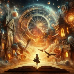
Modern book design has moved beyond simple text blocks. Today, the most immersive reading experiences treat the physical volume as a crafted object. When design choices—like font selection, layout, and paper quality—align with the narrative, the book stops being a passive container. It becomes a sensory environment. Think of it like the difference between reading a blueprint of a house and actually walking through the finished home.
The anatomy of a masterpiece: Three essential design pillars
To identify books that truly come to life, you need to look past the jacket art. High-quality production values are rarely accidental. Look for these three features to determine if a book is built to be an experience:
- Kinetic Typography: Exceptional books use fonts that change to reflect the internal monologue of the character. If a protagonist is panicking, the text might become dense or frantic. Think of typography as the tone of voice for the printed word.
- Strategic White Space: Cluttered pages create mental exhaustion. A well-designed page uses margins and spacing to pace your reading. It acts like a rhythmic drumbeat, telling you when to pause and reflect.
- Materiality and Texture: The weight of the paper—often measured in GSM or grams per square meter—defines the interaction. A heavy, matte stock feels more permanent and intimate than a thin, glossy page that glares under lights.
Case study: Books that mastered the visual narrative
To understand what visual storytelling looks like in practice, examine these three titles. They represent the gold standard for integrating design with deep, complex storytelling.
- S. by J.J. Abrams and Doug Dorst: This is the ultimate example of a book as a physical object. The narrative is hidden within a library book, complete with handwritten notes in the margins, postcards, and newspaper clippings tucked into the pages. It forces you to construct the story yourself by physically handling the evidence.
- House of Leaves by Mark Z. Danielewski: This novel uses layout to mirror the descent into madness. As the characters get lost in a shifting labyrinth, the text literally twists, turns, and shrinks on the page. It is a masterclass in using graphic design to induce vertigo in the reader.
- The Starless Sea by Erin Morgenstern: This book proves that a modern novel can feel like a fable. The publisher used intricate chapter headers, specific color-coded illustrations, and a gold-foil embossed cover that invites you into a world of hidden libraries and underground stories.
Field report: Avoiding the style-over-substance trap
A common error is falling for the ‘coffee table book’ trap. Some publishers focus on beautiful covers while the interior design remains stale and generic. If the visual elements—like illustrations or complex fonts—can be removed without changing your understanding of the story, the design is merely decorative.
You want design that functions as a structural necessity. Before you buy, open the book to a random middle chapter. Does the design look consistent with the cover? If the interior feels like a standard, boring textbook while the cover is vibrant, the publisher prioritized marketing over the reader’s experience.
Tactical advice for building your visual library
Building a collection of stunning books requires a shift in your buying habits. Stop relying on digital previews and start looking for these tactile markers:
- Smyth-sewn binding: Look for a book that can lay perfectly flat when opened. This indicates that the pages are sewn together rather than glued. It prevents the dreaded ‘gutter loss’ where art or text gets swallowed by the fold of the book.
- Endpaper quality: Examine the inside of the covers. Publishers who care about the total experience will commission custom designs for the endpapers. It is a small detail that signals an artisanal approach to bookmaking.
- Paper grain: Hold the book and flip the pages. If the paper has a slight tooth (a rougher texture), it is often higher quality than smooth, machine-coated paper. It suggests a focus on the tactile sensation of reading.
By shifting your focus to these physical and visual nuances, you move from being a simple reader to an active explorer of the written word. Seek out books that demand to be held and viewed, not just read. Your shelf will become a curated gallery of experiences rather than a graveyard of dusty paperbacks.
Content updated on 2026-08-27