
The Lesbian Flag: Evolution, Meaning, and Community Dynamics

Flags are more than fabric and color. In the lesbian community, they function as sociopolitical markers, signaling internal shifts in values, aesthetics, and inclusion. If you are navigating these symbols, you must move beyond a simple list of colors to understand the power dynamics that shaped them.
Think of flag design like the evolution of a brand identity. Just as a company updates its logo to better reflect its target audience, the lesbian community has continuously iterated on its symbols to correct past exclusionary practices. Understanding this process prevents you from using outdated or problematic imagery in your own advocacy.
The Labrys Flag: Reclaiming Historical Strength

Designed by Sean Campbell in 1999, the Labrys flag remains a cornerstone of lesbian history. It centers on the labrys, a double-headed axe historically tied to matriarchal societies and feminine self-reliance.
The violet background acts as a direct reference to the poetry of Sappho. If you want to connect with the literary roots of the community, this is your primary reference point. The inverted black triangle serves as a sobering reminder of the persecution experienced during the Nazi regime. It is not just a flag; it is a monument to survival.
The Critical Lesson of the Lipstick Flag
In 2010, Natalie McCray introduced the Lipstick Lesbian flag. It featured shades of pink and a kiss mark. While initially intended to highlight feminine expression, it quickly became a lightning rod for community friction.
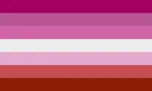
The backlash was not just about the design. Investigations revealed the creator held discriminatory views toward trans individuals. This serves as a vital lesson in modern advocacy: symbols are inseparable from their originators. When you choose a flag, you are implicitly endorsing the history of that design. Always vet the source before you choose to fly a banner.
The Orange-Pink Flag: Modern Consensus
The 2018 Orange-Pink flag, created by Emily Gwen, represents the current gold standard for the community. Its rise to prominence is a result of a deliberate community-led effort to prioritize intersectionality.

The colors are a deliberate move away from the hyper-feminine focus of earlier flags. Here is how you can interpret the layers of this design:
- Gender Non-Conformity (Dark Orange): Moves the flag beyond the binary.
- Independence (Orange): Centers the autonomy of the individual.
- Community (Light Orange): Focuses on collective strength.
- Relationship to Womanhood (White): A bridge between different gender experiences.
- Serenity, Love, and Femininity (Purple shades): Softens the structure of the flag.
Avoiding Common Pitfalls in Symbolism
If you are planning to use these flags for events or personal expression, do not treat them as interchangeable assets. Misusing these symbols can alienate the very people you intend to support.
- Vet your manufacturers: Ensure you are not financially supporting sources with exclusionary or discriminatory histories.
- Check for the five-stripe variant: The five-stripe version of the orange-pink flag is often preferred for its visual cleanliness. Use it when digital space is limited, such as in social media icons or small-scale graphic design.
- Prioritize intent: Are you seeking historical resonance or modern inclusivity? If you want to signal historical depth, go with the Labrys. If you want to signal current community alignment, go with the orange-pink gradient.
The Sociological Impact of Design
The evolution of the lesbian flag demonstrates a move from exclusionary aesthetics toward radical inclusivity. Early designs often focused on a singular, narrow definition of lesbianism, whether that was hyper-femininity or a rigid adherence to historical icons.

Modern flags serve as a consensus-based tool for coalition building. They are no longer about enforcing a dress code or a specific way of existing. Instead, they provide a visual language for a diverse group of people to identify as a cohesive unit. When you choose a flag, you are choosing a specific way to frame that identity.
Practical Action Plan for Your Advocacy
You do not need to be an expert to use these symbols correctly. Follow this simple protocol to ensure your usage remains respectful and effective:
- Research the prompt: Before adopting a design for a local group, search for recent community discourse regarding that specific flag.
- Balance heritage and progress: Do not be afraid to display the Labrys for historical education while using the orange-pink flag for contemporary representation.
- Explain the ‘why’: If you are using a flag in a public space, prepare a brief, two-sentence explanation of its history. This is the most effective way to engage bystanders and foster genuine conversation.
Symbols gain power through consistent, intentional use. By acknowledging the history behind the fabric, you participate in the ongoing conversation about who the community is today and who it aims to be tomorrow.
Content updated on 2026-10-21