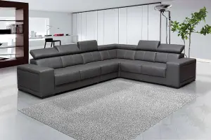
Natural light is the most unpredictable variable in your living room. A color that looks vibrant in the showroom can turn muddy or sterile once applied to your walls. To avoid a costly mistake, you must track the light path over a 24-hour cycle.
North-facing rooms: These rooms receive cool, bluish light. Opt for warmer undertones to prevent the room from feeling like an icebox.
South-facing rooms: You are blessed with abundant, warm light. You can afford to use cooler colors or deeper, moody tones without the space feeling cramped.
East/West-facing rooms: Light here shifts drastically. Use neutral shades that can adapt to both the morning cool and the evening golden glow.
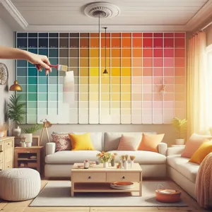
Pro-tip: Never judge a paint color by a tiny paper chip. Paint at least two square feet on a poster board and move it around the room at different times of the day.
Understand Sheen as a Function, Not Just an Aesthetic
Credit : whatcanu.com
Many homeowners choose finishes based on “looks,” but sheen is actually a tool for durability and light reflection. Think of sheen like the skin of the paint: the higher the gloss, the tougher and more reflective the surface.
Flat/Matte: Absorbs light. It is excellent for hiding wall imperfections (like bumps or poor drywall) but is the hardest to clean. Use this for low-traffic areas.
Eggshell: The gold standard for living rooms. It offers a soft, velvety appearance while being durable enough to wipe down with a damp cloth.
Satin: Higher reflection. Use this if your living room doubles as a high-traffic zone or if you want to highlight architectural trim.
The 60-30-10 Rule for Perfect Harmony
If you struggle to combine colors, stop guessing and use the 60-30-10 ratio. This mathematical approach prevents your room from looking cluttered or, conversely, boring.
60% – The Dominant Color: Usually your walls. This should be a neutral, grounding shade that acts as the backdrop for everything else.
30% – The Secondary Color: Usually your upholstery, curtains, or a large rug. This creates contrast without fighting for attention.
10% – The Accent Color: Think throw pillows, artwork, or small decor. This is where you can be bold, neon, or experimental, as it is cheap and easy to swap later.
Avoid the “Catalog Trap”
Credit : whatcanu.com
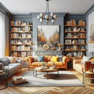
A common error is picking a color that looks stunning in a magazine but ignores your existing furniture. If you have a dark brown leather sofa, painting your walls a trendy, cool grey will likely result in a jarring, mismatched vibe. Instead, look for undertones in your furniture. If your floor has warm oak tones, look for paints with golden or creamy undertones to bridge the gap.
Field Report: The Sample Test
I have seen countless DIYers paint an entire room only to hate the result by dusk. Here is how to test like a professional:
Buy three sample pots of colors you think you love.
Paint two large white boards, not the wall directly (the existing color underneath can skew your perception).
Place these boards against different walls and near your furniture.
Wait 48 hours. Watch how the color performs under your artificial evening lighting—this is often where poor choices become obvious.
Texture: The Hidden Layer of Color
Credit : whatcanu.com
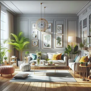
Texture changes how light hits your paint. A rough, plastered wall will hold more shadows, making a paint color appear darker and moodier than it would on a smooth, modern wall. If your room lacks natural texture, consider adding it through woven fabrics or wall paneling before committing to a final paint shade. Texture can compensate for a “flat” paint color by adding visual depth through physical shadow.
Maintenance Reality Check
Before you commit to that trendy matte black wall, ask yourself: how often do you clean? Dark matte paints show every smudge, scuff, and finger print. If you have pets or children, prioritize higher-sheen, washable paints for walls that are at shoulder height. It is better to have a slightly less “trendy” finish that stays clean than a high-fashion wall that looks degraded after three months.