WhatCanU.com has managed to bring together the most common questions that Internet users ask and provide relevant and precise answers
How to choose the right paint color for your dining room?
Choosing the perfect paint color for your dining room can be both an exciting and overwhelming task.
This space is more than just a room; it’s where memories are made over shared meals, laughter, and conversation. The right color can set the tone for these cherished moments, influencing the ambiance and feel of the entire home. With countless hues, shades, and finishes to consider, it’s easy to feel lost in the sea of options. Do you want a warm, inviting atmosphere that encourages long dinners, or a fresh, modern look that sparks creativity? In this ultimate guide, we’ll explore the psychology of color, offer expert tips on how to select a palette that complements your style, and provide inspiration to help you transform your dining room into a vibrant gathering space that reflects your personality and enhances your dining experience. Get ready to unleash your inner designer and create a backdrop for unforgettable moments!
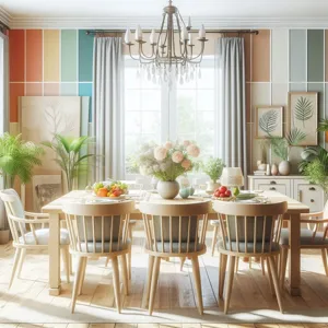
1. Understanding the Psychology of Color
Credit : whatcanu.com
When it comes to selecting the ideal paint color for your dining room, understanding the psychology of color is paramount. Colors have a profound impact on our emotions and behavior, influencing the ambiance of a space and the experiences we have within it. For instance, warm shades like reds, oranges, and yellows tend to evoke feelings of warmth and comfort, making them perfect for creating a cozy atmosphere that encourages conversation and connection. These colors can stimulate the appetite and create an inviting environment for gatherings and family dinners.
On the other hand, cooler tones such as blues and greens can foster a sense of calm and tranquility, making them suitable for more relaxed dining experiences. These hues can help to create a serene backdrop for intimate dinners or quiet family meals, allowing for a peaceful dining experience. Additionally, neutral colors like soft grays and beiges offer versatility and elegance, providing a timeless backdrop that allows your furniture and decor to shine.
Consider the emotions you want to evoke in your dining room. Do you envision lively family dinners filled with laughter and chatter, or serene evenings with soft conversations over candlelight? By selecting a paint color that aligns with your vision, you can create a space that not only reflects your style but also enhances the overall dining experience.
Ultimately, understanding the psychology of color is about more than just aesthetics; it’s about crafting an atmosphere that resonates with your lifestyle and preferences. Take the time to explore the emotional implications of different colors, and let that guide your choices as you embark on the journey of transforming your dining room into the perfect gathering space.
2. Assessing Your Dining Room’s Natural Light
Assessing your dining room’s natural light is a pivotal step in choosing the perfect paint color. The amount and quality of light your space receives can dramatically influence how colors appear on your walls. Begin by observing the light throughout different times of the day—morning, midday, and evening—to understand how the shifting sunlight interacts with your room’s dimensions and architecture.
If your dining room boasts large windows or faces south, it will likely receive an abundance of bright, warm light, which can bring out the vibrancy in hues like buttery yellows, soft whites, or even bold jewel tones. Conversely, a north-facing room typically lacks direct sunlight, often resulting in cooler, muted lighting. In such cases, consider warm tones that can evoke coziness—think soft taupes or warm greys that can help brighten the space without sacrificing depth.
Additionally, consider the type of artificial lighting you’ll be using. The warmth of your dining room’s bulbs can alter how your chosen paint color looks at night. If you plan to use warm lighting, opt for shades that harmonize with that glow, while cooler lighting may require a more neutral or cooler palette to prevent clashing.
Take the time to test paint samples on your walls, observing them under different lighting conditions before making your final decision. Painting swatches on poster boards and moving them around the room can also help you visualize how each color interacts with the light and other elements in the space. By carefully assessing your dining room’s natural light, you can select a color that not only enhances the aesthetic of your dining area but also sets the perfect mood for memorable gatherings.
3. Considering the Size and Shape of the Space
Credit : whatcanu.com
When it comes to selecting the perfect paint color for your dining room, understanding the size and shape of the space is crucial. Each room tells its own story, and the dimensions and layout play a significant role in how that narrative unfolds. A spacious dining area invites bold, rich hues that can create a dramatic and inviting atmosphere, while smaller rooms benefit from lighter, airy colors that help to visually expand the space.
Start by assessing the proportions of your dining room. If the ceilings are high, darker colors can add warmth and coziness, making the room feel more intimate. Conversely, if you’re working with lower ceilings, light shades can help to lift the space and create an illusion of height. Consider the room’s shape as well; long, narrow dining rooms may benefit from painting the shorter walls a vibrant color to draw the eye and create a sense of balance.
In addition, think about how the layout impacts the flow and functionality of the room. If your dining area opens up into other spaces, you might want to choose colors that complement adjacent rooms to create a cohesive look throughout your home. Pay attention to natural light, too—rooms that receive ample sunlight can handle deeper tones without feeling cramped, while those with limited light may thrive in softer pastels or whites that reflect whatever light is available.
Ultimately, understanding the size and shape of your dining room is about more than just aesthetics; it’s about creating an environment that feels comfortable and inviting. Whether you aim for a modern, minimalist vibe or a rich, traditional ambiance, the right paint color can transform your dining space into the heart of your home.
4. Defining Your Dining Room Style
Defining your dining room style is a crucial step in the process of selecting the perfect paint color. The dining room serves as more than just a place to eat; it is often the heart of the home, a space where family and friends gather to share meals, celebrate special occasions, and create memories. Therefore, the atmosphere you want to cultivate in this room should guide your color choices.
Start by considering the overall aesthetic of your home. Is it modern and minimalist, with sleek lines and a neutral palette? Or perhaps it leans towards a cozy, rustic vibe with warm woods and vintage accents? Identifying your design style will help you choose a paint color that complements the existing elements in your home. For a contemporary space, you might opt for bold, vibrant hues that deliver a punch of energy, whereas a traditional setting might benefit from classic shades like soft creams or muted greens.
Next, think about the mood you want to evoke in your dining room. Warm colors such as reds, oranges, and yellows can create a lively and inviting atmosphere, perfect for encouraging conversation and a sense of warmth during gatherings. On the other hand, cooler colors like blues and greens can instill a sense of calm, making them ideal for more intimate dinners or family meals.
Additionally, consider the furniture and decor you already have or plan to incorporate. The color of your dining table, chairs, and even your tableware can significantly influence your paint choice. If you have dark wood furniture, lighter wall colors can create a beautiful contrast, while a bright, modern table might pair well with a darker, bolder wall color.
Finally, don’t forget about the lighting in your dining room. Natural light can dramatically change how a paint color appears throughout the day. A color that looks stunning in the morning sun may feel entirely different under the warm glow of evening lights. Be sure to test your chosen color swatches at various times of the day to see how they interact with your space.
By clearly defining your dining room style, you’ll not only narrow down your color options but also ensure that the final choice reflects your personal taste and the ambiance you want to create. In this way, your dining room will become a beautiful backdrop for the meaningful moments that happen around the table.
5. Popular Color Trends for Dining Rooms
Credit : whatcanu.com
When it comes to selecting the perfect paint color for your dining room, staying attuned to current color trends can provide inspiration and direction. In 2023, a blend of bold statements and soft, inviting tones is shaping the dining room aesthetic, creating spaces that are both stylish and comfortable for gatherings with family and friends.
One of the standout trends this year is the resurgence of earthy tones. Warm terracotta and muted olive greens are making waves, evoking a sense of nature and tranquility. These colors not only create a cozy atmosphere but also pair beautifully with natural wood furnishings and plants, enhancing the overall dining experience.
Another popular choice is deep, moody hues like navy blue and emerald green. These rich colors add drama and sophistication, making your dining room feel like an upscale restaurant or an intimate bistro. When used thoughtfully, they can create a striking backdrop for artwork and decor, drawing attention to your personal style and the unique character of the space.
For those who prefer a more classic approach, soft neutrals like creamy whites, warm beiges, and light grays continue to be a timeless favorite. These shades provide a versatile canvas that can easily adapt to seasonal decor changes and allow for bold accents through table settings and artwork.
Lastly, pastels are making a comeback, with soft blush pinks and gentle sky blues bringing a fresh, airy feel to dining spaces. These colors can evoke a sense of calm and approachability, perfect for casual dinners and family gatherings.
Embracing these popular color trends not only elevates the aesthetic of your dining room but also sets the mood for memorable meals and meaningful conversations. As you consider your options, remember to visualize how the color will interact with your dining room’s lighting, furniture, and overall style. The right shade can transform your dining area into a welcoming haven that invites guests to linger long after the last bite has been served.
6. How to Use Color Theory to Your Advantage
Color theory is a powerful tool that can transform your dining room into an inviting and harmonious space. By understanding the basics of color theory, you can effectively choose hues that not only reflect your personal style but also create the desired atmosphere for dining and entertaining.
Start by considering the color wheel, which is divided into primary, secondary, and tertiary colors. Colors that are opposite each other on the wheel, known as complementary colors, can create a vibrant contrast that energizes the space. For instance, pairing a rich navy blue with a warm orange can add a dynamic and lively feel to your dining area, making it perfect for lively gatherings.
On the other hand, if you’re looking for a more serene and calming environment, explore analogous colors—those that sit next to each other on the wheel, such as soft greens, blues, and yellows. These colors blend seamlessly and create a cohesive look that invites relaxation, making them ideal for intimate family dinners or quiet weekend brunches.
Additionally, pay attention to the psychological effects of colors. Warm tones like reds, yellows, and oranges can stimulate appetite and conversation, making them great choices for a dining room. Cool colors, such as blues and greens, evoke tranquility and can help slow down the pace of a meal, fostering a more relaxed dining experience.
Don’t forget the importance of lighting, which can significantly alter how colors are perceived. Natural light can bring out the true vibrancy of your chosen palette, while warmer artificial lights can soften and enhance the coziness of deeper hues. Test your color choices in different lighting throughout the day to ensure they resonate with the ambiance you wish to create.
Incorporating color theory into your decorating process not only enriches the aesthetic appeal of your dining room but also enhances the overall experience for you and your guests. By thoughtfully selecting colors that complement each other and align with your dining goals, you can create a space that feels both inviting and visually stunning.
7. Testing Paint Samples: Best Practices
Credit : whatcanu.com
When it comes to selecting the perfect paint color for your dining room, testing paint samples is an essential step that can make all the difference. This is not just about picking a color from a swatch; it’s about experiencing how that color interacts with your space, lighting, and furnishings. Here are some best practices to ensure you choose wisely.
First, invest in sample pots of your top color choices. Most paint brands offer small containers at a reasonable price, allowing you to experiment without committing to a full gallon. Once you have your samples, apply swatches on different walls in your dining room. This is crucial because the way a color looks can vary significantly depending on the wall it’s on and the surrounding elements.
Consider the lighting in your dining room throughout the day. Natural light can change a paint color dramatically, so observe how your samples look in both the morning sun and the evening glow. If your dining room only receives limited natural light, you might want to test your colors on walls that receive the most sunlight as well as those that don’t.
Another effective method is to use large poster boards painted with your sample colors. This way, you can move the boards around the room to see how they interact with different angles of light and against your furniture and decor. It’s also helpful to observe the colors at different times of day to see how they shift under varying light conditions.
Don’t forget to take into account the existing elements of your dining room, such as your dining table, chairs, and any artwork on the walls. The right color should not only complement these pieces but also create a cohesive and inviting atmosphere.
Finally, after thorough testing, take a step back and evaluate how each color makes you feel in the space. The dining room is a gathering place, so it’s important that the color you choose fosters warmth and comfort. By following these best practices for testing paint samples, you’ll ensure that the color you ultimately select will enhance your dining experience for years to come.
8. The Role of Accent Walls in Color Selection
When it comes to choosing the perfect paint color for your dining room, accent walls play a transformative role that can enhance both the aesthetic and ambiance of the space. An accent wall—typically one that is painted a bolder or contrasting color compared to the other walls—serves as a focal point, drawing the eye and adding depth to your dining area.
Imagine stepping into a room where three walls are painted in a soft, neutral hue. The fourth wall, however, bursts with a vibrant navy blue or a rich burgundy, instantly creating an inviting atmosphere. This strategic use of color can highlight architectural features like a beautiful mantel, a stunning piece of artwork, or even a buffet table, making your dining room feel both stylish and cohesive.
When selecting your accent wall color, consider the overall mood you wish to evoke. Warm tones like terracotta or mustard yellow can create a cozy, welcoming environment, perfect for family gatherings and intimate dinners. In contrast, cooler shades like teal or olive green can instill a sense of tranquility, making your dining space feel serene and sophisticated.
Furthermore, the color of your accent wall can influence the choice of decor and furnishings. A bold accent wall can serve as a canvas, allowing you to play with complementary colors in your table settings, artwork, and even dining chairs. For instance, a deep charcoal accent wall pairs beautifully with crisp white tableware and warm wood tones, creating a chic and modern vibe.
Additionally, lighting plays a crucial role in how your chosen accent color appears throughout the day. Natural light can enhance the vibrancy of the hue, while softer, ambient lighting can create a more subdued and intimate feel in the evening. Be sure to test paint samples in different lighting throughout the day to see how the colors interact with each other and the overall space.
Incorporating an accent wall into your dining room design not only allows for playful experimentation with color but also provides an opportunity to express your personal style. Whether you opt for a bold statement or a subtle enhancement, the right accent wall can elevate your dining room, making it a space where memories are created and shared.
9. Harmonizing with Existing Furniture and Décor
When it comes to selecting the perfect paint color for your dining room, harmonizing with existing furniture and décor is crucial for creating a cohesive and inviting atmosphere. Your dining room isn’t just a place to eat; it’s a space that reflects your personal style and sets the tone for gatherings with family and friends. To achieve a seamless look, consider the hues, materials, and textures already present in your dining space.
Begin by assessing the color palette of your furniture—dining tables, chairs, and sideboards often serve as focal points in the room. If your furniture boasts rich, dark woods or bold upholstery, softer, lighter paint colors can provide a beautiful contrast, creating a balanced and welcoming feel. Conversely, if your furnishings are in light tones, consider deeper, more saturated shades to add depth and sophistication.
Next, take stock of the décor elements in your dining room, such as artwork, curtains, and decorative accessories. These items can serve as inspiration for your paint choice. For instance, if you have a vibrant piece of artwork that you cherish, pull colors from that piece to create a harmonious link between the walls and your décor. This approach not only enhances visual interest but also ensures that every element in the room feels interconnected.
Don’t forget about the texture of your items as well. A glossy finish on your dining table or a plush rug may inspire you to choose a paint that complements or contrasts with these textures. If your décor leans towards rustic or farmhouse styles, warm, earthy tones can enhance that vibe, while sleek modern furniture might call for cooler, more contemporary shades.
Finally, lighting plays a significant role in how colors appear in your space. Test your paint samples in different lighting conditions—natural light, evening light, and with your overhead fixtures—to see how they interact with your furniture and decor throughout the day. This will help you visualize the final effect and ensure that your chosen color harmonizes beautifully with everything in the room.
By carefully considering how your paint color interacts with your existing furniture and décor, you can create a dining room that feels unified and inviting—one that encourages memorable meals and cherished moments shared around the table.
10. The Impact of Finish: Matte vs. Glossy
When it comes to selecting the perfect paint color for your dining room, the finish you choose can have as much impact as the color itself. The two primary categories—matte and glossy—each offer unique characteristics that can dramatically influence the ambiance and functionality of the space.
**Matte finishes** are known for their soft, non-reflective surfaces. They create a warm, inviting atmosphere, making them ideal for dining rooms where comfort and intimacy are paramount. A matte finish is excellent for hiding imperfections on the walls, as it absorbs light rather than reflecting it. This can be particularly beneficial in older homes with textured walls or uneven surfaces. However, it’s important to note that matte paint can be less durable and more challenging to clean than its glossy counterpart. If you have young children or frequent dinner parties, consider that a matte finish may require more upkeep to maintain its fresh appearance.
On the other hand, **glossy finishes** bring a vibrant energy to any space. These paints reflect light, which can make a room feel larger and brighter, an attractive quality if your dining room lacks natural light. Glossy finishes are also highly durable and easy to wipe clean, making them ideal for high-traffic areas. However, their reflective nature can accentuate imperfections in your walls, so it’s advisable to ensure your surfaces are smooth and well-prepared before applying a glossy coat.
In addition to aesthetics and practicality, consider how the finish interacts with your chosen color. A deep navy blue in a matte finish can evoke a cozy, sophisticated vibe, while the same color in a glossy finish might create a bold, contemporary look. Experimenting with different combinations can help you achieve the desired effect, ensuring your dining room not only looks stunning but also feels inviting during every meal.
Ultimately, the choice between matte and glossy should align with your personal style, the mood you want to create, and the practical needs of your dining area. By carefully considering the impact of finish alongside your color selection, you can transform your dining room into a space that is both beautiful and functional, perfect for every gathering.
11. Seasonal Colors: When to Make a Change
When it comes to painting your dining room, considering seasonal colors can breathe new life into your space and create a dynamic atmosphere that reflects the changing moods of the year. As the seasons shift, so do the colors around us, influencing not only the interior aesthetics but also the emotional ambience of your home.
Spring, with its gentle pastels and fresh, vibrant hues, invites a sense of renewal and warmth. Soft greens, blush pinks, and sunlit yellows can transform your dining area into a cheerful gathering place, perfect for hosting brunches with friends or family feasts. As you transition into summer, you might opt for brighter, bolder colors that echo the vibrancy of the season. Think of sunny oranges and deep blues that evoke the joy of warm evenings spent outdoors.
As the leaves begin to change in autumn, deeper, richer tones become more appealing. Warm terracotta, burnt sienna, and earthy olive greens can create a cozy, inviting atmosphere that complements the harvest season. These colors not only enhance the dining experience but also create a comforting backdrop for those intimate gatherings as the days become shorter.
When winter arrives, consider cooler, more subdued palettes. Soft grays, icy blues, and deep charcoal can evoke a serene and elegant setting, perfect for cozy dinners by candlelight. By aligning your paint choices with the seasons, you can create an environment that feels both relevant and refreshing, ensuring your dining room remains a beloved space throughout the year.
Remember, transitioning your dining room colors seasonally doesn’t have to mean a complete overhaul; small accents like a fresh coat of paint on an accent wall or new decor elements can make a significant impact. Embrace the changing seasons, and let your dining room reflect the beauty of nature outside your window.
12. Creating a Cohesive Flow with Adjacent Rooms
When it comes to selecting the perfect paint color for your dining room, considering the adjacent spaces is crucial for creating a harmonious and inviting atmosphere throughout your home. The dining room often serves as a central gathering place, and its color scheme can significantly impact the overall flow and aesthetic of your living areas. To achieve a cohesive look, start by evaluating the colors of nearby rooms—your kitchen, living room, or hallway.
For instance, if your kitchen boasts warm, earthy tones, such as terracotta or soft beige, you might want to carry those hues into your dining room with a complementary shade that enhances the warm palette. Think of colors that transition smoothly from one space to another; a subtle gradient can create a serene environment that feels intentional and well thought out.
Additionally, consider the architectural elements and furnishings in adjacent rooms. If your living room features a bold accent wall or vibrant artwork, a more subdued shade in the dining room can help balance the visual weight, allowing each space to shine in its own right while still feeling connected.
Another effective technique is to choose a common color that recurs throughout your home, perhaps in different shades or finishes. This could be a soft blue, a muted green, or even a classic neutral that ties everything together, creating a seamless transition and a sense of unity in your home’s design.
Ultimately, the goal is to create a cohesive flow that invites guests to move effortlessly from one area to another. By thoughtfully considering the colors in adjacent rooms, you can achieve a beautifully coordinated look that enhances your dining experience and reflects your personal style.
13. Expert Tips for Small Dining Rooms
### Expert Tips for Small Dining Rooms
When it comes to selecting the perfect paint color for a small dining room, the challenge lies in creating an inviting and spacious atmosphere without overwhelming the space. Here are some expert tips to help you make the most of your compact dining area.
**1. Choose Light and Airy Hues:** Soft, light colors such as pale blues, soft grays, and creamy whites can make a small room feel larger and more open. These hues reflect light, creating a bright and airy vibe. They also provide a neutral backdrop that allows your dining furniture and decor to shine.
**2. Consider Monochromatic Schemes:** Using varying shades of a single color can create a sense of harmony and depth. For example, painting the walls in a light shade of sage green and using slightly darker accents in the decor can add visual interest without making the room feel cluttered. This technique can also elongate the walls, giving the illusion of height.
**3. Use Accent Walls Wisely:** If you’re looking to add a pop of color, consider creating an accent wall. Choose one wall to paint in a bold color while keeping the other walls light. This strategy draws the eye and can make the room feel more dynamic without overwhelming the entire space.
**4. Test with Samples:** Before committing to a color, always test samples on the walls of your small dining room. Paint swatches can look vastly different in varying light conditions, so take the time to observe how the colors change throughout the day. This step is vital in ensuring that you choose a color that complements your room’s natural lighting.
**5. Incorporate Reflective Surfaces:** To enhance the sense of space, consider incorporating reflective elements such as mirrors or glossy finishes. Painting the dining room with a high-gloss finish or adding a mirror on the opposite wall can help bounce light around the room, making it feel more expansive.
**6. Don’t Forget the Ceiling:** Often overlooked, the ceiling is an important surface that can contribute to the room’s overall feel. A lighter ceiling color can create an illusion of height, while a slightly darker or contrasting color can add warmth and coziness.
By following these expert tips, you can transform your small dining room into a stylish and inviting space that feels larger than life. Remember, the right paint color can set the mood for countless gatherings, so choose wisely and enjoy the process!
14. Common Mistakes to Avoid When Choosing Paint Colors
Choosing the perfect paint color for your dining room can transform the space into a welcoming haven, but it’s all too easy to make missteps along the way. Here are some common mistakes to avoid that can save you time, money, and frustration.
**1. Ignoring the Lighting:** One of the most significant factors in how a paint color looks is the lighting in your dining room. Natural light can make colors appear different at different times of the day, while artificial lighting can alter shades dramatically. Before committing to a color, test it in various lighting conditions. Swatch samples on your walls and observe how they change as the sun rises and sets.
**2. Skipping the Samples:** A small paint chip or digital color preview can be misleading. Always invest time in purchasing sample pots and painting larger swatches on your walls. This allows you to see how the color interacts with your furniture, decor, and even the food you serve. Balancing hues can make a world of difference, so take the time to visualize the color in the full context of the room.
**3. Overlooking the Size of the Space:** Lighter colors can make a small room feel more spacious, while darker shades can create a cozy atmosphere. However, using a dark color in a cramped space may make it feel even smaller. Conversely, very bright colors can be overwhelming in larger rooms. Consider the dimensions of your dining room when selecting shades, aiming for a balance that complements both size and function.
**4. Not Considering the Flow of Your Home:** Your dining room is just one part of your home’s overall aesthetic. Choosing a color that clashes with adjacent rooms can disrupt the visual flow of your home. When selecting a paint color, consider the hues in nearby spaces and strive for a cohesive palette that seamlessly connects the rooms, creating a harmonious environment.
**5. Rushing the Decision:** Choosing a paint color should be a thoughtful process, not a hasty decision made on a whim. Take your time to research, explore different palettes, and visualize how each color will affect your dining room’s mood and functionality. Remember, paint is not just a color; it’s an expression of your style and can significantly impact your dining experience.
By avoiding these common pitfalls, you can confidently select a paint color that enhances your dining room’s beauty and creates an inviting atmosphere for family and friends to gather. Embrace the journey of color selection, and enjoy the transformation that awaits!
15. Finalizing Your Color Choice: How to Make the Decision
Finalizing your color choice for your dining room can often feel like a daunting task, especially with the plethora of options available. However, narrowing it down can be made simpler by following a few key steps. Start by reflecting on the mood you want to create. Dining rooms are typically places of warmth and connection, so consider colors that evoke feelings of comfort and hospitality. Warm neutrals like soft taupes or creamy whites can create an inviting backdrop, while muted shades of blue or green can bring a sense of tranquility.
Once you have a general idea of the mood, gather samples of your top contenders and apply them to the walls. This is crucial because colors can look drastically different under various lighting conditions throughout the day. Observe how each hue interacts with the natural light coming into the room, as well as how it complements your existing furniture and decor.
Next, enlist the help of friends or family for their opinions, but remember to trust your instincts. Sometimes, the perfect color is the one that resonates with you the most. Visualize how each shade will look with your dining table set up and consider how it will harmonize during gatherings and family dinners.
As you weigh your options, don’t forget to think about the longevity of your choice. Trends come and go, but timeless colors tend to withstand the test of time, offering a classic look that won’t feel outdated in a couple of years.
Finally, when you’re ready to make the decision, take a step back and envision the completed space. Imagine celebrating milestones, sharing meals, and creating lasting memories within those walls painted in the color you’ve chosen. Ultimately, the right paint color should reflect your personal style and enhance the overall ambiance of your dining room, making it a welcoming haven for every guest that walks through your door.
As we wrap up this ultimate guide to choosing the perfect paint color for your dining room, we hope you feel inspired and equipped to make a decision that reflects your style and enhances your dining experience. The right paint color can transform the atmosphere of your space, setting the tone for memorable meals and cherished gatherings with family and friends. Remember to consider factors like lighting, room size, and your personal preferences as you embark on this creative journey. Whether you opt for a calming hue or a bold statement color, trust your instincts and have fun with the process. Your dining room is not just a place to eat; it’s a canvas for connection and conversation. Happy painting!